A nexus of neighbourhoods: NZ Post House


Honestly industrial with a dash of corporate colour and light, bright multi-use spaces, the New Zealand Post House fit-out in Wellington, designed by Jasmax, brings the workplace into the 21st century. New Zealand Post House, a tower-and-podium construction favoured in the 1960s was originally the main mail-sorting centre. But now, the new public and workspace interiors fulfill the client’s aim “to create an open and diverse environment that allows agile and effective business”.
New Zealand Post Group incorporates three main businesses: New Zealand Post, CourierPost and Kiwibank with respective key colours of red, green and yellow. The client brief stated that “the strategic objective for New Zealand Post Group was to ensure that New Zealand Post House embodied the business: to be one group under one roof; to be responsive to the customer (with facilities on the ground floor); and to highlight the brand of the New Zealand Post Group both internally and externally.”
The ground floor has been devised as an internal street between the north and south entranceways: in effect, a sheltered extension of the building’s location. “The intention was to encourage people to walk through the building concourse rather than braving the windy blast along Waterloo Quay,” says Jasmax architect Vivienne Radcliffe.
“All the materials bring the outside in,” Radcliffe says and this is evident in the ground floor where the colour palette is neutral, industrial greys with natural timber. A suspended metal grille ceiling is layered on the underside with acoustic material, and all the mechanical and electrical services are exposed.
.jpg)
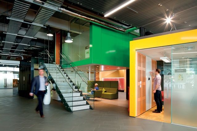
Pops of red, yellow and green reference the three main business units (New Zealand Post, CourierPost and Kiwibank). Image: Jason Mann.
The ‘street’, paved in grey tiles, is laid in an offset pattern, reducing the impression of length. Red private mailboxes, edged with LED strip lighting, have been repositioned to the heart of the space and are accessible day and night. Representative of the traditional core of the business, these mailboxes are encased in package-like angular timber containers. The idea of packing boxes and cases is also evident in the silver beech concierge pod at the south end, and in the timber-clad leaners and planters, studded with bronze rose-head nails.
The public can use the new hospitality venue at the northern end of the building and access mailboxes day and night. All the large meeting rooms for formal internal and external meetings are now located on the ground floor. The corporate colours – red, yellow and green – are present in booths and other furnishings, and in the the brightly coloured, folded-metal-clad meeting rooms (manufactured by Hansen Interiors).
Jasmax worked to develop an accommodation strategy with the executive and business unit representatives of the Post. The process included workshops, interviews, meetings and analysis over all of the buildings occupied by the Post at the time.
.jpg)
Members of the public can use the new ground-floor hospitality venue at the northern end of the building. Image: Jason Mann.
“The strategy that developed from this was to rationalise the meeting rooms,” Radcliffe says. “Meetings with external visitors were centralised on the ground floor where the concierge can greet the visitor. These rooms are bookable and it’s a more efficient use of space. Meetings with internal staff can occur also on the ground floor but are more likely to [happen] in the variety of spaces on the tower floors.”
The project began in 2009 as the internal refit of two floors and evolved to incorporate the external part of the building then the ground floor, and continued to grow from there covering, on the ground floor, a floor plate of 3,100m2, with each of the four tower floors measuring 1,150m2.
The entire ground floor was gutted and older work technology, such as the steel structural supports for mail conveyor belts, was removed; the external glazing, previously subdivided with aluminium mullions into smaller panels, was replaced with frameless glass. The building line was brought out beyond the columns, providing a transparent connection between the street and the interior.
“The columns were sandblasted back to the original concrete and, if you look at them, there’s a history – old paint, old fixings and finishings. It’s honest.”
Through the security door, there are more formal meeting rooms (nine across the public and non-public areas), fully facilitated conference spaces and two casual meeting spaces with glimpses of back-of-house services, CBD postie and mail sorting, building manager offices and shower facilities. A large boardroom with acoustically panelled, movable walls can open to include an adjacent meeting room for a larger function: typical of the design’s flexible, multi-use approach to space. The fabric on the boardroom, meeting-room and movable walls contains the corporate colours and is reversible with both sides used.
Move up to level eight and out of the lift to find ‘The Vineyard’, one of three informal meeting areas beside the stairwell, whose windows frame some of Wellington’s best harbour views. “It’s good when you are running from place to place and you haven’t got everything done before you return to your desk; you stop and do it here. You’ve got WiFi and your phone: everything you need,” says New Zealand Post strategic asset manager, Dennis Rodgers.
The colour palette and stairwell features of the tower floors are based on the different geographical locations of early New Zealand Post offices. Level eight refers to Napier; on level six, a pohutukawa sculpture represents Wellington and, on level five, illuminated reeds, Nelson. The carpet around the northern core contains green, referencing the casual ‘village green’ area of the floors, whose people and environments are conceived as communities.
.jpg)
The building concourse of New Zealand Post House now features an espresso station, and is designed to encourage public through-traffic. Image: Jason Mann.
Each of the floors have a central ‘main street’ moving through working areas where people walk and meet informally in open meeting pods or booth seating. The ‘village green’ with its kiosk kitchen spaces, reminiscent of a caravan café, and grandstand meeting areas provides social breakout spaces around the northern core while the ‘civic forum’, around the more business-oriented southern core, has small, private, acoustically insulated meeting rooms.
The work environments respond to and shape modern ways of working. New Zealand Post wanted to remove internal barriers and break down the stratification of the building, reducing workplace hierarchy and creating “one look and feel” of the same quality throughout. According to a Jasmax statement, the design set out to “provide a mix of flexible and varied workspaces where there is the possibility to work in many different/engaging workstyles [and to] allow people to locate and access people and facilities with ease”.
Staff members use unallocated, clear desks and have individual lockers; stationery, storage and equipment resources are centralised, reducing duplication. Teams work in neighbourhoods and can move around to sit together as required. There are common areas where people can meet and have coffee.
“Instead of standing having a discussion at a colleague’s desk, people can come to a booth and have it without disturbing others,” Rodgers says. “Part of the change process was to make [staff] think about their work and the types of space they needed to do it in. People have responded well.”
This article was originally published on ArchitectureNow


 Indonesia
 New Zealand
 Philippines
 Hongkong
 Singapore
 Malaysia


