Butterfly effect: Antipodes HQ


Buildings, like cats and the Dalai Lama, can have many lives.
Take, for example, this art deco building in the far reaches of Ghuznee Street, the Wellington thoroughfare named, somewhat randomly, after the 1839 battle of Ghuznee (Ghazni) in Afghanistan.
Built in 1936, the four-storeyed structure was, for many years, the HQ for Nestlé chocolate. Later, it became an RSA and, in the ’80s, restaurant Brasserie Flipp. Later still, it was the iconic music venue Bar Bodega and home to a youth support group.
In its day, the 1070m2 building must have been something. Sadly, that day had long since passed by the time Elizabeth Barbalich saw it. But the founder of global skincare brand Antipodes Nature wasn’t deterred by the dingy, dark rooms, the low ceilings (on the admin floors) and the fact that, at some point in its history, it had been carved into two.
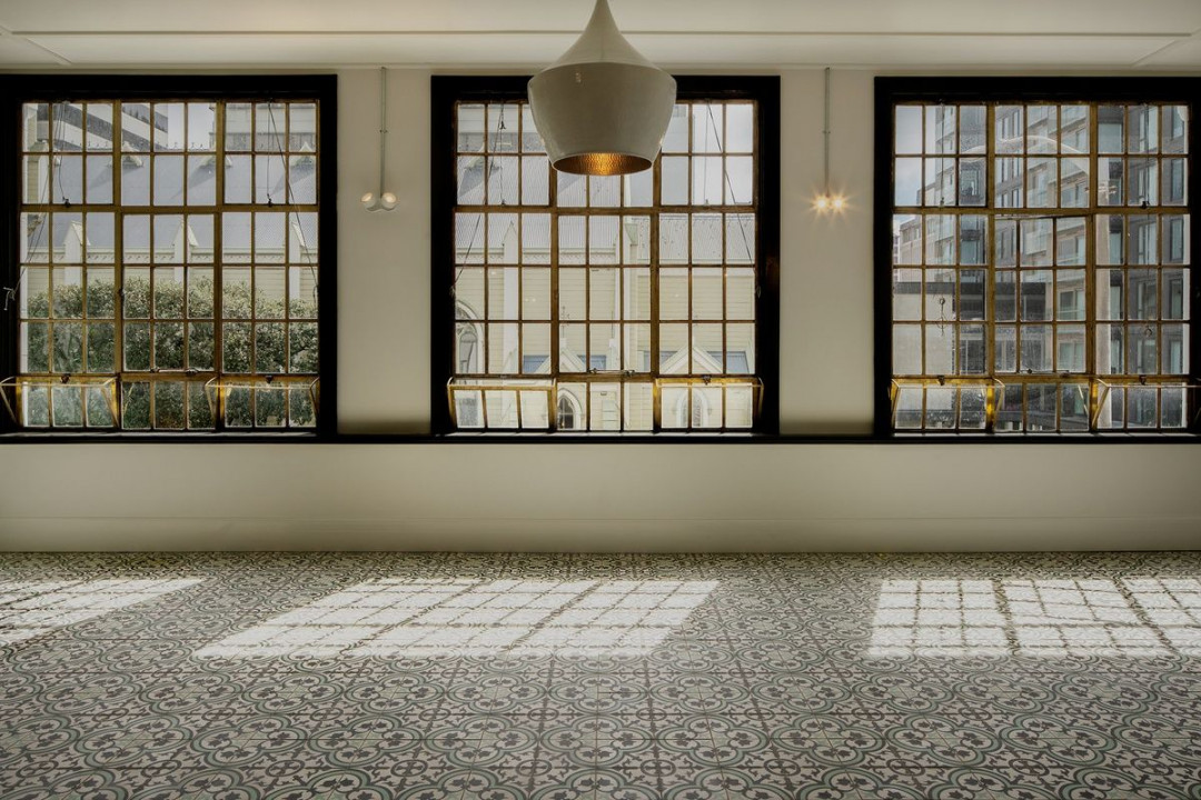
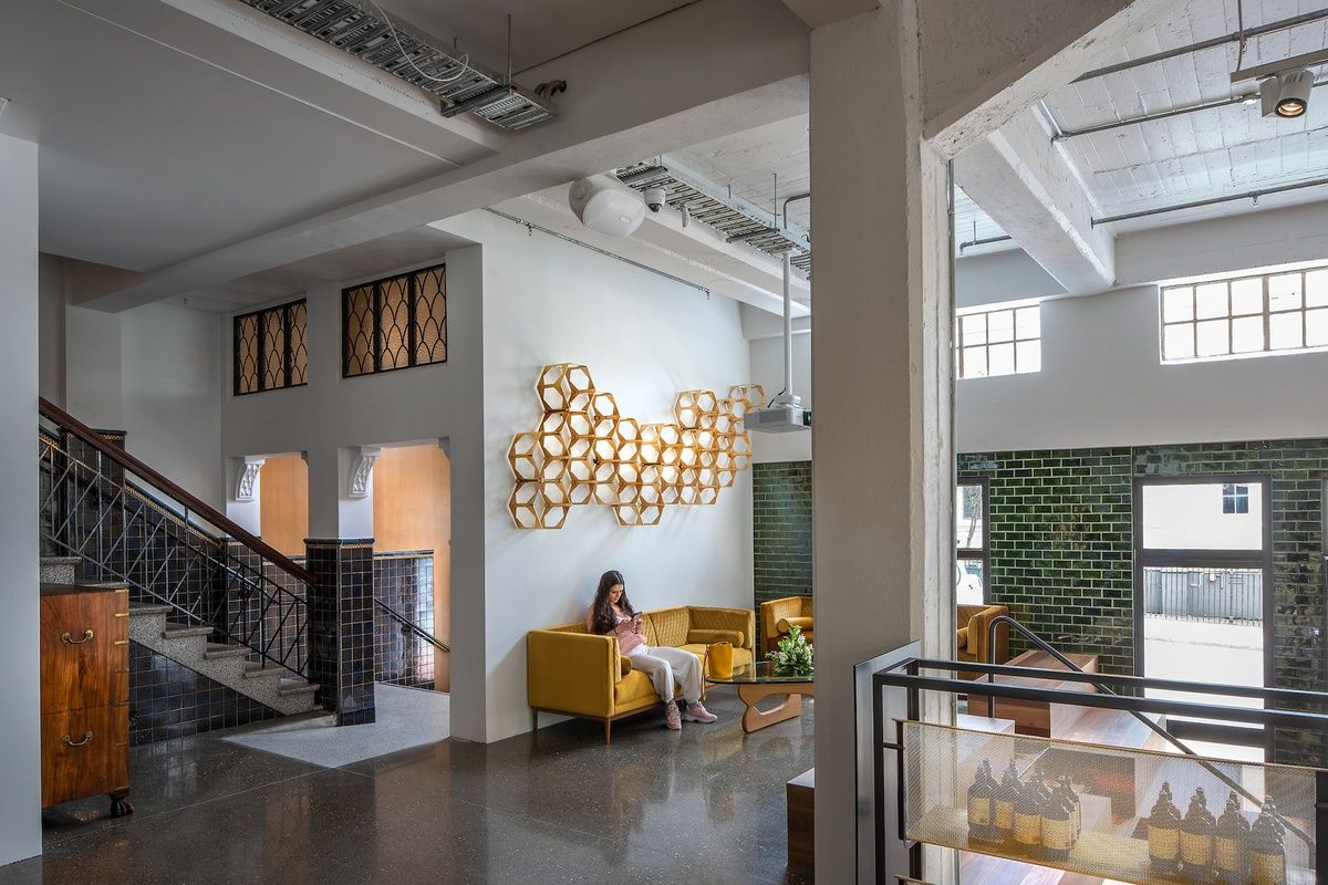
Antipodes Headquarters, with interior architecture by Architecture Workshop. Image: Andy Spain
“This is an iconic Wellington building and I could see how we could restore it to its former classical glory by giving it a modern edge,” says Barbalich. “We wanted to focus on improving the layout and flooding the space with natural light.”
Enter Architecture Workshop’s Chris Kelly, whose role was to recalibrate the structure into a series of spaces that both honoured its heritage and met the practicalities of a modern business supporting 50 head office staff.
“Our role was to examine the space with its new workplace brief and to discover more ‘commodity, firmness and delight’, which is the original Vitruvian definition of architecture,” says Kelly.
That revolved around three key steps: adding light, connecting the various spaces to one another and bringing in nature, which is in line with Antipodes’ brand values. Firstly, though, essential earthquake strengthening had to be undertaken: dropping 200 tonnes of “muscular seismic structural frames” into the concrete structure, which burrowed deep into the ground to anchor the piles. This brought the building up to around 130 per cent of the National Building Standard.
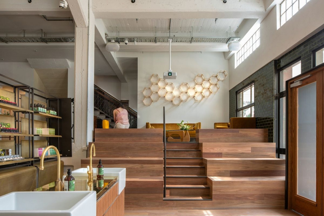
Image: Andy Spain
“The UB frames incorporate a steel fusible link that dampens the seismic rock and roll, and, when distorted, can easily be replaced after a big quake to provide a resilient building that’s immediately safe.”
Started in late 2016, that process took almost three years to complete. A key to the design was creating spatial diversity for each of the four floors – basement, ground floor, first floor and rooftop terrace – via a series of simple but radical moves.
Much-needed light was brought in by slicing out a section of the first floor and roof on the western side of the building, creating a 12.0m by 1.6m conservatory light-well that’s topped with glass and drops down to an indoor garden on the ground floor.
Next to that, a glass floor was added to bring in light to the subterranean basement level. It’s here that Barbalich was keen to honour what was once an illegal speakeasy bar, the Blind Tiger.
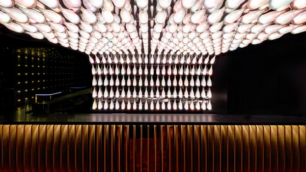
This space has now been repurposed as the company’s staffroom, which transitions into a bar/events space at night. “We used mirrors along some walls and added uplighting to bring in light to the low space,” says Kelly.
Next door, what was once the keg room has morphed into a dedicated library and space for staff lockers while the original Blind Tiger doors now grace a utilities cupboard.
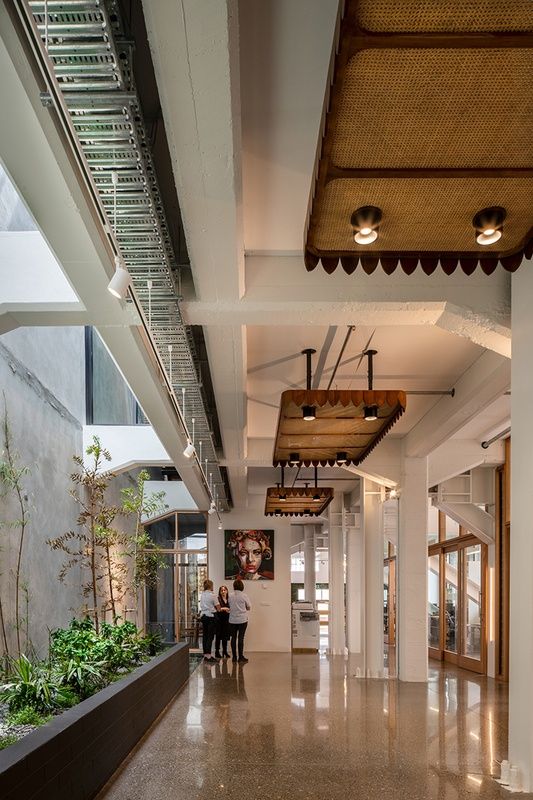
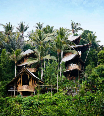
Rattan ceiling fixtures continue the Balinese-esque aesthetic, which aligns with the company’s affinity with nature. Image: Andy Spain
This was achieved by introducing a laneway along the western side of the building, with offices on the perimeter delineated by large timber sliders in glazed Tasmanian oak partitions that filter light and air into the centre of the enclosed plan. Hydronic heating is tucked under the polished concrete screed flooring, sourced from Oreti Beach in Southland. Occupants are able to control heat, light and ventilation individually in each office. Custom-made acoustic panels also feature in each office, while acoustic felt has been subtly incorporated into ceiling bays.
“This level, which was once Bar Bodega, is raw and stripped back, with painted steel braces and cable trays that contrast with the new glass and timber elements.”
Drop down a few steps to the customer-facing retail space, which served as a docking bay for trucks during the Nestlé era. Here, a series of tiered timber steps, carved from Australian spotted gum, is on message with Antipodes’ natural, organic brand.
To align with its heritage listing, the façade of the building was required to remain unchanged. And so it has, apart from like-for-like fixes, such as re-rendering and polishing the original brass window frames.
The first floor contains the executive wing, boardroom and skin lab, where testing for many of the company’s products is carried out. Here, the vibe is more classically formal, with chandeliers and fleur-de-lis floor tiles Barbalich sourced on annual trips to Bali.
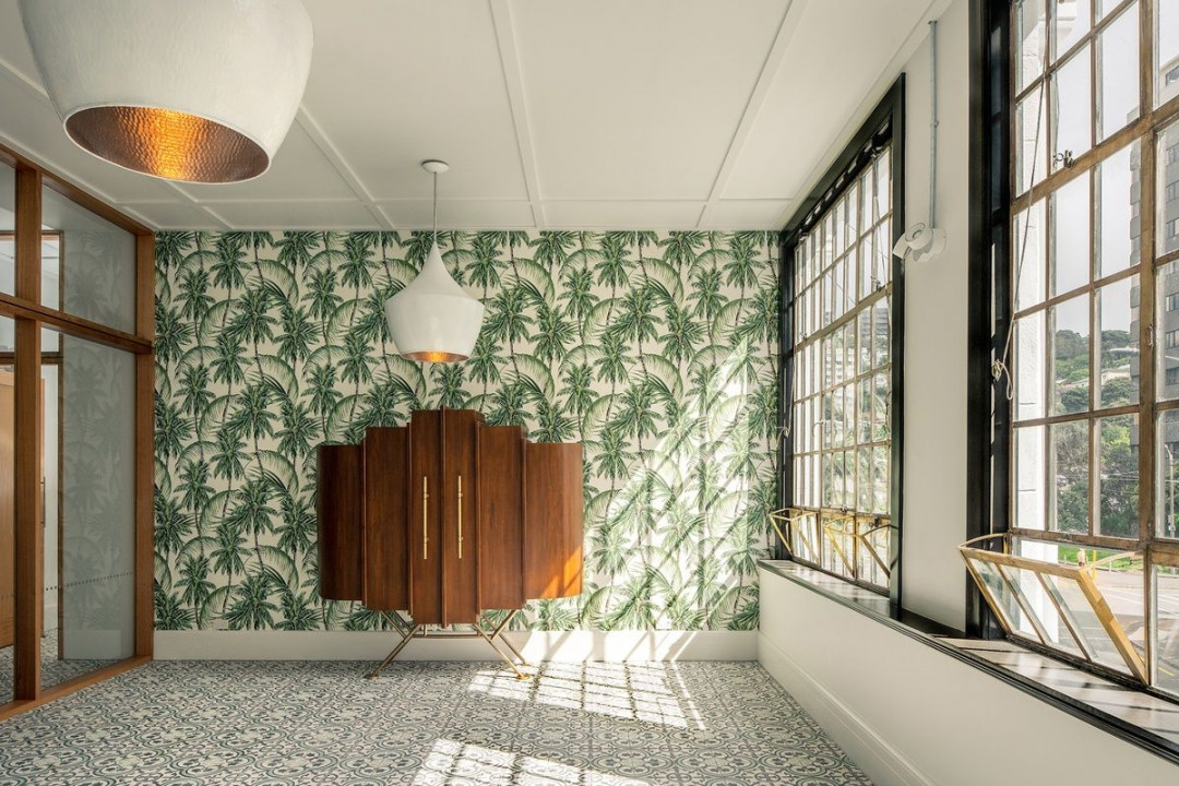
A retro cabinet imported from Bali perfectly complements frond-like wallpaper. Image: Andy Spain
Barbalich and her husband Zoran were intimately involved in sourcing many of the building’s features from Indonesia, including tiles, lights, marble benchtops and the hardwood flooring in the basement, as well as the custom-made wallpaper, which includes gold leaf and colourful tiger images in the lift.
While this worked well within the context of the design, it also presented the construction team with some challenges.
“Some of the installers weren’t familiar with the products so there was a bit of trial and error involved: for example, with using the Indonesian floor tiles,” says Kelly. “But, incorporating the various overseas and local elements has resulted in a rich palette that enhances the Antipodes brand.”
Barbalich agrees. “We absolutely love the end result. We planned and worked closely with the architects, engineers and contractors to make a series of iterations to achieve this outstanding outcome. Thanks to the use of natural materials, such as marble, wood and concrete, our workspace is comfortable and fun to work in.”


 Indonesia
 New Zealand
 Philippines
 Hongkong
 Singapore
 Malaysia


