Clyde Quay Wharf


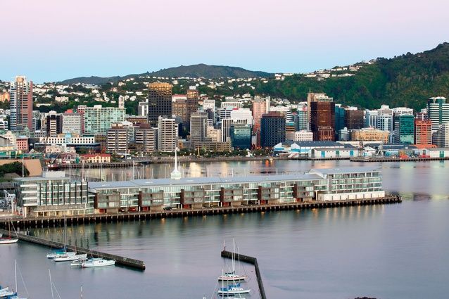
Wellington’s Clyde Quay Wharf is what real estate marketing people call ‘a destination’. This seems ironic because, unless you’re into fishing off the end of a wharf or you’re a fan of British seaside piers, filled with slot machines and fair rides, you’re unlikely to want to spend much time in such a place. While there’s a certain amount of filmic drama to be enjoyed, standing on the end of a wharf as the waves crash around you and a force-9 gale whips through your hair, it’s hard to imagine that being blown about on a Wellington pier is many people’s idea of heaven.
Yet, Wellington’s latest luxury property destination of 76 apartments, designed by Athfield Architects, has practically sold out – at prices ranging from around $1.4 million to $3.5 million. And, once inside, you can see why; the views are stunning, the apartment interiors are posh and spacious with generous ceiling heights, and the layouts are flexible with open-plan living/dining areas leading out onto loggia decks. Nearly all of the apartments have east-to-west connections with bedrooms mostly facing east to take in the morning sun and to enjoy views out across Oriental Bay; the living areas face west over the city and towards the setting sun. It is surprising how sheltered the loggia are away from the prevailing winds, making Wellington’s picturesque harbour seem even more beautiful.
The building’s finger-like plan has been cut up into eight ‘exclusive neighbourhoods’, with ‘boutique lobbies’, a STC 65 acoustic rating so you can party hard without annoying the neighbours, and access to a concierge service, a business centre with a private meeting room, a ‘boutique fitness centre’, and a luxury 16-seat movie theatre: all the chutzpah you’d expect at this high end of the property market. A one-bedroomed apartment is around 71m2 while a four-bedroomed home is more than 400m2, plus decks. The architect told me that there was “a working drawing for everything” to cater for tenants’ individual requests.
The public can walk around and access the wharf promenades but, to avoid confusion and to maintain privacy for the tenants, the western side is dedicated strategically to the public and commercial tenancies, while the eastern side is where all the private entry lobbies are situated.
The old building was in a state of disrepair but now, at street level, there are offices (Satchi & Satchi has a premium site), retail and hospitality, including a couple of restaurants. The design needed to provide for the local waterfront community as well, with lockers and showers designed specifically for them.
Clyde Quay Wharf is located on an historic wharf, whose construction began in 1894 and which opened in 1908; then, in the ’60s, it was developed into the Overseas Passenger Terminal, designed by the former Wellington mayor Michael Fowler’s firm Morton, Calder, Fowler & Styles. It was an elegant structure with a 17m-high spire that has been retained and set on top of the new building. Other elements from the terminal have been reused also, including large mosaic artworks, a world clock and steelwork.
I’m told that a huge amount of money was invested to strengthen the basement, making it one of the most expensive car parks in Wellington, if not the country. The engineering requirements were huge. The old wharf was very crooked and the foundations weren’t structurally strong enough to hold up a building of this scale; 200 waterproof concrete piles were poured into the sea floor up to 35m deep during low tide to make it watertight before the tide rose again. Some original cross-bracing has been retained in the new basement and the space has a really spooky quality to it: situated right on top of the sea with its low 2.4m-high ceiling and old piles and bracing next to new. The architects tell me that the columns had to be set out at 6.096m precisely, to cater to the length of each apartment and the width of the walls.
A 239m-long building is certainly a unique beast in New Zealand. It’s pretty much the length of a city block. Where else could you build an apartment building of this scale, except on a wharf? However, it took nearly 11 years in design for this building to happen, due to a drawn-out battle in the Environment Court. Many will remember the debates around its potential effects on the harbour and existing users, as well as about the privatisation of public leasehold land. Waterfront Watch won the decision and strict height and bulk stipulations were made. The building height was set at 21.4m and, while the building’s footprint increased, the wharf size remains the same. Still, this must have placed huge pressure on the developer, Willis Bond & Co, and Athfields to ensure that this would be a darn fine building.
And I think they have achieved a very good building. You hardly realise the extreme length of Clyde Quay Wharf because the architects have created a repetitive human scale to the form, cohesively separating the length into three parts: the north end, central section and the posh ‘number 8’ at the prow. The prow and stern are very evident, and the roof form has been taken off the original grid to maintain its character. The scaling is further reduced by stepping the façade in and out with enclosed balconies, the varied use of the materials and two passages which have been driven through the cross-section to provide access across the wharf and into the different ‘neighbourhoods’. From a distance, the building merges into the city and, while I visited the wharf on a blustery, grey day, people were still fishing off the end of the wharf, cars and trucks came and went, and there were a few people about. So you can imagine that, on a nice day, it would be a really lovely destination.
This article was originally published on ArchitectureNow


 Indonesia
 New Zealand
 Philippines
 Hongkong
 Singapore
 Malaysia


