Colour Collab: Henri Sayes


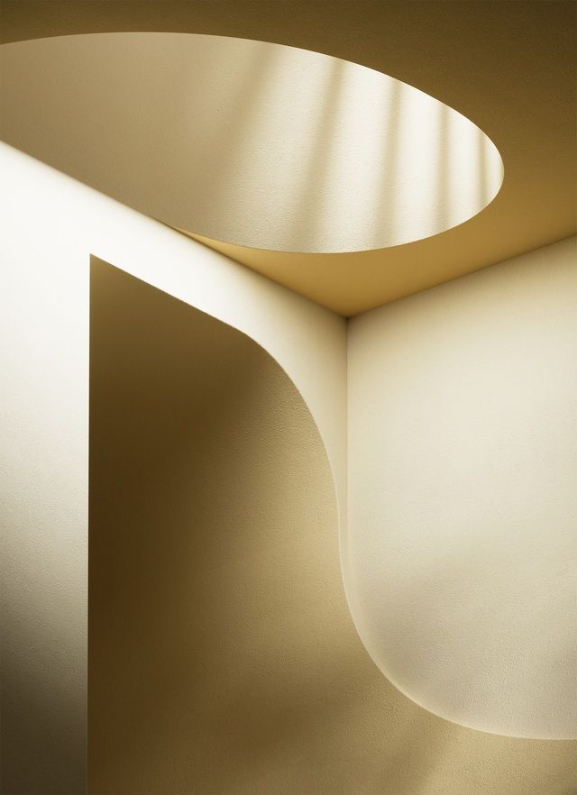
Auckland-based architect Henri Sayes founded Sayes Studio in 2016. A specialist in residential new builds and renovations, Sayes is known for his beautiful, bespoke work, which has earned local and national acclaim along with international media attention. In this Colour Collab with Resene Henri talks to Architecture NZ about how he uses colour to link and define spaces and amplify a sense of playfulness and fun.
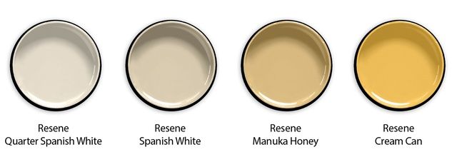
Henri Sayes’ Colour Collab features Resene Quarter Spanish White, Resene Spanish White, Resene Manuka Honey and Resene Cream Can. Image: Art direction by Thomas Cannings.
Your first home, Truss House, won a Resene Total Colour Award in 2014, with a mix of warm, dusky colours juxtaposed with white walls, punctuated by playful bright elements. Tell us about your colour selection process.
Henri Sayes (HS): Every project has a tone, in the sense that it has a material palette and a design language, and an environment that it exists within. A lot of the design process is about interpreting that tone, understanding what the project wants to feel like, then building that idea through form, and colour and material, to manifest that physically.
The tone of Truss House was playful. It is a small house, and the architecture is all about interconnecting spaces; rooms borrow from each other and you are always aware of another space beyond the one you are in. So, colour was a big part of the way we linked and defined space, and amplified that sense of playfulness and fun. For example, the ceiling of the main bedroom is Resene Bonanza, an earthy millennial pink. There is an open void down to the living spaces below so, when you look up, you see into the bedroom; you just see this glimpse of blush. It brings colour into the main spaces but in a clever, slightly removed way.
White, in its many varied hues, has remained a firm residential favourite over the past century. What role does it play within a project?
HS: The architect Richard Meier said: “Architecture is expressing a quality of light. It should also allow you to appreciate nature that’s around you. White is all colours. It’s everywhere.”
In every project I do, whites form the base tone of a project, and can be manipulated and amplified with a material palette and by the ways light falls on a surface. Some people think
white is white is white but the various shades of white can dramatically talk to, or clash with, the tone of a house – nodding to the period of the house, whether a villa or mid-century or contemporary, or underpinning the architectural language of angles or curves.
Does white feature predominantly in your current home?
HS: Yes; it’s all Resene Quarter Sea Fog. But it’s not uniform. Depending on the time of day, and the light quality in the house, and where you are looking – whether it’s a flat wall or a curve in the ceiling – the colour shifts and changes.
Tell us about the thinking behind your collab. Its beautiful, sculptural nature seems to play with the light and entice the viewer into the space. Where did you draw your inspiration from?
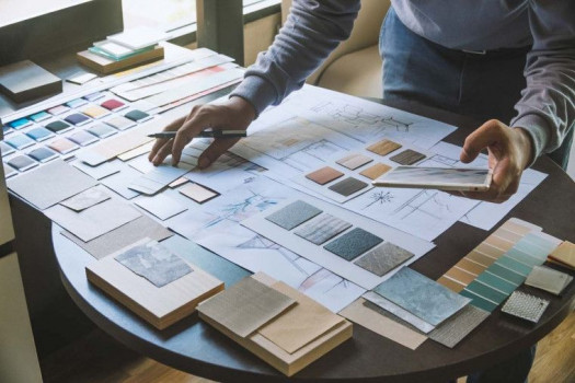
HS: I started with whites, thinking about that sense of tone and variation you can get depending on the space you’re trying to create, its proximity to a window or how it contrasts with the other materials around it. But the more I thought about it, I started to think of examples with colour that do the same thing. Mexican architect Luis Barragán used colour so well. It never feels like an applied surface; it’s about a volume, a form. There is a weightiness to it and the colour is integral to that.
Yellow has a lot of the same tonal qualities of whites, in the way it expresses form and light, but its sunniness adds a levity that maybe we all need a bit more of right now. As the idea progressed, we became interested in the intersection between surface and volume. We landed on a gradient of colours that started with Resene Spanish White (in my mind, the pinnacle of ’90s’ sophistication), which is quite a beautiful yellow-undertoned beige and, when you use it on a very slick, sculptural form, suddenly, it’s reinvented.


 Indonesia
 Australia
 Philippines
 Hongkong
 Singapore
 Malaysia


