Cradle Mountain Visitor Centre


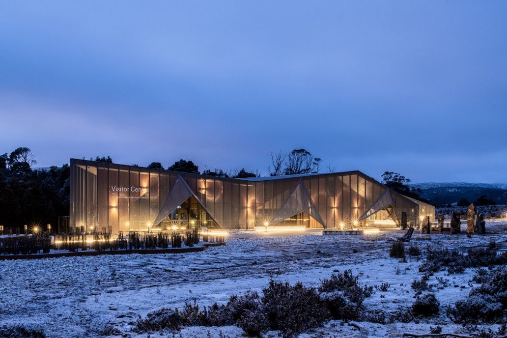
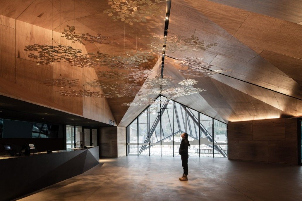
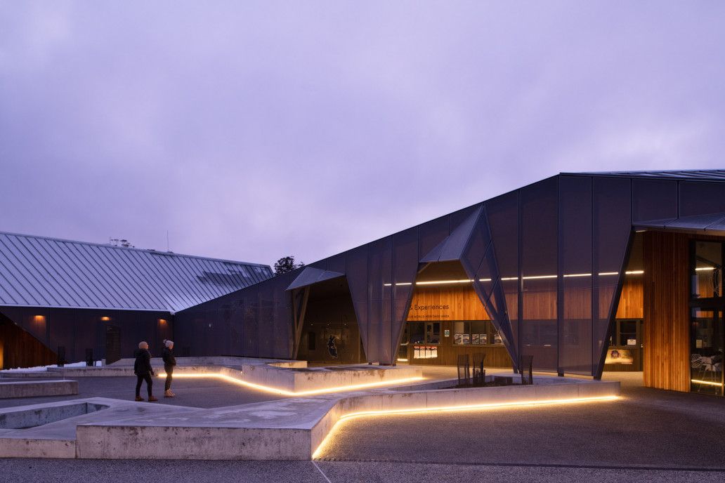
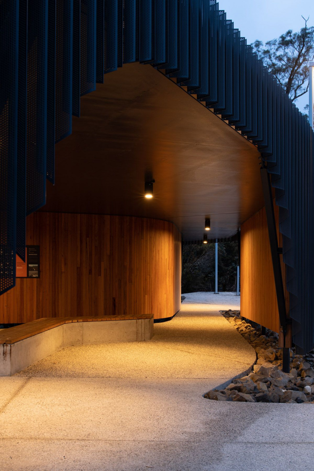
Cradle Mountain Visitor Centre is a building of contrasts. It’s imposing but harmonious. It’s an abstract interpretation of nature. And it’s modern with a rightness unrooted in time. Most surprising of all, perhaps, is how the raw exterior unwinds into a warm, soft, delicate timber lining.
With wild rainforests, rolling grasslands and roaming Tassie Devils, it’s no surprise Cradle Mountain entices a surging number of visitors. But how can you design a meaningful visitor experience in a footprint never intended to accommodate that number of guests? The Visitor Centre is the first development in a major plan to reimagine the iconic Cradle Mountain experience.
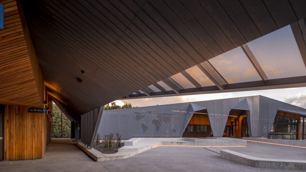
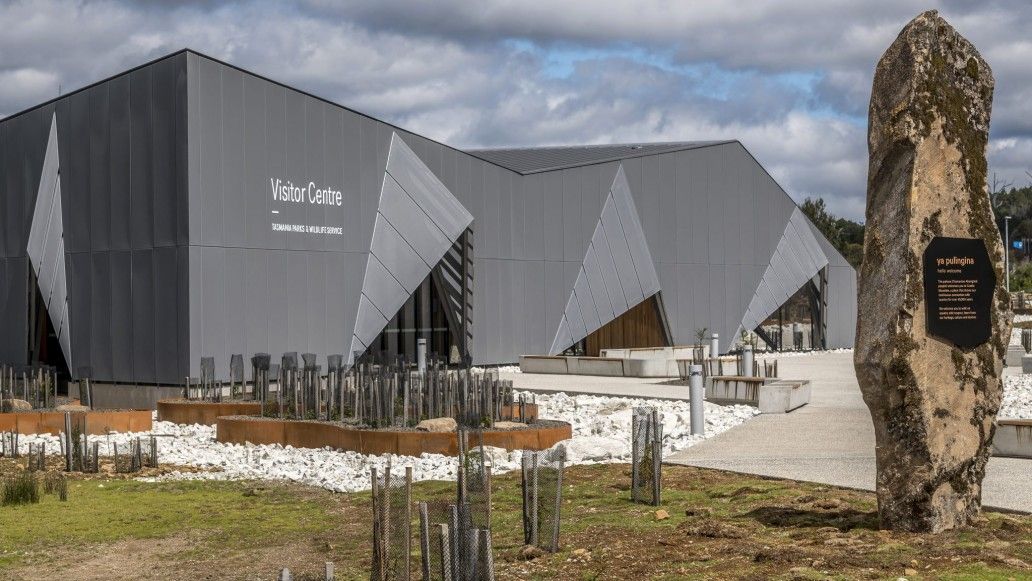
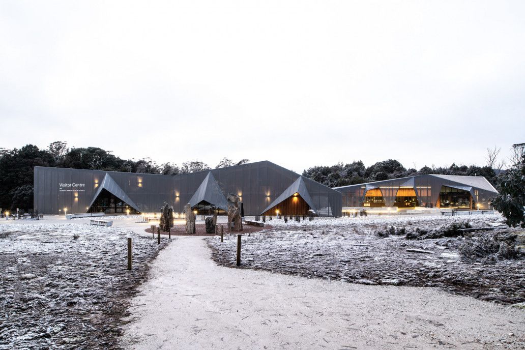
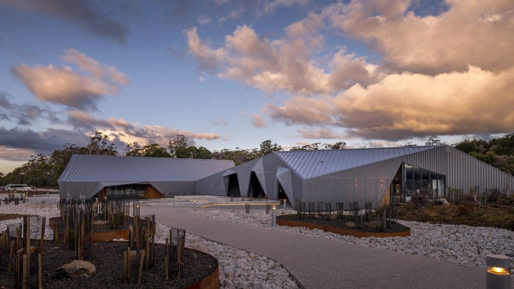
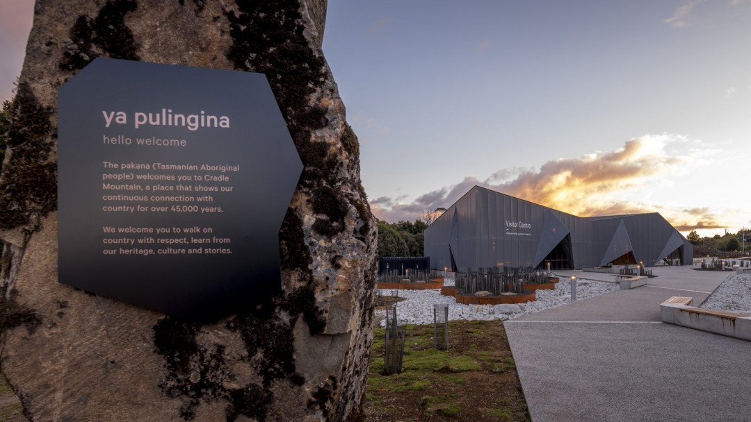
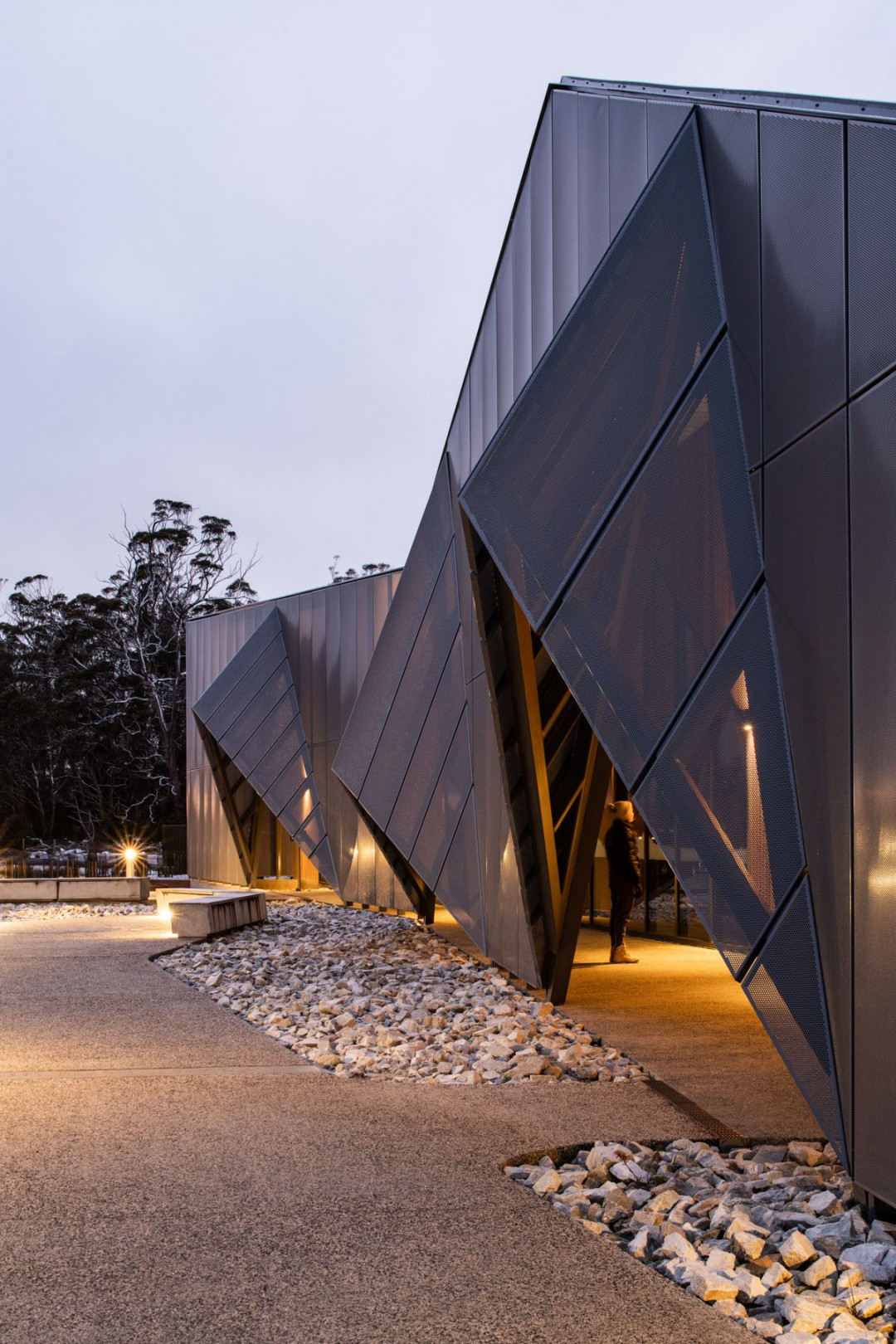
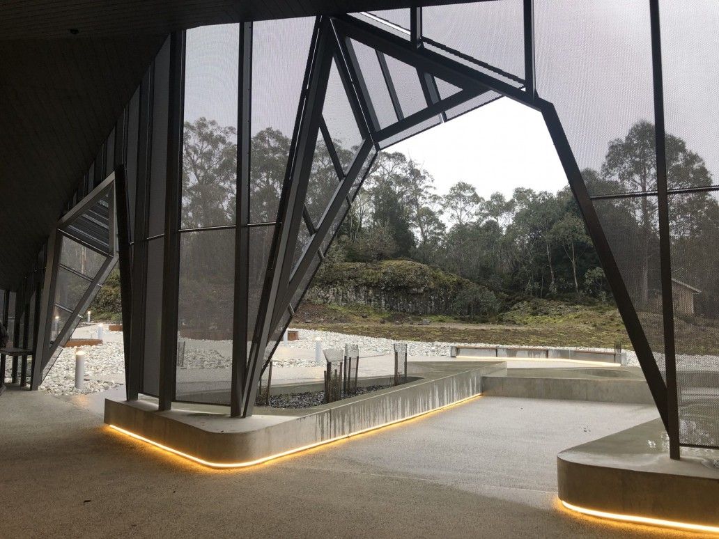
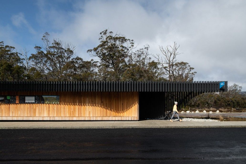
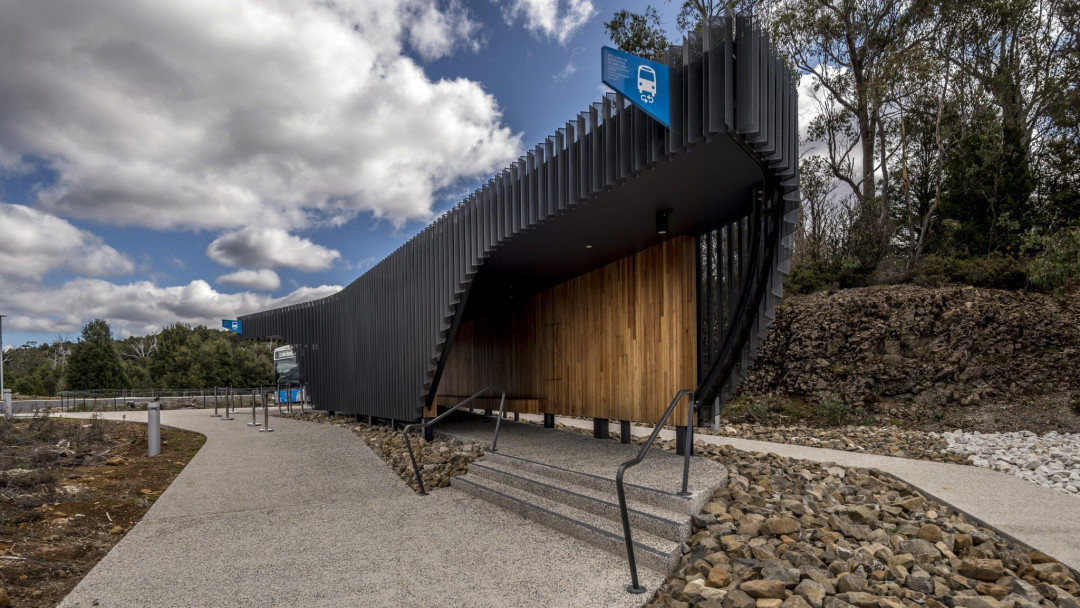
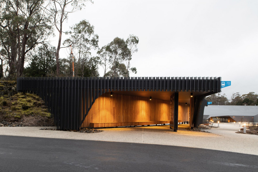
The Visitor Centre offers a warm alpine welcome to reflect both the sense of rugged-up anticipation on arrival and the distinctive Cradle Mountain geology. The sculptural, wilderness-inspired development includes an orientation building, commercial services base, shuttle bus shelter and coach transit centre. At every turn, we aimed to honour the significance and sensitivity of this world-renowned national park.
Materials to mirror nature
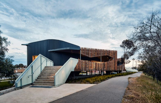
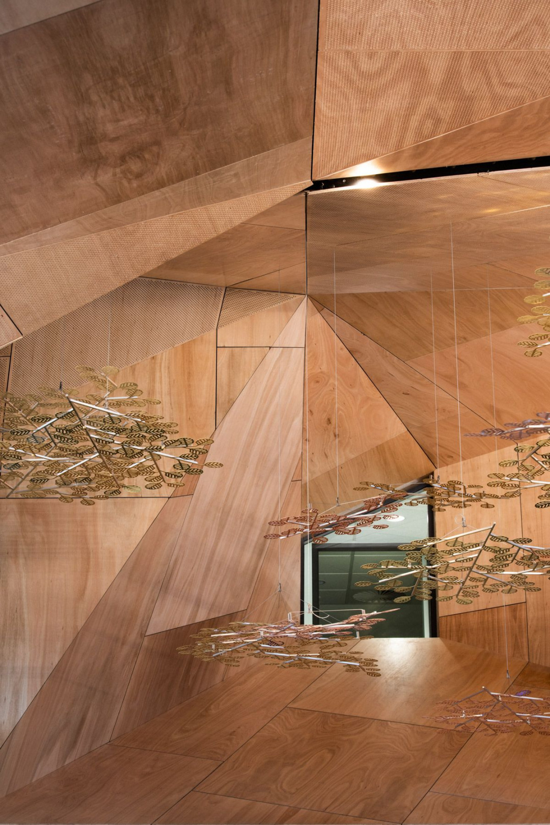
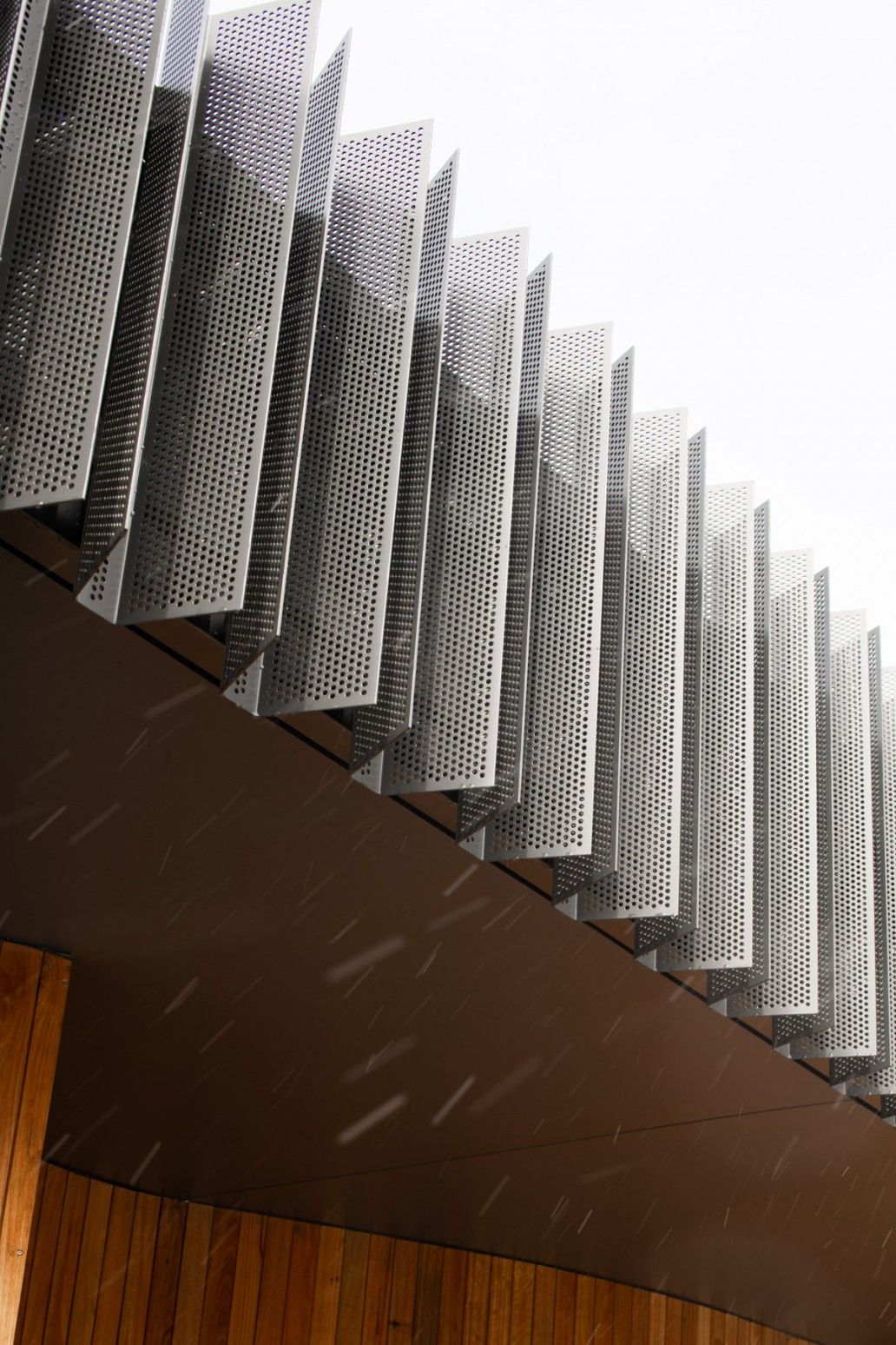
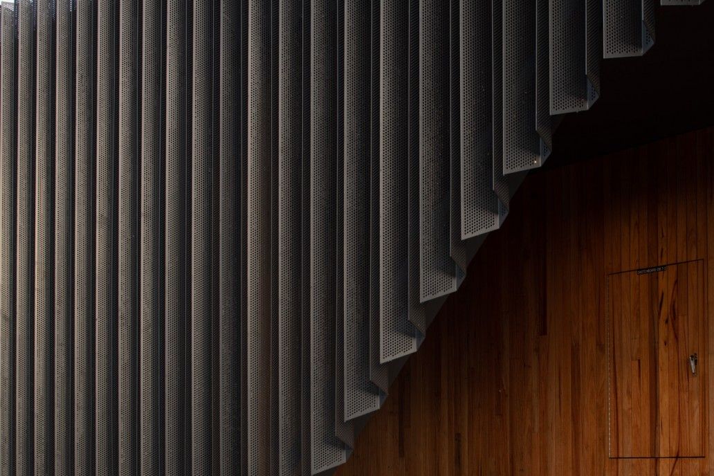
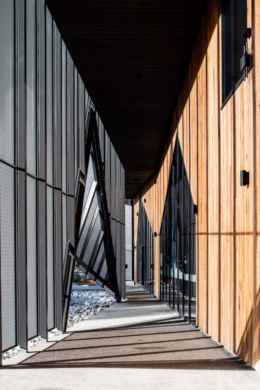
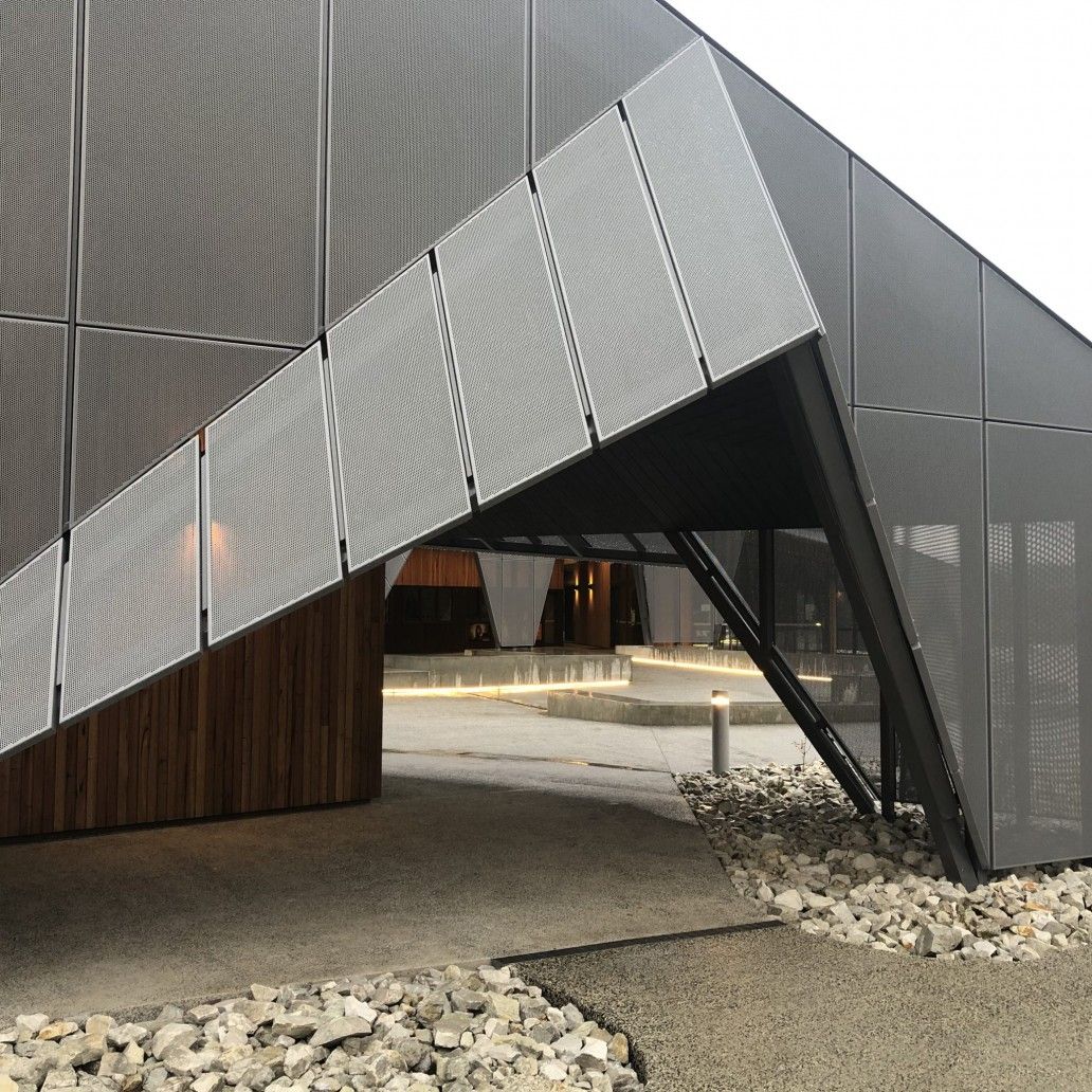
We designed the buildings to feel grounded, as if carved from a solid rock by a glacier. The umbrella rain-screen form references the folding angular geology of the site, inviting visitors into the cave-like timber interior.
The choice of timber for the interior was about the poetics and qualities of the place. Because timber is natural, guests feel connected to nature. It often evokes a response other materials don’t.
Measured tourists footprints
The design required an in-depth understanding of visitor movements across the site. It needed to accommodate the wide gap between peak and average visitor numbers and feel inviting in both cases.
Our intuitive way-finding strategy creates a flow to subtly guide visitors while they interact with site interpretation and visitor information. We used a hierarchy of space that organises services but lets the staggering natural setting sing out.
No mountain high enough
The Visitor Centre design went through many iterations as more stakeholders saw the project’s potential. But we’re proud the essence and guiding goals remained constant throughout, even as other aspects shifted around them. It’s quite a feeling to walk inside the sculpted interior timber cave, a completely unexpected gem inside the building. Whilst the triangulated timber volume’s complex geometry proved a technical challenge, it’s all the more satisfying to admire it now knowing the hard work involved.
This article originally appeared in cumulus.studio


 Indonesia
 New Zealand
 Philippines
 Hongkong
 Singapore
 Malaysia


