Extra-ordinary


Your ordinary brick is a ubiquitous building material that’s been used in architecture since ancient times: functional, cost-effective, commonplace. However, the architectural and spatial effects created with brick can be anything but ordinary.
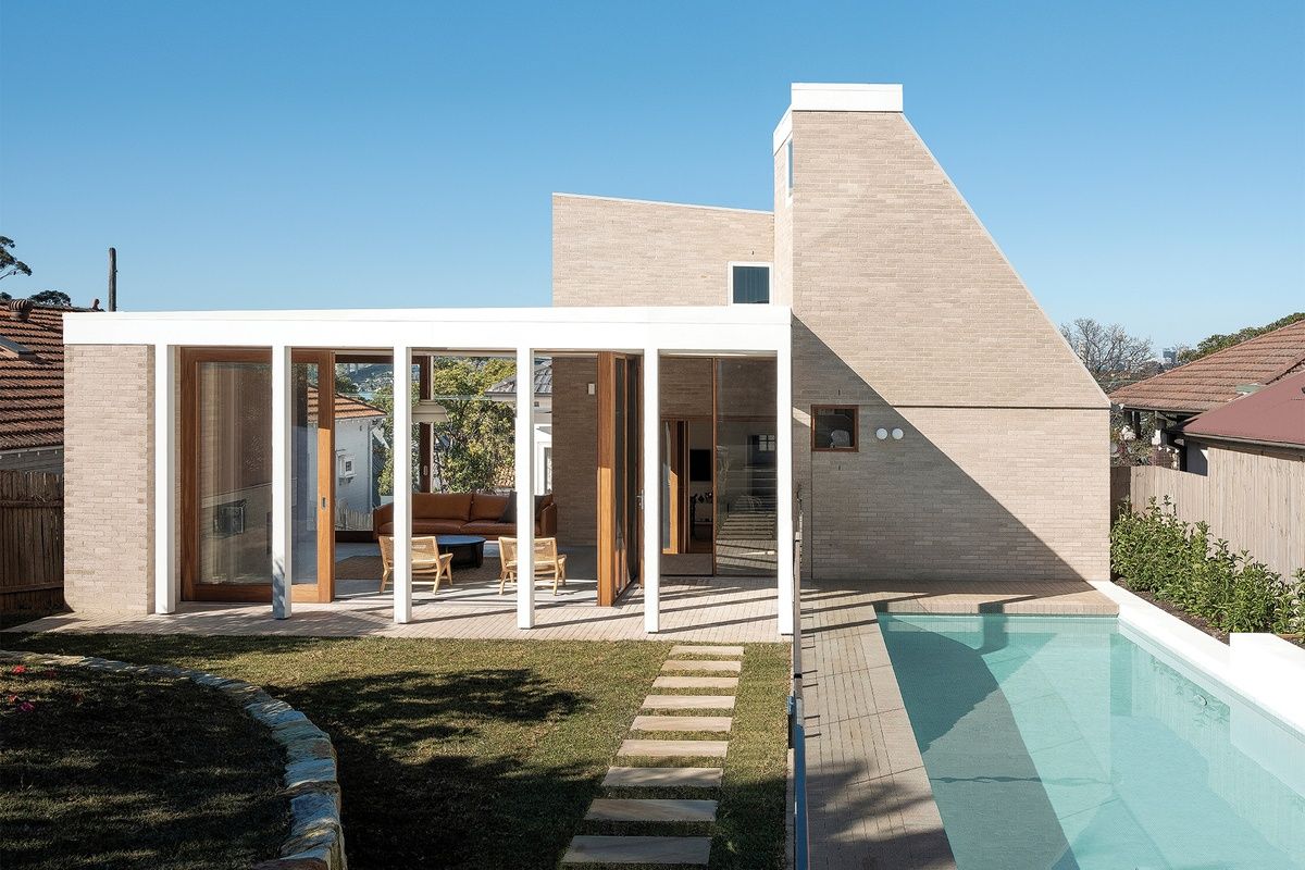
Australian architecture studio Benn+Penna used the humble brick for this rear addition to a bungalow on Sydney’s Lower North Shore. The studio designed three interlocking brick pavilions with carved-out spaces, creating a composition of solid, monolithic volumes and transparent, skeletal forms.
“We talked about the building looking almost like a ruin,” says Andrew Benn, director of Benn+Penna. “The brick has a stone-like quality so the buildings appear to emerge out of the ground, and the emphasis on negative space makes the structure look quite ruinous.”
.jpg)
The courtyard separates the old and new sections of the house, with living spaces positioned around it. Image: Tom Ferguson
The clients are parents of two teenaged children. Their existing brick bungalow had a series of rear lean-tos accommodating the living areas, with only a single door to the backyard – a large, upward-sloping site. The clients wanted more space for their family, giving independence and privacy to them and their children. As keen gardeners, they wanted better connections to the outdoors.
There are three bedrooms and a dining area in the pre-existing bungalow, with the kitchen, living room and master suite in the addition. Designed as an interlocking cluster, the three pavilions integrate the house and garden by overlapping indoor and outdoor space. Benn+Penna’s uniform use of brick for the walls, floor and courtyards embeds the house in the site and creates an uninterrupted flow between inside and out. “The brick is a fusion between the original cottage and the landscape,” Benn explains.
“It has an earth-like quality that lends itself to the garden, and an architectural quality that lends itself to the heritage of the cottage.”
The slimline, elongated bricks are a silvery-clay colour that is pale and muted, and the dull surface augments the unified, monolithic look of the house. Also, the mortar has been matched to the colour of the brick and roughly finished to create more texture.
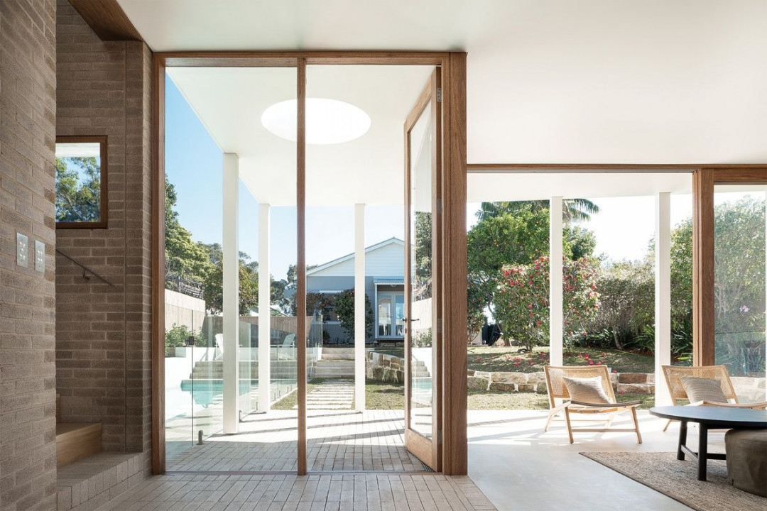
“Some spaces are intimately enclosed by the bricks while others are far more open and flowing to the garden. There is a different atmosphere in each space, even though the material palette is uniform”. Image: Tom Ferguson
Benn+Penna’s pared-back aesthetic showcases the qualities of the brick and craftsmanship of the brickwork, and the reductive approach to space creates a variety of atmospheres throughout the house, despite the predominating brick palette. “Some spaces are intimately enclosed by the bricks while others are far more open and flowing to the garden. There is a different atmosphere in each space, even though the material palette is uniform,” says Benn. The brick is complemented with blackbutt stairs, frames and joinery, and concrete and timber floors.
The three pavilions are organised around a central courtyard that separates the old and new sections of the house. The courtyard is a weighty brick plinth that aligns with the sandstone base of the cottage and then gently ascends as a series of platforms through the home.
The kitchen sits alongside the courtyard, carved out of the two-storeyed pavilion, which appears solid and monumental otherwise. The effect is enhanced by the deep, recessed threshold that connects the kitchen and courtyard, and which provides an eave to protect the interior from the sun.
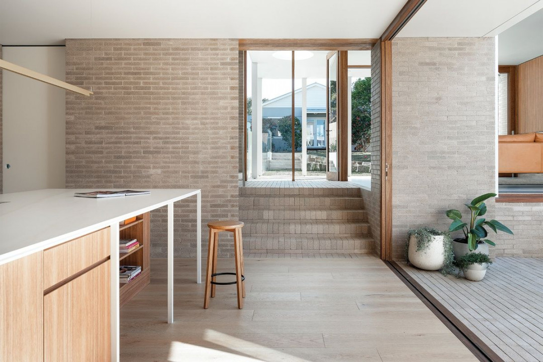
Image: Tom Ferguson
Rowlock brick steps rise to the second pavilion where large sliding glass doors and a skeletal white frame diminish the barriers between the living room and landscape. The pavilion opens to courtyards on both sides, and the white timber frame extends beyond the glazing to create a covered space outside.
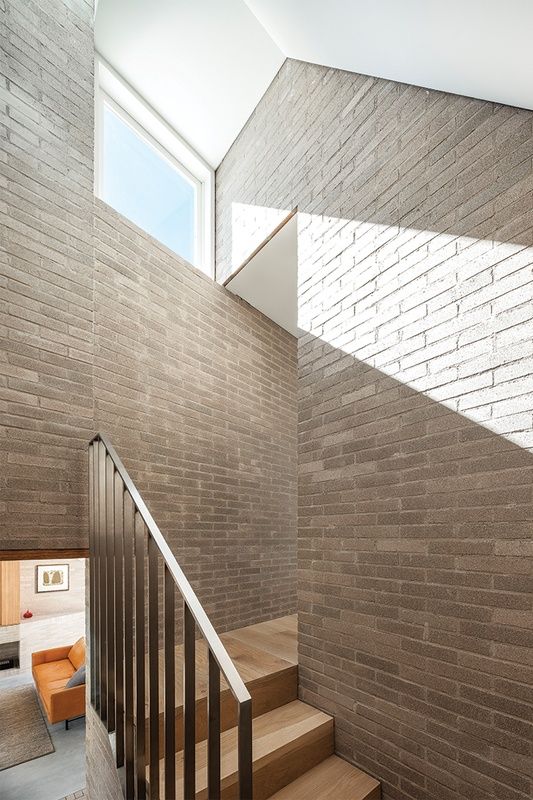
The stairwell is contained in a narrow, dramatically vertical space. Image: Tom Ferguson
The transparent form of this building is reminiscent of Mies van der Rohe’s Farnsworth House and Philip Johnson’s The Glass House. Each of these modernist pavilions is reduced to its essential structure, thereby immersing occupants in the garden landscape. Brick walls anchor both ends of this horizontal pavilion.
A shelf and fireplace are recessed in the brick wall at the far end of the room, and the vertical grain of timber cabinetry above is a subtle contrast to the horizontal brickwork. The entrance to the stairwell is recessed into the other brick wall, which is the third pavilion.
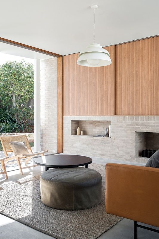
Image: Tom Ferguson
This narrow, vertical space, through which the stairwell ascends, is evocative of a passage up and into a turret. Light from above heightens the dramatic effect, with shafts of light streaming through a skylight and high-level window. These also draw hot air out through the stack effect so that the angled form of the pavilion looks and functions like a chimney. “It’s like a chimney in a ruin: still standing and surrounded by skeletal structures,” Benn describes.
The stairs lead up to the master suite – the “hawk’s nest of the house”, says Benn, thanks to the deep-set telescopic window that offers views towards the harbour foreshore.
Benn+Penna has achieved a creative, atmospheric outcome using the commonplace brick as the dominant material. Like a contemporary rendition of an historic ruin, it speaks to brick’s long-standing place in architecture.


 Indonesia
 New Zealand
 Philippines
 Hongkong
 Singapore
 Malaysia


