Houses Revisited: Super tent


Perched in a deck chair at a camping ground, you’re perfectly placed to observe humanoid behaviour. Watch the new arrivals circle in a slow loop, looking for, first, the perfect site and then the perfect spot to make camp. Most campers settle for a yellowed, damp square betraying prior occupation. But others scout around, weighing up the holiday-making or holiday-breaking criteria: sunshine versus privacy; proximity to teenagers; optimum distance from the toilets (not too far, not too close).
Then those other essential questions: Which direction should the door flap face? How do the family’s tents group together? The construction of these temporary townships, with their domes and triangles, illuminated by flickering torchlight, is architectural decision-making in process.
The owners of this Northland house used to come to Cooper’s Beach decades ago when the site was a camping ground. Each year, they’d pitch their summer villages on the cliff overlooking the beach, their tents lined up to offer views through the pohutukawa to the sea. The campground is now a suburban development, gently curving but patchy – unbuilt sections still predominate. The owners were keen to build a house here which would have the same easygoing playfulness of their tenting memories. Architect Tim Dorrington obliged, designing a beach house that operates like a grown-up campsite.
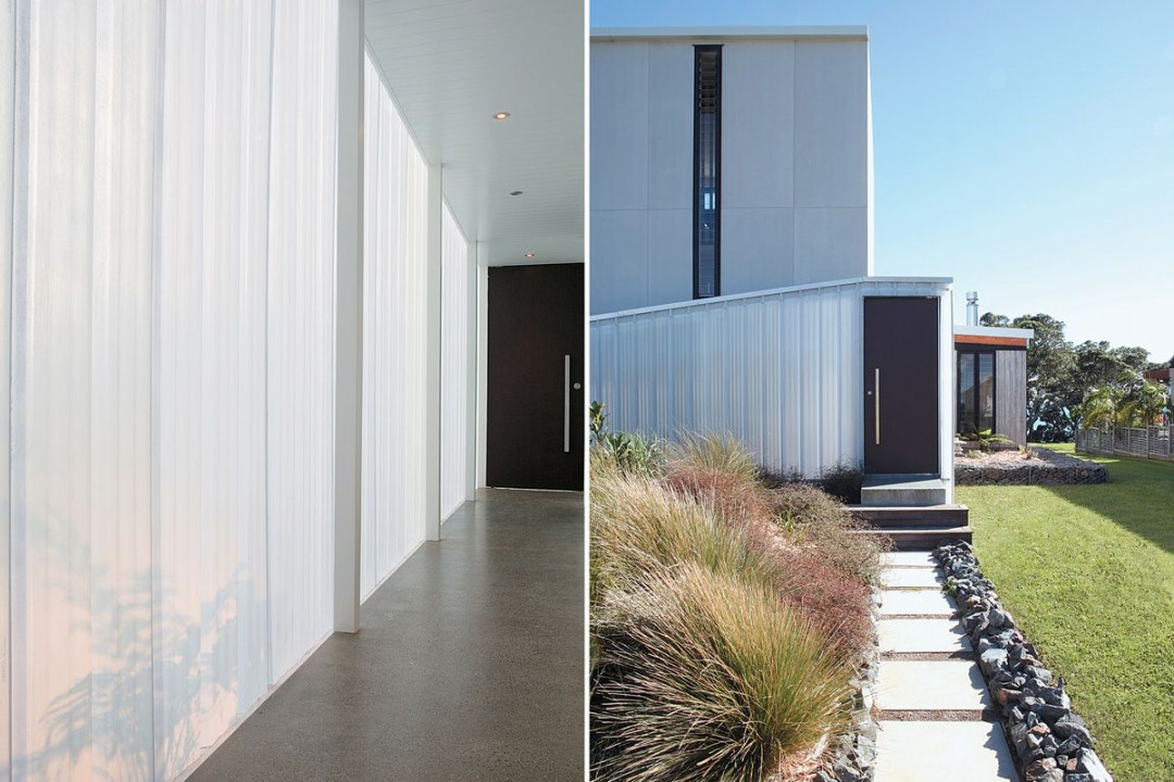
Inside the hall, looking towards the front door; The entry into the polycarbonate-clad breezeway that wraps the south-eastern corner. Image: Emma-Jane Hetherington
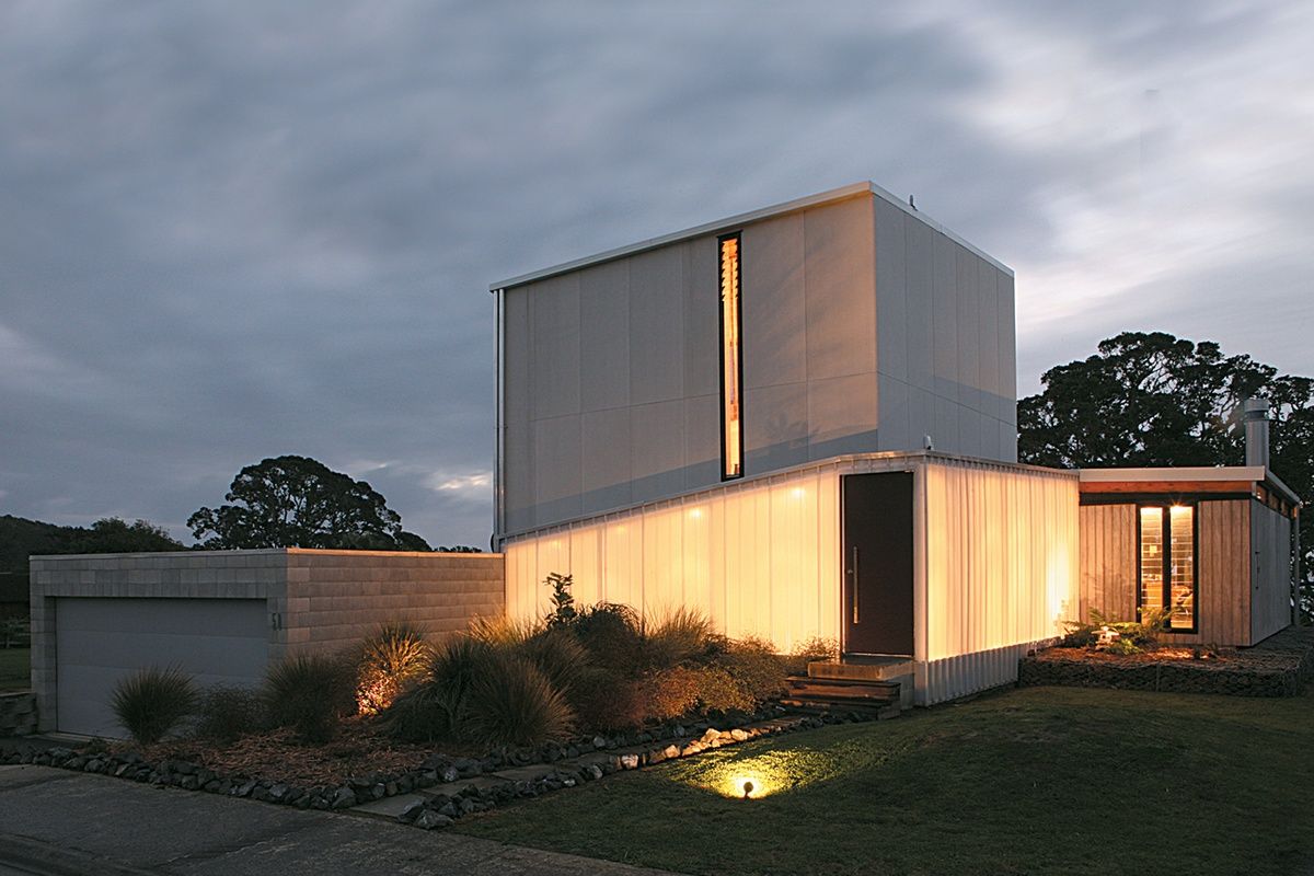
The house is a collection of four forms: three-storey tower; horizontal pavilion; L-shaped hall; and garage. In a manner similar to the way families divide out into separate tents, the house’s distinct elements constitute a whole but maintain a sense of separation. Each form is clad differently: the hall is clad in polycarbonate; the tower in fibre cement sheets; the pavilion in glass and board-and-baton timber. The material differences allude, perhaps, to the disparate elements of the encampment: pup tents; heavy canvas awnings; strung-up canopy; and dew-dusted thresholds between tents.
Layering the house’s forms allows for sophisticated connections between spaces. The linkage of the vertical tower and low-lying pavilion could have been awkward but Dorrington has created a breezeway – a semi-exterior hallway clad on its exterior face in profiled polycarbonate – which creates a glowing passage that allows the tower and pavilion to overlap gracefully. It also reinforces that essential spatial relationship of camping: moving outside between tents.
The placement of the hall to the perimeter is an interesting move. Usually our desire to push out rooms to the edges to secure views and light leaves the circulation spaces in the dark, innermost spaces. The site for this house is a rapidly developing suburban neighbourhood – having a translucent wall lets in light, but shields that less than desirable view. Few windows face this southern side; thus the house is both warm and private. The bracing white light that seeps through the milky polycarbonate is the architectural equivalent of a firm guiding hand, leading the visitor quickly through this anteroom to the prime bits of the house: the living pavilion, and the main bedrooms upstairs.
The north-west facing pavilion is flooded with afternoon sun. At night lights are strung between exposed beams; they’re much like camping lamps, and they cast a similarly appealing yellow light. Timber cabinetry fills the eastern wall, lending warmth to a steel and glass structure, and imparting a sense of coziness. The proportions of the living area are particularly well considered. While sufficiently ample to accommodate a large group, this area is also comfortable for a sole occupant.
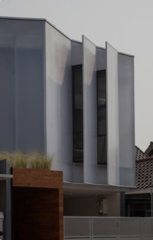
In contrast, the proportions of the tower at first seem out of kilter. It seems too tall, and almost awkward. The rigorous cladding in fibre cement, without external fixings, was intended, Tim Dorrington says, to “make it appear as much like a mass element as possible”. This effect works well when you’re inside the house – there’s a lovely tactility in the fibre cement that seamlessly slips from exterior cladding to interior wall finish. But viewed from the beach, the grey block dominates. A house is going up right in front of this residence, and I imagine the tower, which will still be able to poke its head over the newcomer, will settle into its position and its proportions will seem more natural.
Tim Dorrington’s clients held off building here for 15 years, preferring to wait to see what would spring up on neighbouring sites, especially on the site between them and the beach. As so often happens, as soon as they finally started building, the neighbours in front began building, too. The neighbours’ building is set to be only one storey high, and Dorrington is confident that by jacking his clients’ pavilion up to higher ground and building up three storeys in the tower, the house he has designed will retain the advantages of its site.
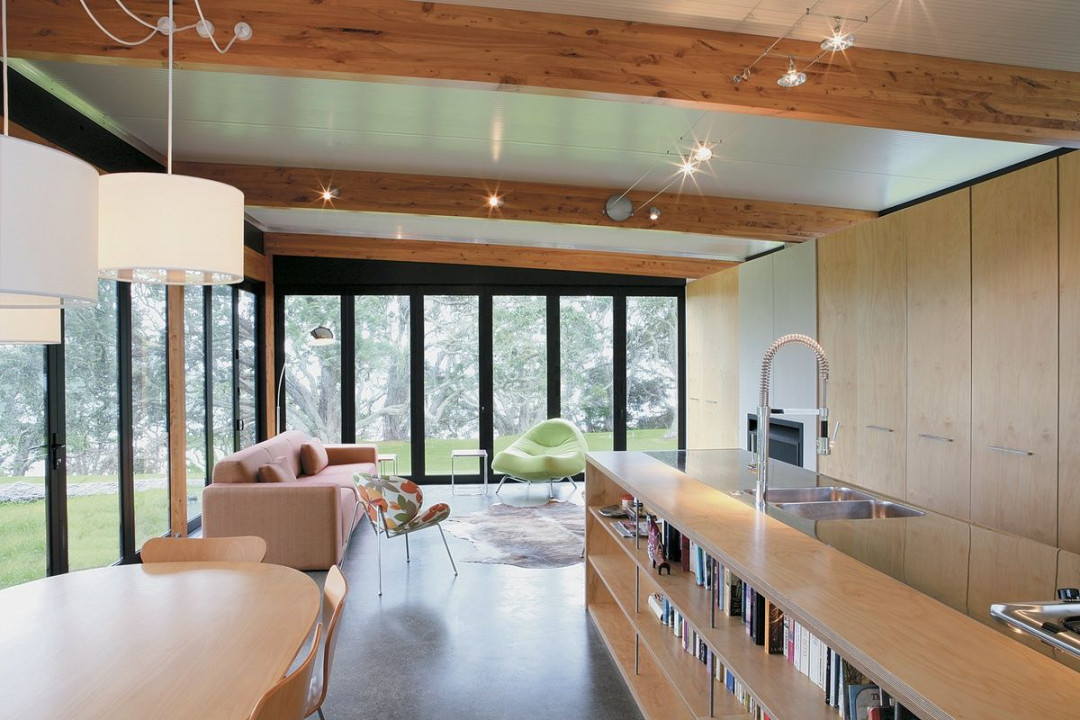
The casual elegance of the living area inside the pavilion. Image: Emma-Jane Hetherington
Back inside the ‘tents’, the detailing has the same inventiveness of ingenious fold-away, zip-up, pack-down pieces of camping equipment. A handrail has been inset into a slot in the wall alongside the stair. A plywood shelf has been fitted over a window sill. Upstairs, in the games room, a solid timber slat screen spans the height between floor and ceiling, filtering western light through this room and down through the stairwell. The architect has eschewed anything which might be too fiddly, preferring blocks of a contrasting material or colour or a slash of shadow to provide interest.
Colour has been used to great effect, predominantly in the downstairs kids’ areas. The ground floor of the tower is the darkest area of the house and the use of strong primary colours injects some playfulness into these spaces. The bathroom has an orange door and orange cabinetry, and also a claw-footed bath dipped in the same citrus-hued paint.
It’s a huge leap from canvas tents to this concrete, glass and timber ‘bach’, but the egalitarian ideas of camping, the embrace of the weather, consideration of the space between tents, and of the routines of cooking, eating, and playing, all inform this design. Tim Dorrington has created a house that is both complex and surprising, one that preserves the carefree casualness of holidays under canvas.


 Indonesia
 New Zealand
 Philippines
 Hongkong
 Singapore
 Malaysia


