Layering spaces, light and modernity


As busy professionals with two children, the owners of this classic Remuera home believed they knew what they were looking for when they approached architects Mark Gribble and Natasha Cockerell from Respond Architects. But, a bit of investigation prompted a shift in design direction.
“Our client’s initial plans for the renovation were modest,” says Gribble. “They wanted an extra bedroom, bathroom and en suite, while maintaining much of the existing layout. However, once we delved further into how the family lived and what they wanted to achieve with the house, we realised their plans weren’t going to deliver this. As architects, it’s so important to get to know your client – it’s our job to help them achieve their vision, even if they’re not quite sure what it is.”
Respond proposed an entirely new layout that would improve the home’s flow, make better use of the existing spaces and do justice to the location. They also convinced the clients that their original plan to lift the house to add additional rooms below was unnecessary.
“Lifting a house can be a messy, expensive way of achieving what you want,” Gribble explains. “One thing the clients were adamant about was retaining the traditional bungalow street elevation, so to do this while adding that much needed extra space, we suggested essentially chopping the rear of the house off and building a new two-storey addition out the back. It made the job far simpler from a structural point of view and meant the time on site to achieve the work was reduced and de-risked.”
Rather than the modern ‘box’ addition you find at the back of many Auckland bungalows, the clients wanted the exterior form of the new extension to be simple – reflecting the home’s classic features and clean aesthetic. To achieve this, Respond carried the bungalow’s weatherboards and traditional roof form through, installing timber window and door joinery, traditional wide 1920s’ bungalow skirting and even recreating an additional bay window to match an existing one.
Despite its exterior simplicity, the addition is well thought-through, sophisticated and perfectly formed – adding layers of space, light and modernity to the home.
“A bungalow is different from a villa – it’s a later style,” explains Cockerell. “It’s less fiddly and much more honest in its aesthetic and decoration – an architectural step towards mid-century modernism. The refined, contemporary interior of the addition fits with this ethos and creates a synergy with the existing house.”
The result is a home that works perfectly for this busy family of four. The upper level has been reconfigured, moving the bedrooms to the front and the living/dining/kitchen area to the back, overlooking the new pool and outdoor area below. As the house is on a sloping street, overlooked on its south-eastern side, windows on this face needed to be limited to ensure privacy. As Cockerell explains, that’s where the home’s skylights come into play.
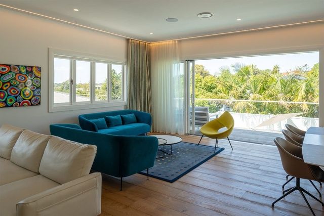
At the clients’ request, lighting throughout the house is as unobtrusive as possible. Image: Blair Hastings
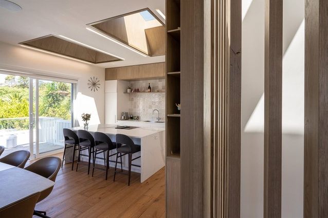
“A lot of thought was put into lighting and privacy. The kitchen has no windows, but instead uses bespoke skylights to bring light into the room while offering privacy. The shafts feature the same timber as the kitchen cabinetry and they’ve been embossed with a 10mm negative detailing around the edge and recessed perimeter lighting – elevating them from standard skylights to a real feature. Similarly, in the en suite, a large skylight sits directly above the shower, bringing light into the bathroom and maintaining privacy while giving the daily showering experience a sense of luxury.”
At the clients’ request, lighting throughout the house is as unobtrusive as possible.
“Lighting is very minimal,” says Gribble. “You don’t see the light fittings or the light source itself, you just see the effect of the light and the way it washes the walls. Even the recessed ceiling lights are created so you don’t see the rim around them – they’re just holes in the ceiling that emit light.”
In the centre of the new space is a large internal staircase linking the upper and lower levels. Surrounded by cedar slats that draw the eye to oversized skylights above, it allows light to flow through to the downstairs living area.
“When developing the design concept in 3D, I realised we needed more light to feed through to the lower level,” says Gribble. “The client was initially hesitant about the open staircase but, thankfully, they put their trust in me and are over the moon with the result.”
The downstairs living room opens to a new outdoor entertainment and pool area, complete with bar, state-of-the-art sound system (including requisite soundproofing to the walls and floor) and an office/guest room that can be closed away or opened to enjoy the views. The lower level of the house even includes a custom-built doghouse – built for a dog that was to join the family after the owners moved in.
“The clients put a lot of thought and planning into how the house would work for them. This included asking us to design a little dog room in the basement to accommodate the family dog they were intending to buy. They’re also big travellers who have collected sculptures and paintings from around the world, so they wanted the design to provide lots of opportunities to display these. Throughout the design process they showed us their most treasured pieces and involved us in their placement, which meant we could allow for the ideal spots in our plans.”
Gribble says having clients who understand the value of engaging a professional makes a real difference to the design process and to the result.
“They were the ideal clients really. They put their trust in us, taking our advice rather than spending time trying to solve things themselves. At the same time, they put a huge amount of thought into the home’s detail and this level of planning has really paid off.
“The house is bespoke and perfectly executed but it’s not over the top. There’s nothing flashy about it, but everything is thought through to the nth degree. The spaces are well executed and well proportioned, the lighting and privacy are great, and everything connects and flows perfectly. It’s this kind of detailing that elevates the home from a collection of rooms to something really special.”
This article was originally published on ArchitectureNow


 Indonesia
 New Zealand
 Philippines
 Hongkong
 Singapore
 Malaysia


