Nature play


An aspirational ideology was the basis for the design of Kākāpō Creek Children’s Garden. The clients, a teacher and a child psychologist, wanted to break away from the usual institutionalized nature of childcare centres and create a place where connections between children, teachers and the natural world are fostered.
Before this could happen, however, they needed to find out if it was possible to build on the low-lying site they had purchased in Mairangi Bay. With a stream flowing along its edge and large established trees, it was a beautiful spot that had huge potential for flooding.
The couple called upon Phil Smith of Collingridge and Smith Architects, who initially organised for a civil engineer to assess the site for viability. The resulting report recommended a building raised 1.5m above the lowest level of the site. Along with the specifics of the client’s brief, this need to raise the building formed the inspiration for its unusual shape, says Smith.
“Their philosophy for this building was for the four classrooms to be connected, both physically and with a sense of transparency. They also wanted to keep kids together the entire time they are there with the same teacher, rather than have them move from one classroom to another as they grow older. From a pedagogical point of view it is quite different from our usual brief. This became a driving force for the design.”
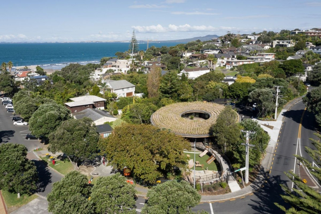
The centre is designed to be malleable, with the possibility of being altered to become a restaurant in the future. Image: Mark Scowen
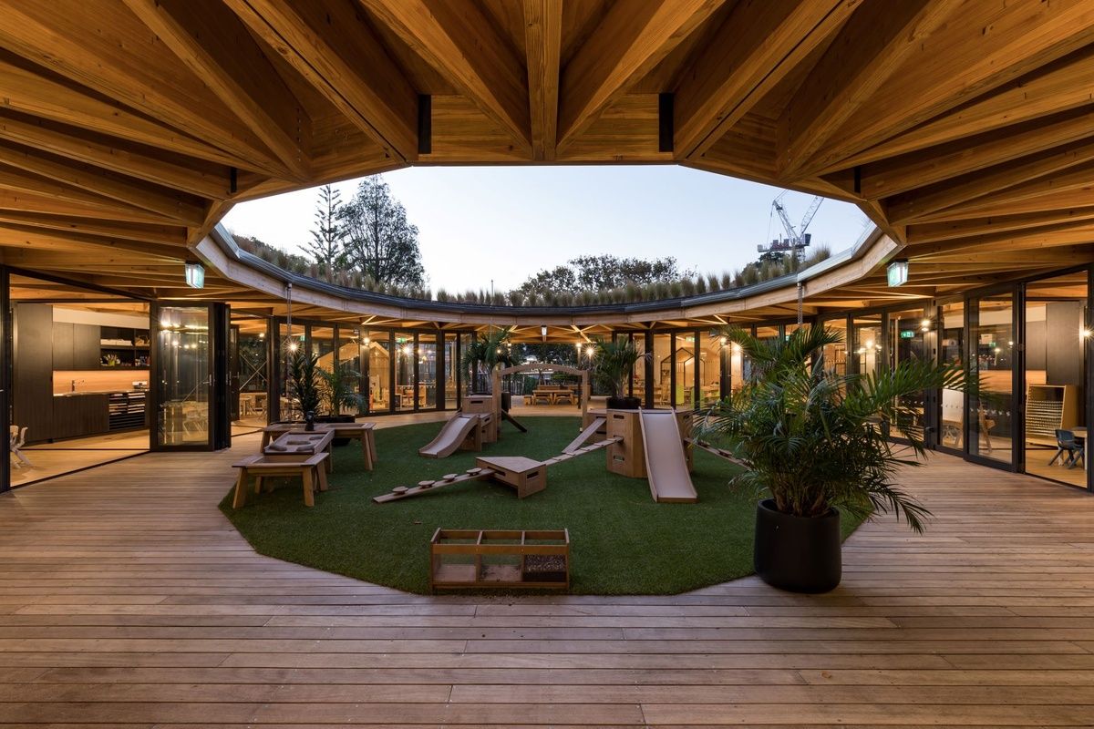
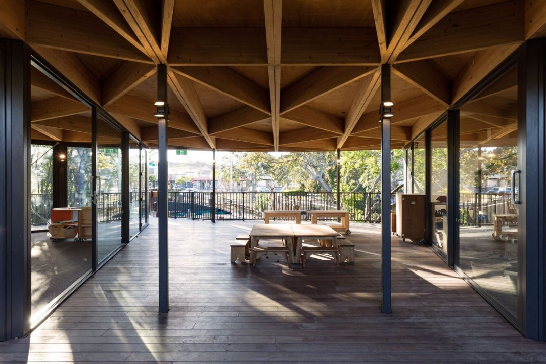
The U-shaped building with a courtyard at its centre is reminiscent of the circular Fuji Kindergarten in Japan. Through the faceted sliding doors that open into the courtyard at Kākāpō Creek, close connections are created between interior and exterior spaces, while extensive glazing inspires learning from the natural surroundings. The building also acts as a screen, preventing sound from traveling across to nearby residential areas, an issue when the building is raised above the level of most fencelines.
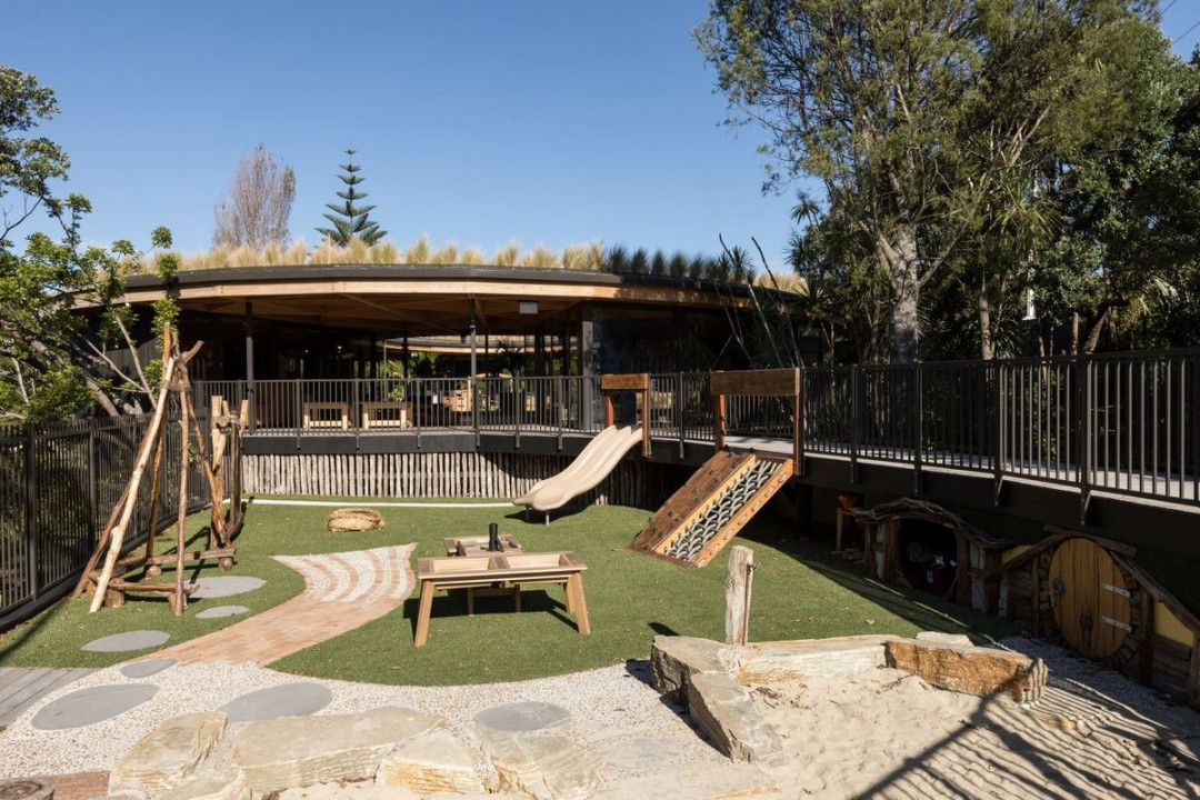
The building opens towards a section of the site which connects with the street corner. In this space, a sunken outdoor playground was created, positioned here to eliminate any noise issues, which are swallowed up by street activity. The playground is creatively designed, with a hobbit house and tunnel dug under the entrance bridge and a slide and climbing wall providing entry and exit points from above.
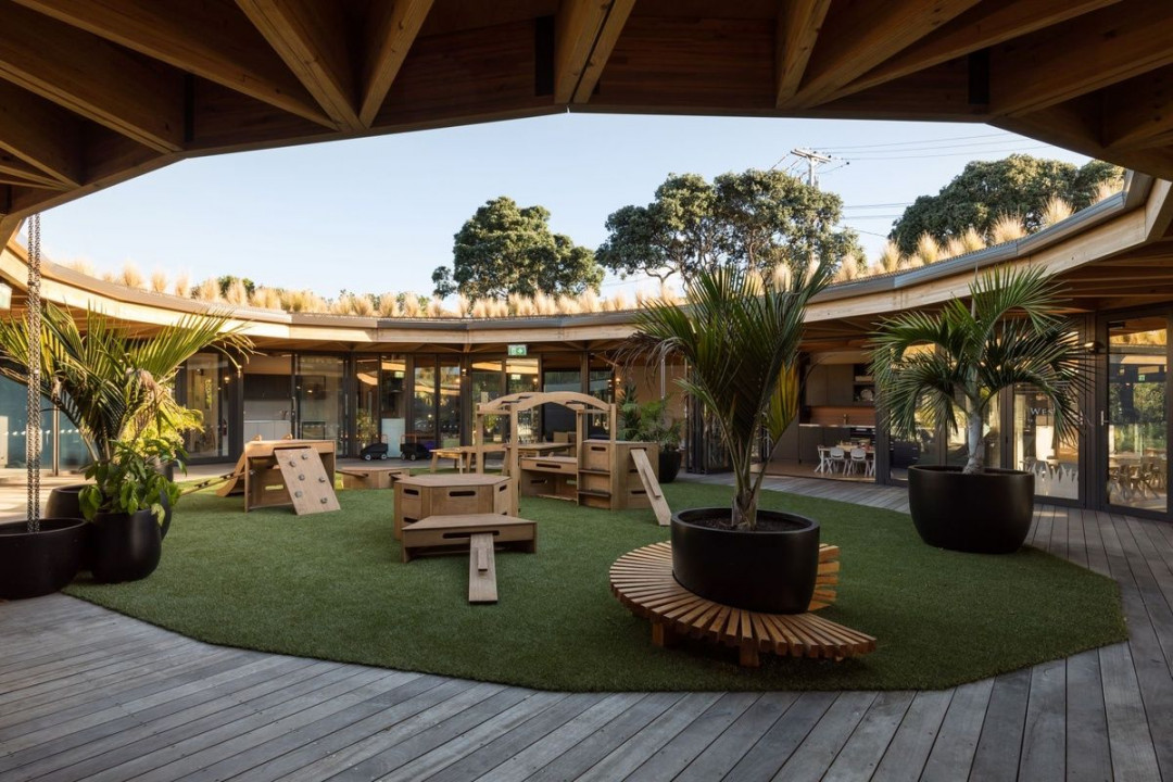
The central courtyard provides a further, inspiring place to play within eyesight of the classrooms. Raised on decking and open to the air, it is an especially interesting place to look out onto when it rains, explains Smith.
“The gutter on the circular roof has rainchains which catch the water. It splashes into pots on the deck and then goes down into channels and through a rock and gravel filtration system into the stream. So, it returns to the stream like it would have done naturally, but we’ve cleaned it. The green roof also cleans the water and removes heavy metals and impurities,” says Smith.
With windows and doors on all sides, the centre benefits from natural ventilation and lighting, reducing both running and carbon costs. This also allows the landscape to take precedence, with the murmuring steam and swaying trees beyond the windows providing colour and texture, as well as a calming atmosphere for the children.
Recycled materials from the existing house on site were used to create the playground, furthering the eco-friendly credentials of the project. Inside, the classrooms are designed using a clean palette of neutrals and sustainable timbers, allowing the children to add their own ‘colour’.
“My philosophy for most of the centres we do is that they are a backdrop, to showcase the site around them.” says Smith. “Loads of colour can provide too much stimulation. There is evidence that it makes it more challenging for children with learning difficulties to cope and concentrate. We put minimal amounts of pinboard up in certain places, positioned like picture frames. It’s methodifical and nicely presented, instead of chaotic, visual mayhem.”
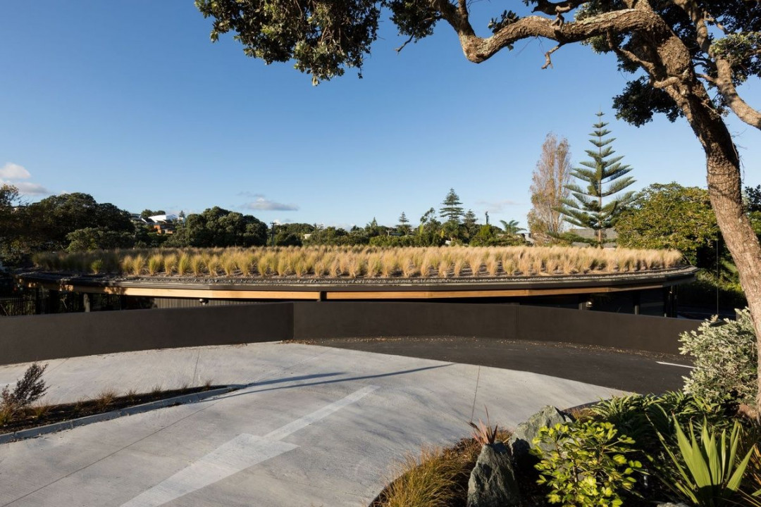
The roof is planted out in grasses which change tone according to the seasons. Image: Mark Scowen
The carpark, rather than being a concrete afterthought, follows the lines of the stream and is designed to be a part of the landscaping, with a curving access road wrapped around the ends of the building.
For Smith, having a complex brief and a challenging site gave him a clear position to design from. “We have been designing childcare centres for 16 years now and we are usually given relatively free reign, aside from stipulations around the number of children and size of spaces. Very few are as specific as this in their brief, but having constraints can be inspirational.”
The result is indeed an inspiring place to be for the children who spend their time here, with the building adding value to the surrounding neighborhood and assimilating with the natural environment.
This article was first published on architecturenow


 Indonesia
 New Zealand
 Philippines
 Hongkong
 Singapore
 Malaysia


