Opinion: In consideration of users


I was taught to swim at a very young age in the old Christchurch Centennial Pool by the extraordinary Jack Breward. Jack’s daughter Bev headed off to ride the wild waves of Hawaii’s North Shore in the 1960s and was an early hero of mine as I came under Jack’s tutelage. His balance of gentle support and robust encouragement was focused on a pool full of children, each with something vital missing. As the armless, legless or headless sank under water, leaving only bubbles breaking the surface, Jack would hook a bamboo pole into our togs and flick us skyward for a brief gasp of air before we plummeted back to the depths.
I have not had much to do with the differently-abled, as we are now called, since those days, other than to have the occasional ball-bearing race and perished German feet replaced. Rather, I have taken pride in being proof of that theory that has us overcompensating by doing that to which we are least suited. By this logic, the hypochondriac becomes a doctor, the spatially confused an architect and, in my case, the double whammy of spatial confusion and one-legged surfing.
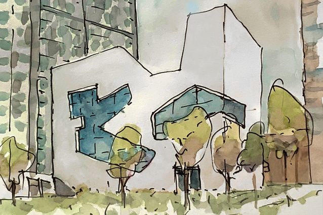
I thus felt somewhat ambivalent about the early critique that Steven Holl’s Queens library at Hunter Point received. There has been a generally favourable response to the building in the architectural press and especially for its relationship with Manhattan, visible across the East River through a wonderfully playful pair of cut-out windows. It has also received a drubbing in social media for its fiction stacks being inaccessible to those unable to navigate a flight of stairs. Given the robust nature of New York local politics, the project has had an extremely long gestation but not so long as to predate the 1990 Americans with Disabilities Act.
The Act is intended to ensure access to public buildings for all and was passed amid some rancour, culminating in a protest on the steps of Washington’s Capitol Building. The protest had disabled supporters casting aside their crutches and wheelchairs to claw their way up the 100 or so steps as the bill was being debated. I don’t think Holl’s library has provoked such dramatic protest but the twittersphere was full of commentary as the building opened. The response was split pretty equally between praise for the quality of one of the very few civic buildings erected in the city and that castigating insensitive architects of which Holl was just the most recent in a long line of careless, ego-driven, arrogant purveyors of style and image over substance.
For those not familiar with the building, it is a white-clad rectangular block, about the proportion of three shoe boxes stacked one on another and with large, free-form-shaped windows cut in the sides. The large openings generally, but not exactly, relate to the internal organisation of the library, which has five or six floors stacked unequally at either end and housing the various library collections. The levels are connected by a seemingly haphazard system of stairs and ramps encircling a central atrium. It is this route that is the source of friction, the fiction book stacks being on levels accessed only by ascending a rather daunting stairway, or they were until the critique hit the fan and the books were relocated.
The example of the Queens library shows that, while a law will ensure that basic requirements of, say, disabled toilets, might be met, it is insufficient to ensure that the non-ambulant are free to search the book stacks. Lest you think this is a call for yet more regulation, let me put your minds at rest. I have always railed against the prescriptive, be it legal imperative or the constraints of ‘how-to’ texts. I have preferred instead to flail around finding my own way, relying on common sense and a humane regard for the basic rights of one’s fellow citizen. I am happy, too, to put aside the constraints of the law or the petty chivvying of bureaucrats if a greater good is at stake.
I do not know the brief for the library nor have I seen the claims of defence to the lawsuits that have been set against the building and its architect. Perhaps the city library system of New York felt that the differently-abled were in greater need of self-improvement books than of the wanton distractions of the fiction stacks, but I doubt it. I am afraid I join with those on social media who have gathered to throw stones, to say that the power of an enticing image, that of the magnificent windows over the East River, is insufficient to offset the failure to meet the basic requirements of the building: that is, that its contents be accessible to the citizens it serves.
Lest we think this a singular rush of blood to a great architect with an outstanding oeuvre, we might look closer to home and at more modest criteria. In this regard, I am finding myself having greater recourse to the accursed prescriptive texts, and especially the one that loomed as large as the anti-Christ during my time at architecture school: Christopher Alexander’s A Pattern Language.
That great, fat volume arrived at the end of my first year, about the time I travelled to Eugene in Oregon to visit friends. The university campus in Eugene was the site of Alexander’s ‘Oregon Experiment’, a then-radical strategy for democratising place-making on a campus recently riven by the turmoil of Vietnam-era student protest. The gentle, human-centred spaces Alexander facilitated collided with my bursting enthusiasm for the heroic power of architecture, the Age of the Masters as Reyner Banham called it, and the results on the campus seemed tawdry and of small aspiration by comparison.
Now, 40 years or so down the track, I lament the civility that underlies the text. I find myself sidling up to hapless members of the studio, clutching a beat-up copy of A Pattern Language as furtively as an earlier generation might have carried a well-fingered Playboy. Like some ageing pusher, I open pages I think relevant to the work at hand: say, outlining the correct pattern for a front door. The text, monochrome photos and occasional sketches make a potent argument for providing for the civilised accommodation of human endeavour. It is suggested, for example, that the front door should have a covered bench to allow one to remove one’s riding boots before entering, a light to illuminate a visitor’s face and so on. Alexander’s gentle exhortations now seem hopelessly dated yet the library is proof of what happens when such basic expectations are overlooked.
I suspect Pinterest and its digital brethren have become the new ‘how-to’, with their relentless importuning to save one or another image and scurrying off to find others if one rests a cursor for more than a nanosecond. This relentless hoovering of the world’s architecture is intoxicating, as image upon image rains down from on high, though I think we are much the poorer for lack of explanatory text and those evocative images in Alexander’s tome.
I wonder, too, if the parade of images is in some way the progenitor of those massive windows looking towards Manhattan. Are they all that is new and exciting in this building? The lawsuits and public opprobrium suggest matters of greater importance: that a building has a lot more to do than provide a striking image. It reminds us, too, that we architects have a duty, at the very least, to treat our building users with humanity, respect and civility.
Is this just the conservatism of age railing against the whirling pixels of a new generation, one for whom a power point and a recharging station are more important than a bench to allow one to remove one’s boots? No, damn it, respect for the needs of those poor sods who cast aside their crutches on the steps of the Capitol deserves to be embedded in our consciousness and so, too, do the rights, needs and sensitivities of those who use our own buildings.
This article first appeared in Architecture New Zealand magazine.


 Indonesia
 New Zealand
 Philippines
 Hongkong
 Singapore
 Malaysia


