Two sides of Sala


Alongside this boutique gym’s first space, opened in 2018, a second studio space designed by Mijntje Lepoutre offers both continuity and change for the brand.
The design of healthcare and wellness spaces is increasingly coming into focus, with proprietors understanding the impact that good interiors can have on our wellbeing. Even brands that are more traditional in the gym space, like Les Mills, have sought the advice of design experts for their new spaces in recent years. Plenty of boutique offerings abound in our metropolises as well with good design at their heart, and Sala is no exception.
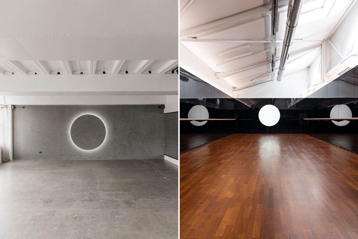
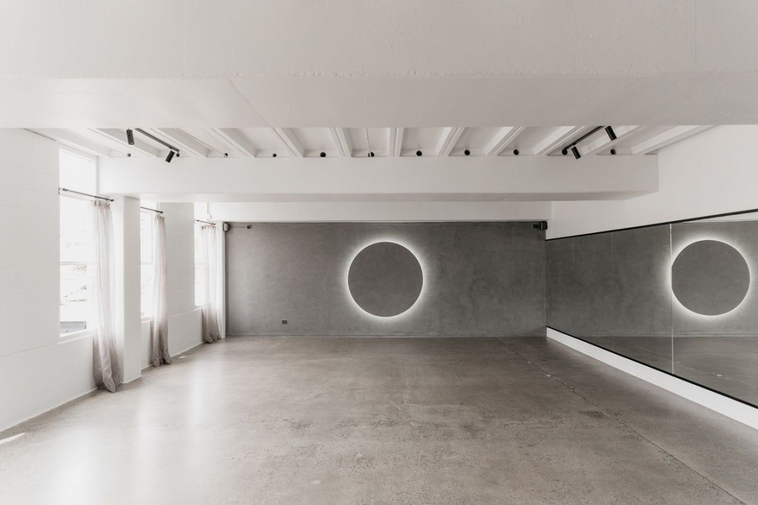
First opening in 2018, and now with a second studio space opening in May of this year, Sala’s founder Sarah Lindsay has had the look and feel of the group fitness space in mind since its inception. Lindsay notes, “The first space has an expansive feeling to it, the grey plastered walls meeting the concrete floors give the same sense as looking out far into the horizon and feeling as though you could stretch out your arms and both touch everything and nothing at all at once.”
When it came to expanding Sala into a second space, Lindsay engaged interior designer Mijntje Lepoutre, who has been a member at the gym since it opened. “I trusted she wouldn’t rip out the heart of Sala,” Lindsay says. “Outside of movement and design we both share a passion for tactile and immersive art and installation so I intuitively knew she would elevate my own imaginings.”
The two rooms are linked with Sala’s signature large circle as a focal point, but where the original room features a monochromatic round that glows from backlighting, the new studio’s circle glows white in contrast to the dark walls. Light from the high ceilings of the new room also juxtaposes nicely with the black palette. “The design was a direct response to the existing room: dark and narrow with lofty ceilings,” Lepoutre explains. “There was a sense of intimacy and quietness about it. A real departure from the bustle of Ponsonby. We wanted to emphasise this as well as create a synergy between the two studios.”
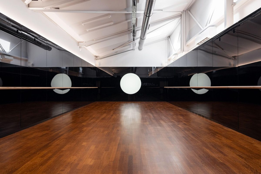
Lepoutre notes that designing for a fitness space came down to the community. Designer and client worked together to distil the idea of Sala’s members being put at ease and able to work alongside each other into a feasible design. Lindsay says, “When I initially imagined the new sunset room, I saw it as warm and orange with a feeling of astral projection. I changed my mind every day on what that room should look like and how to embody intimacy. I reached out to Mijntje to help dissect the aesthetics, and she immediately digested intimacy differently to the loop I’d been stuck in. It was from here we began exploring the notion of darkness to support and amplify the minimalist lightness of the eclipse room.”
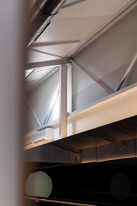
Blackened mirrors that create diffused, duotone reflections have been used to clad the walls of the new room. Lepoutre says this “invites a participatory experience by casting collective movement as the subject of the room, rather than the finer details of your reflection”. It is a break from what you might expect in a group fitness studio, where bright lights and silvery mirrors often compel you to stare at your own reflection rather than focus on your movements.
Sala’s two spaces show just how far design can go in creating a mood and, indeed, making or breaking a brand. As Lepoutre notes, “materiality, repetition and form” all contribute to the role that design plays in both linking the two rooms and setting them apart. Expansion versus contraction. Light versus dark. Continuity versus change.
Lindsay sums up the evocative nature of the new Sunset studio by saying, “Interestingly when we see colour, we’re actually seeing vibration, and black does not reflect light, rather it is a pool of absorption. I feel that vibration is strong when you enter the space, it pulls you into itself, and holds you in a way which feels safe and contained.”


 Indonesia
 New Zealand
 Philippines
 Hongkong
 Singapore
 Malaysia


