Gestalt Principles in Interior Design: How to Create Visual Harmony


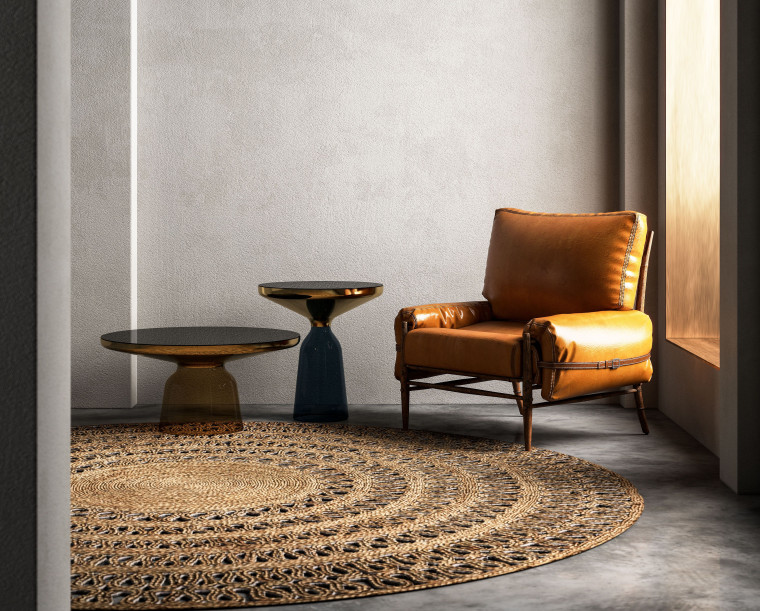
The human brain is built to see structure and patterns in order for us to better understand our environment, hence why we see faces in clouds, food and architecture. This concept is one of the most important underlying ideas behind the Gestalt principles which can be applied to all aspects of design, from art to architecture.
Gestalt principles or laws of perception, originate from Gestalt Psychology. Gestalt psychology is a school of thought that seeks to understand how the human brain perceives the world around us. It suggests that the human brain perceives objects as elements of a more complex system instead of simply focusing on every small component.
The Gestalt principles offer a framework to understand human perception and behaviour within a space, which is especially relevant to architects and interior designers. When you apply Gestalt principles to your interior design, you are taking into account how people will see and interact with the space as a whole which can improve the aesthetics, functionality and user experience.
In this article, we will discuss the six key Gestalt principles and how you can use them to create a beautiful and functional interior space.
Similarity
This principle states that it is human nature to group similar elements together. Similarity is used to create a single design element out of multiple separate elements that may or may not be in close proximity. Similarities can be created using a number of design elements including colour, size, shape and texture.
This principle is important when selecting and arranging furniture. Consider the colour, shape and texture, as those pieces that share visual characteristics will be seen as belonging together.
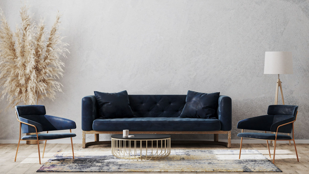
Image courtesy of Shutterstock
In contrast, breaking from similarity draws our attention to the dissimilar element, creating a focal point.
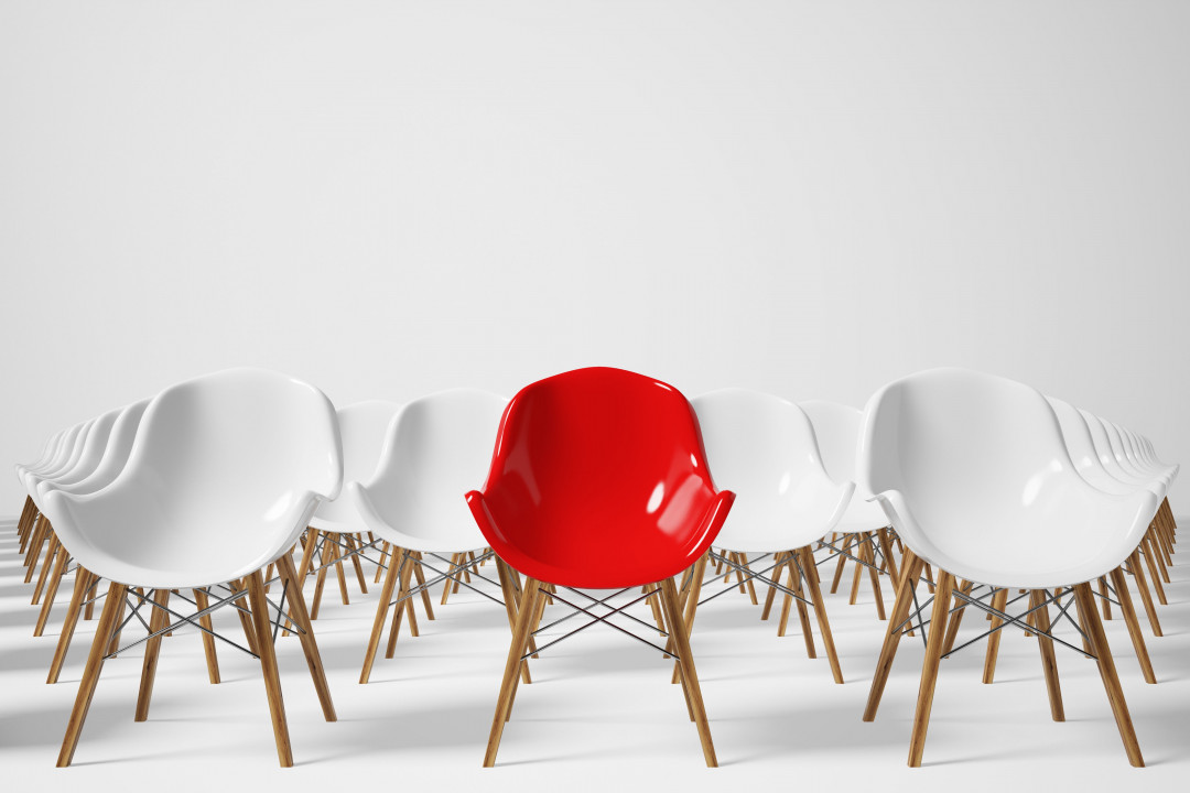
Image courtesy of Shutterstock
Continuation
The principle of continuity postulates that the human eye will follow the smoothest path when viewing lines, paths or curves, regardless of how they are actually configured. Sharp or acute angles, create an unnatural feeling so we are less likely to group objects that involve them.
Continuation can be used to guide a user’s attention in a certain direction. It can also be used to define or separate spaces visually. Arranging furniture in a continuous path will establish separation in an open-plan space without the need for walls.
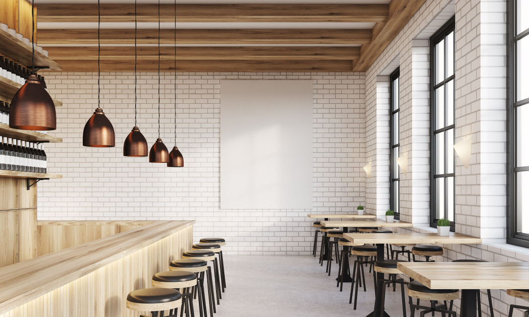
Image courtesy of Shutterstock
Closure
Our brain likes to create patterns, so we will naturally close any gaps in a design or image to create a complete picture. The Gestalt principle of closure is based on this premise.
Furniture placement can delineate a space through the principle of closure.
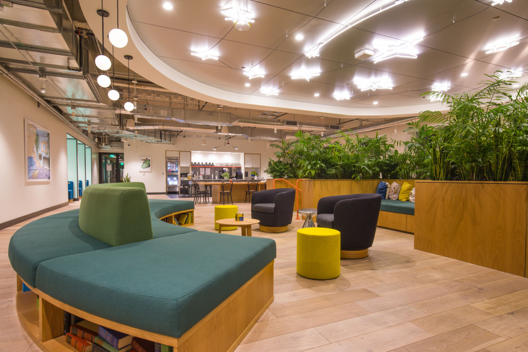
Image courtesy of Shutterstock
Proximity
The principle of proximity posits that individual elements which are close to each other will be viewed as a group. As they appear further away from each other, they go back to being perceived as individual elements.
Proximity can be used to create separate spaces within a larger space. For example, compactly arranging elements in an open plan office to create break out spaces.
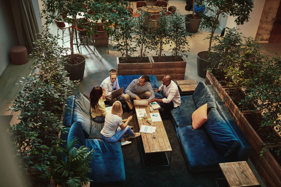
Image courtesy of Shutterstock
Figure-ground
The Figure-ground principle is based on the brain’s tendency to distinguish form from its surroundings. It is essentially the visual relationship between foreground and background. In design, we use this principle to focus the user’s attention on the thing we want them to engage with. All elements in design are either figure or ground, and understanding the relationship between the two is a key component of good design.
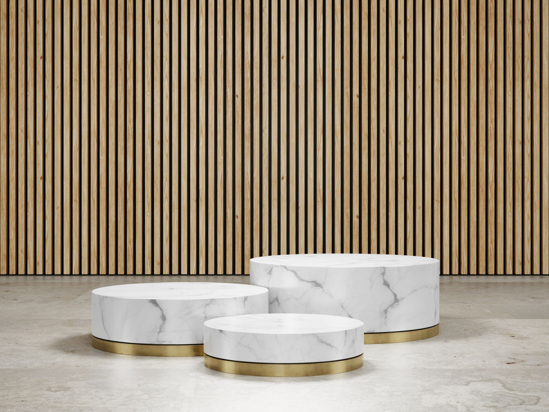
Image courtesy of Shutterstock
Symmetry & order
We are drawn to elements that are symmetrical and ordered. Our brain pulls these out from the asymmetrical background. This Gestalt principle can be used to distinguish certain elements from others and create a focal point. Symmetrical furniture arrangements and clean lines can help create a sense of stability and a formal aesthetic.
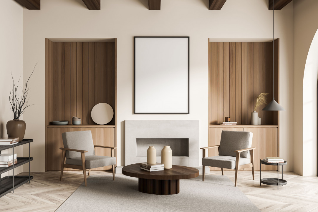
Image courtesy of Shutterstock
By taking into account how people will perceive the space as a whole, you can create a harmonious and functional interior design that inspires and delights users.


 Indonesia
 Australia
 New Zealand
 Philippines
 Singapore
 Malaysia


