Stack By Step Red Red Zone


The project started from a concern of dorm typology in a crowded urban area. The architect studied the comparison of the application of single and double loaded concepts to be the best design for land effectiveness.
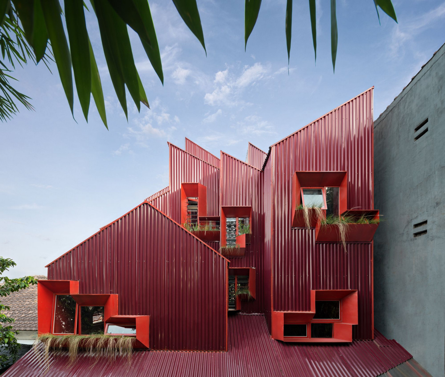
This circulation system becomes another architecture statement than the other dormitory design typology. The architect applied an intense red palette on the façade to grab people's eyes instantly.
Massing & Passive Design Strategies
The function and location, a multi-dwelling between residential areas, become the building form's idea as cumulative stacked houses. The stacked mass formed by the circulation later formed a split-level space. Then, the fragmented sloping roof that follows each unit's grid below makes the image stronger. The space under those roofs will be used as a mezzanine to expand the unit's room in the future. At the same time, stacked mass with fragmented roof becomes another response for the tropical climate that potentially has more air circulation to the inside of the building. Another strategy is making a setback distance on every side of the mass so the mass won't adhere to the other structure around and it also formed a void.
.jpg)
The emptiness of the pilotis mass connects to the void in the middle green space, a staircase and green space on the back of the site. These 2 areas were placed between every unit, and it became a source of air and sunlight. It is maximised by the perforated footstep that air and light can be pass-through from the pilotis mass and skylight. The empty space formed by pilotis mass becomes some support area for the resident, such as parking, communal, pantry, and laundry.
.jpg)
Details & Materials
The stair is the only one access to the unit, sculpturally designed by a suspended structure using steel and iron. It shows a hanging stair system structure that gives the residents an iconic and memorable experience. Steel perforated flat on the stair's footstep makes the light from the skylight. Its shadows can move through and highlight the combined texture between exposed brick and red metal walls and make stronger the room characteristic that continuous with exterior design.
.jpg)
This building basically has a light structure on the highest floor that doesn't have any loaded from above. So instead, the project applies roofing materials that usually use steel frames for the wall on the highest floor. Meanwhile, concreates are applied for the base and exposed brick for the wall on the ground floor. Those exposed materials could minimise maintenance of the building, so it doesn't need to be repainted.


 Indonesia
 Australia
 New Zealand
 Philippines
 Singapore
 Malaysia


