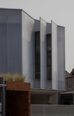
Beach Hotel in Odessa


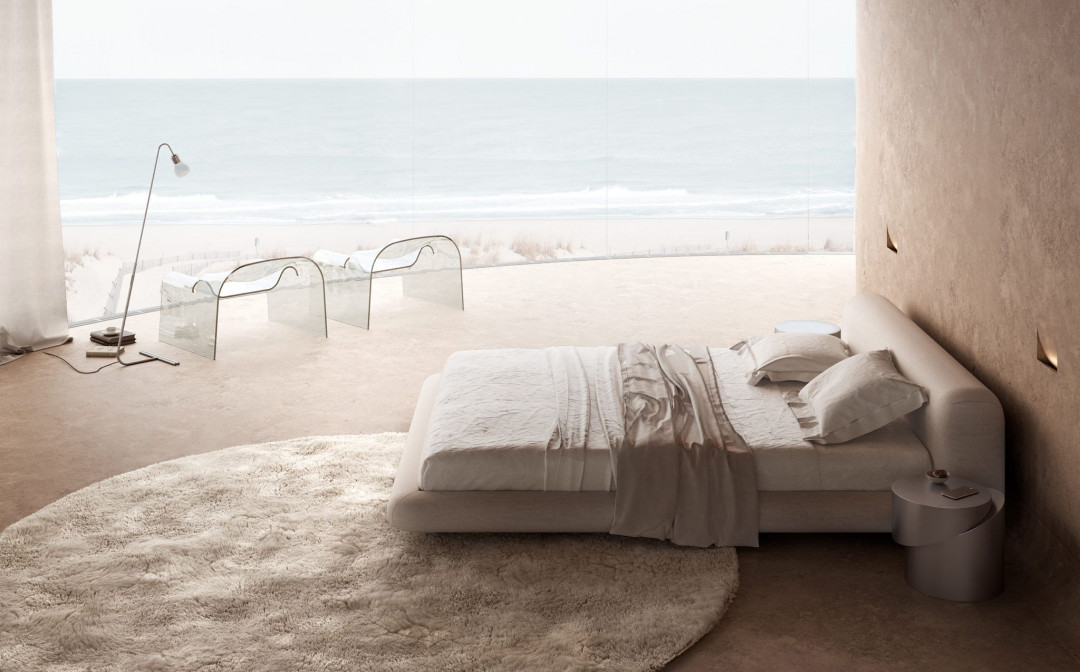
I like to feel the surface of the material tactilely and not visually and compare materials by touching them. I call this tactile contrast. So, for example, a soft carpet will seem even softer if before that you walked on a hard cold concrete floor.
I also like to draw people’s attention to the fact that the materials to the touch may not be what they seem visually. For example, this Cini Boeri’s armchairs looks like a cold piece of glass, but they are surprisingly convenient and comfortable when you sit in it. The glass is curved so ergonomically that it even seems soft.
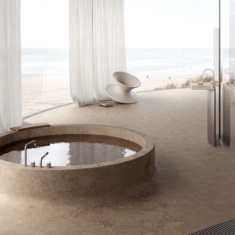
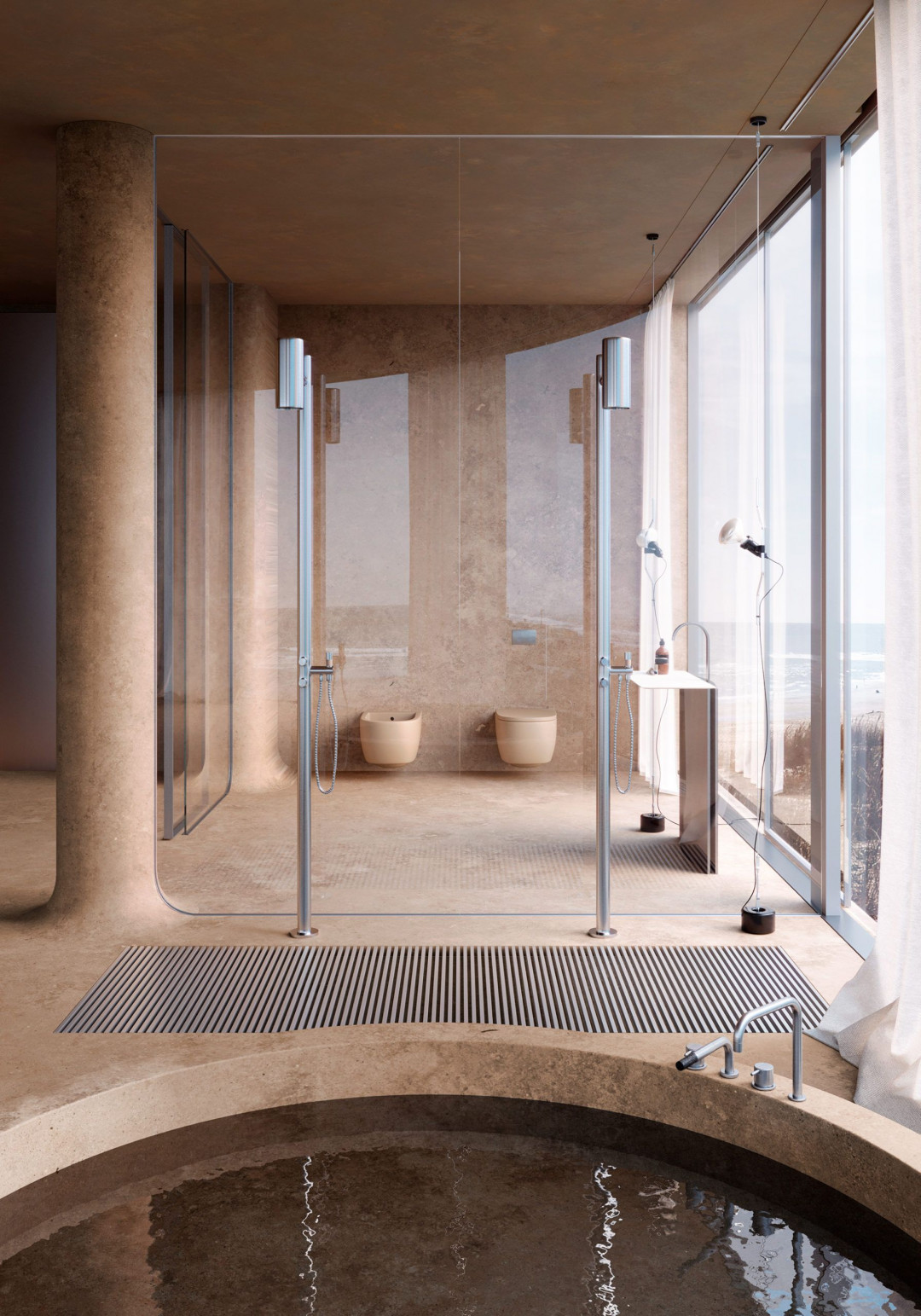
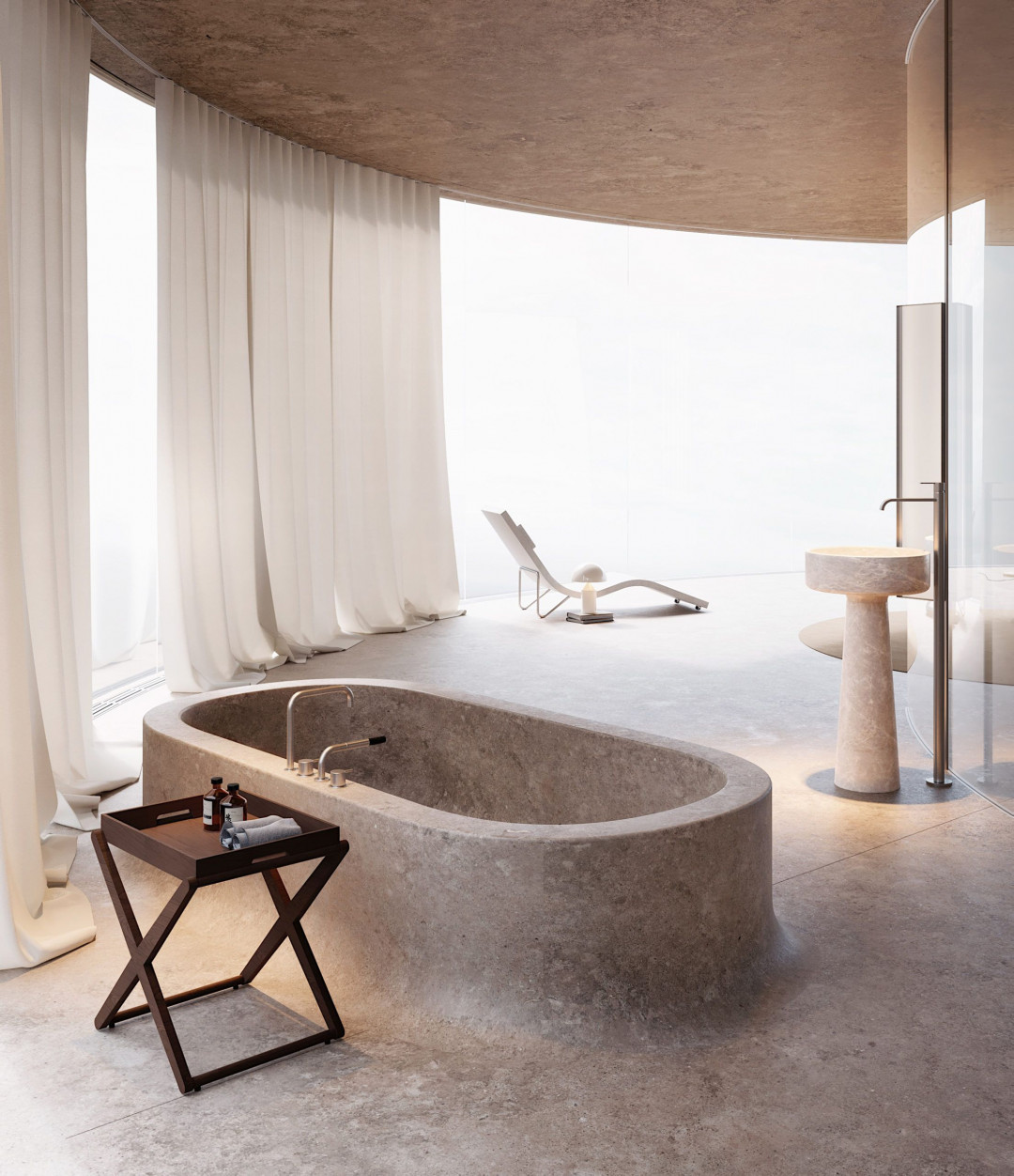
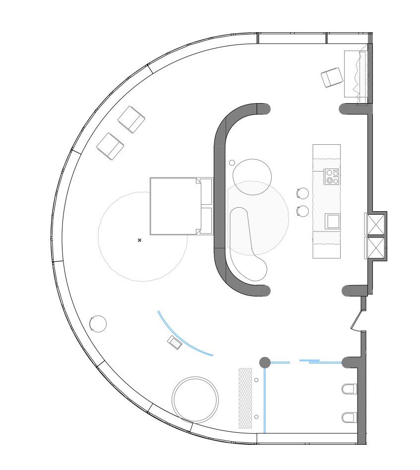
I really wanted to make bathing in this room look like bathing in a hot spring, so I made the bath bowl in the same material as the entire floor in this room. It grows smoothly from the surface of the floor and is very similar to a small pool that arose in the floor under the influence of natural forces.
Also there’s a smart glass between toilet and bath area, so when someone comes into the toilet the glass becomes opaque.
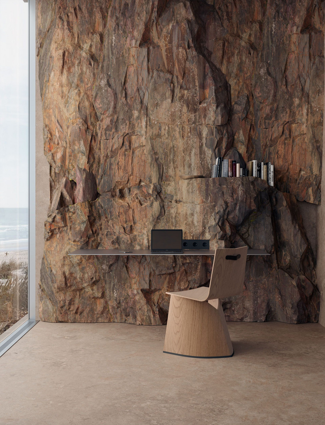
This work space was designed without any chest of drawers, because this hotel situated on a beautiful beach and I want the clients to spent more time there rather than work. It is only for Skype calls, emails etc.
The idea of the materials is that in this digital era, when work means siting on the PC and answering email for 2-3 hours I want to see and feel something natural, which will deliver my thoughts somewhere over this table and screen, so I think that would be cool to sometimes touch a brutal rock plate to feel how powerful nature is.
I also like how the steel desk cut this big slice of rock and emphasize the contrast between human technology and power of nature.
The interesting detail is that there’s a hidden shelf in this rock, so the books are like growing from the stone.
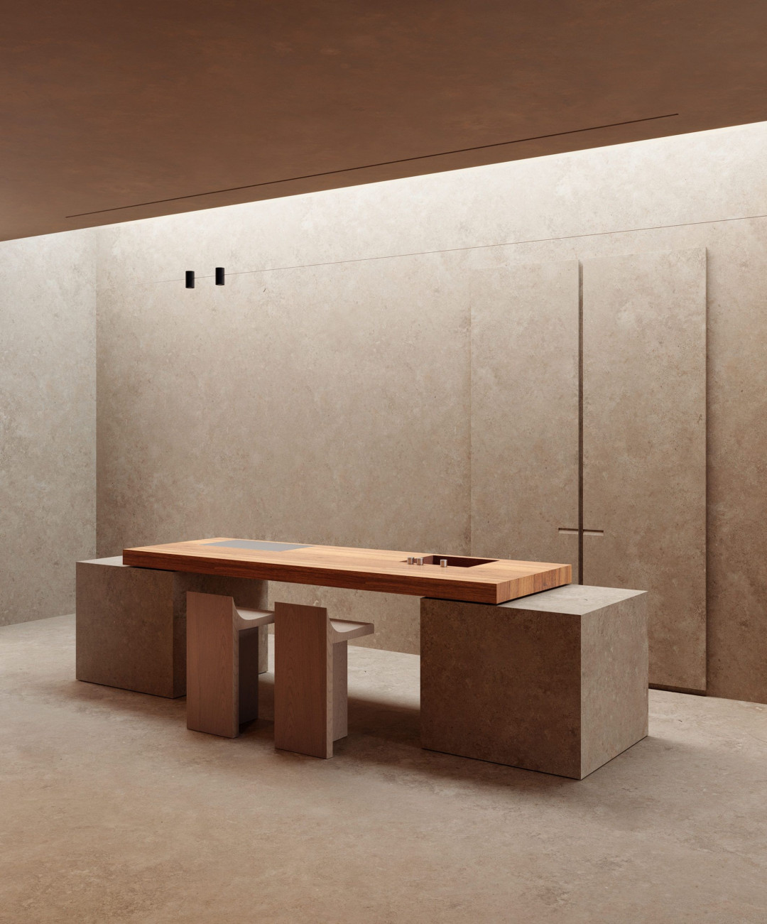
There’s a few restaurants in this hotel, so this kitchen is just for some small personal needs like small snacks, coffee, cocktails etc. There’s even no dining table because of this.
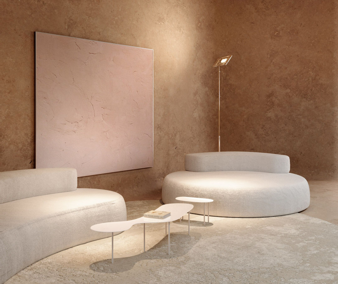
The lounge area opposite of the kitchen looks cozy and very convenient. It is designed for evening chill, reading, texting and other. Art on the walls is a very interesting detail as for me. First of all the kitchen area is very strong and a bit aggressive by form and light, so I wanted to create a contrast between kitchen and lounge zones and the soft color of this painting have emphasized it. Also this art shows what circles is world of art going through for thousand years. If you look a bit on this painting you’ll mention that the facture of the walls and this painting are very similar. So if this brutal natural cavelooking walls were very ordinary a few thousand years ago, now we see them so rarely that we even have to paint them on the canvas.
The design of this interior went through a lot of stages, different concepts and sketches. Some of them were very appreciated and became popular on instagram:
This article originally appeared on sivak-partners.com


 Australia
 New Zealand
 Philippines
 Hongkong
 Singapore
 Malaysia


