One Market Lane


Apartment design is a hot topic at the moment with so many apartment buildings rising up all over Auckland and Wellington. Rapidly increasing urbanisation is being fuelled by population growth, along with changing demographics and lifestyles. Apartment living is particularly well suited to those looking for low-maintenance, secure, community-style living close to all the amenities that a central-city locale offers. Meanwhile, there is a fear of intensification among some city dwellers and the notion of living closely beside our neighbours appears to niggle away at established Kiwi culture – a love of space, the great outdoors and the quarter-acre section.
People’s fears are somewhat justified, given the poorly-designed apartment developments that have arisen in recent decades, not to mention there is very little to celebrate in the affordable-to-mid price range. Good spatial planning and high-quality materials, as well as contextual and community considerations, are not attributes that appear to have readily been adopted.
It’s a somewhat perplexing situation because, back in the ’60s and ’70s, there were some really good-quality, well-planned apartment blocks built in our cities within this price bracket. The learnings are there for developers to employ talented architects to adapt these to fit new contexts. Perhaps, then, we might start to remedy the situation, helped along by more government incentives and greater pressure from buyers looking for inspired design. Our new apartment buildings don’t need to be radical; they just need to be really well designed. There are plenty of overseas examples, together with some high-end apartments here, from which we can learn.
And so I was intrigued to visit the developer Willis Bond & Co’s latest mixed-use apartment building, One Market Lane, in downtown Wellington. While this scheme caters to the ‘luxury’ end of the market, Willis Bond already has form working within this typology and Studio Pacific Architecture has designed more than half a dozen apartment buildings, so one would assume that they’ve learned a thing or two. Willis Bond also developed the Clyde Quay development, which is sited near One Market Lane on the other side of Te Papa Tongarewa. And, working again with Studio Pacific, it is also creating two new apartment projects in Auckland: the Sunderland precinct at Hobsonville Point and another scheme in Wynyard Quarter.
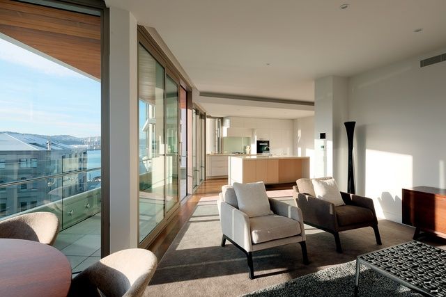
An open-plan kitchen and living area overlook downtown Wellington.
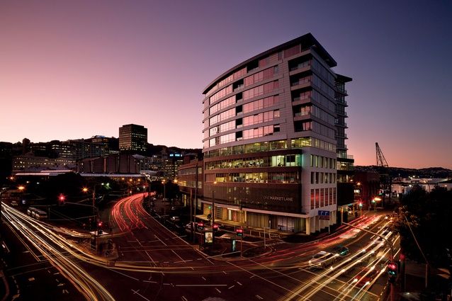
One Market Lane sits on a unique island-shaped block surrounded by Taranaki and Wakefield Streets and Market Lane, diagonally opposite Circa Theatre, and is an important transitional site on the journey from sea to city to Te Papa. It is adjoined by the low-rise, wedge-shaped Xero building − formerly the John Chambers building (built in 1918 and now heritage listed) − which points towards the Michael Fowler Centre. Studio Pacific refurbished and re-strengthened the Xero building in the first stage of the overall development of the block.
As the One Market Lane (OML) name suggests, the site once hosted an actual market building up until about eight years ago, when it was demolished to make way for a hotel/apartment scheme (by a different developer), which was cancelled as a result of the GFC. Since then, Market Lane has had a street upgrade by Boffa Miskell to lift the overall appearance of the site and a new café opens OML up to the public at street level. Both OML and Xero hug the lane, creating a curvature on the façade which has been accentuated by the architects. Along Taranaki Street, the inclusion of a colonnade offers pedestrians protection from the elements.
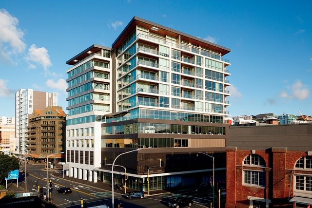
View of One Market Lane from the Circa Theatre, diagonally opposite. Image: Jason Mann.
The scheme is located at the lowest part of a basin at the height of the water table and, thus, the ground conditions meant that it wasn’t economically feasible to place car parking within a basement structure. The piling has been drilled down 10 storeys and I was told that it is one of the more seismically robust buildings in Wellington.
OML has been intentionally designed to fit in with the heritage buildings in the neighbourhood and has been articulated to separate its various floors. The skin ducks in and dives out on the face, which cost more time and effort in the budget but creates a richer environment and greater spatial experiences. Over 12 storeys, three levels of commercial space and two levels of naturally-ventilated car parking are pancaked between the ground floor − consisting of a lobby, café, meeting room, residents’ gym, movie lounge, and a commercial/retail space − and the apartment levels which float above, including five penthouses at the top.
The façade is broken down with a ‘black chocolate’ terracotta tile system, white painted GRC concrete and bronze aluminium joinery, while the gridded seismic frame is articulated in white. The architects have completed the pallet of the north- and south-side edges of the spandrels as concrete beam, which are part of a structural system, designed with engineer Adam Thornton. Services and structure were coordinated early on, to ensure the bones of the building were correct − and it shows.
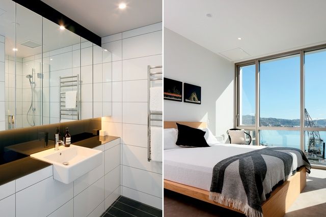
A black-and-white tiled bathroom and a bedroom with a view, overlooking Wellington’s stunning harbour. Image: Jason Mann.
Each apartment has a terrace, which is inset, offering greater protection from the elements, while small openings cut through the timber soffits of the roof terraces pull in additional light on the top floor. Glazed corners in the apartments create diagonal views out from within and were, no doubt, tricky for the architects to implement. Essentially the building has five corners, which aids in creating wrap-around views and different experiences from morning to evening.
One of the biggest drawcards of living in a building such as this is the 360-degree views around the city. Residents are able to look out over the harbour, Mount Victoria, the city and up the coast, depending on the location of the apartment; this is one of the advantages of being sited in the central-city zone on a big plot surrounded by wide roads. Another drawcard is the quality of light within the apartments, which has been maximised by inserting the central core into the middle of the building, an ideal arrangement given OML’s big square site.
Within its apartments, the developer has seen great success in two particular elements it now repeatedly briefs architects to incorporate within their designs: a movie lounge on the ground floor for watching films and sports, as well as for business presentations and keeping the grandchildren entertained; and a media room, which removes modern technologies like smart TVs away from the main living and entertaining spaces. Media rooms are also a great way for architects to resolve dingy dark spaces at the back of the plan, although a lot of consideration is needed to ensure noise is kept away from the bedrooms and adjoining apartments.
Overall, this is a thoughtfully planned and detailed design which offers learnings for future apartment development. The design team has created a building that is socially interesting and attractive for its residents, in addition to providing public areas which enhance the neighbourhood. One Market Lane is a classy, contextual building that doesn’t shout or scream; it blends into the fine grain of the city and should still stand proud in 50 years’ time.
This article was originally published on ArchitectureNow


 Australia
 New Zealand
 Philippines
 Hongkong
 Singapore
 Malaysia


