Sonmei Hotel


Sonmei hotel is located in the southeast corner of a commercial building. The reception hall on the first floor shares a space with the office building in the west. It is the intersection of daily customer flow and staff. In such a comprehensive modern field, the integration and existence of the hotel has become particularly important. With unexpected artistic intervention, the designer broke the established state and orthodox impression of the space, and opened up a new world that is different from the routine and presents artistic and unique aura.
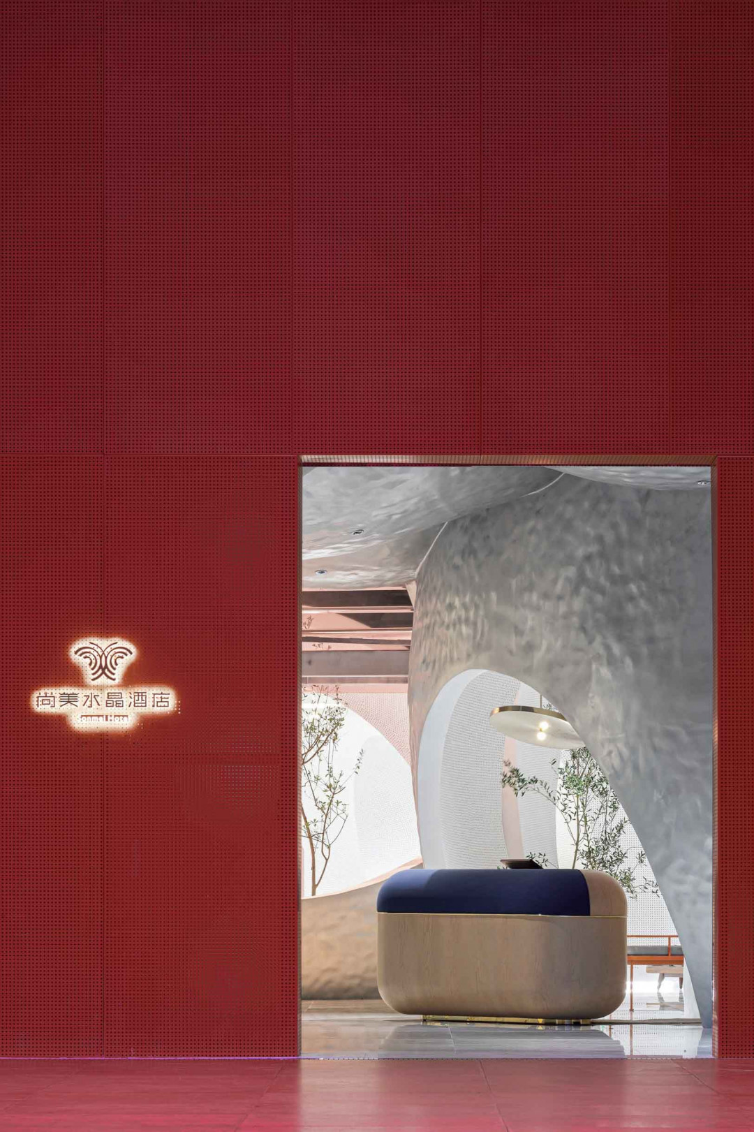
The concise facade design scheme outlines a highly symbolic entrance. The dark pink appearance sets off a unique sense of domain, trying to trigger the emotional perception of the audience. The transparent facade increases the space appeal in the hazy atmosphere, which seems to guide the audience exploring deep into the dream.
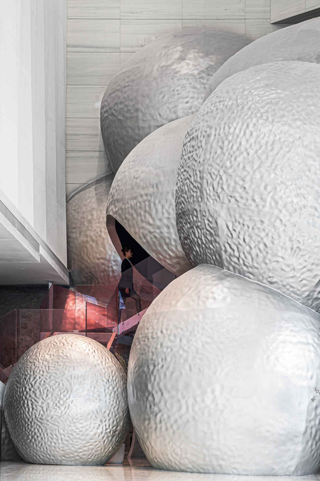
Considering the complete and regular framework of the original building, the designer does not resort to the traditional strategy and logic of simply putting a vertical partition to divide the lobby and the office building, but endows the “heterogeneous medium” a different mission and let the commercial public space and artistic space conflict and integrate with each other.
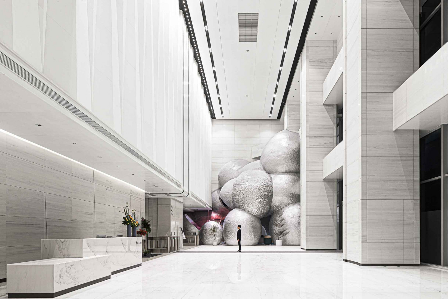
If you use the screen to enclose the space of the lobby, the audience feeling and experience will get a discount because of the insufficient interaction between the inside space and the outside space. As a result, large bubble-shaped spheres fall from the top, breaking the traditional pattern of the wall and ceiling, and thus realizing the romantic idea of space variation. This non-standard hotel lobby has the appearance of avant-garde art and the core of complete function. The hollowing and opening, the consideration of the size and the placement of the points not only make the enclosed reception desk, rest area, lobby bar and other functional areas perfectly hide among them, but also create an intimate, open and immersive experience atmosphere field for multiple target groups.
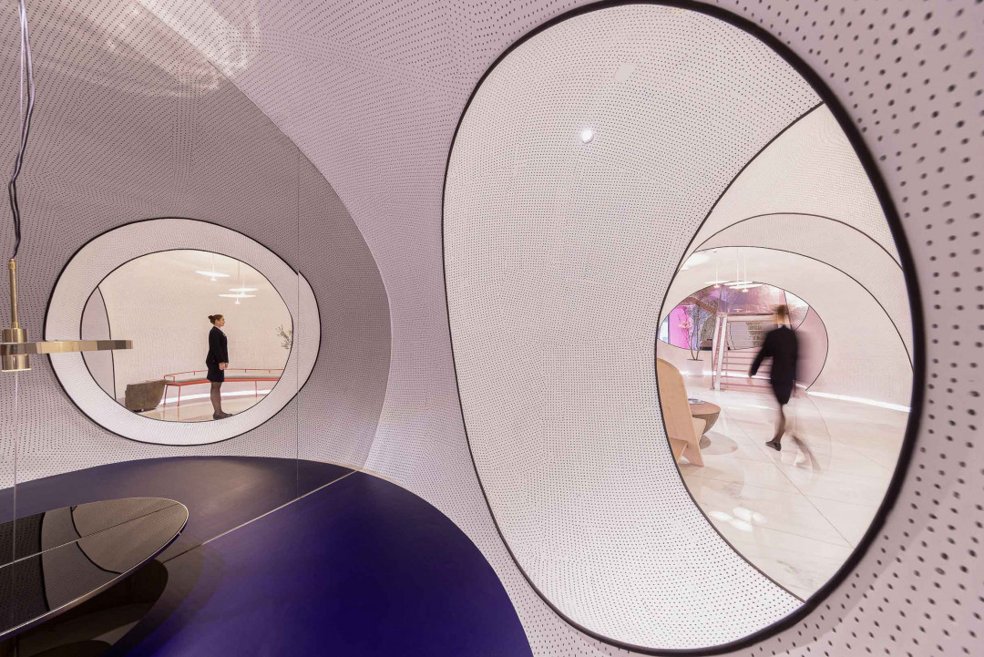
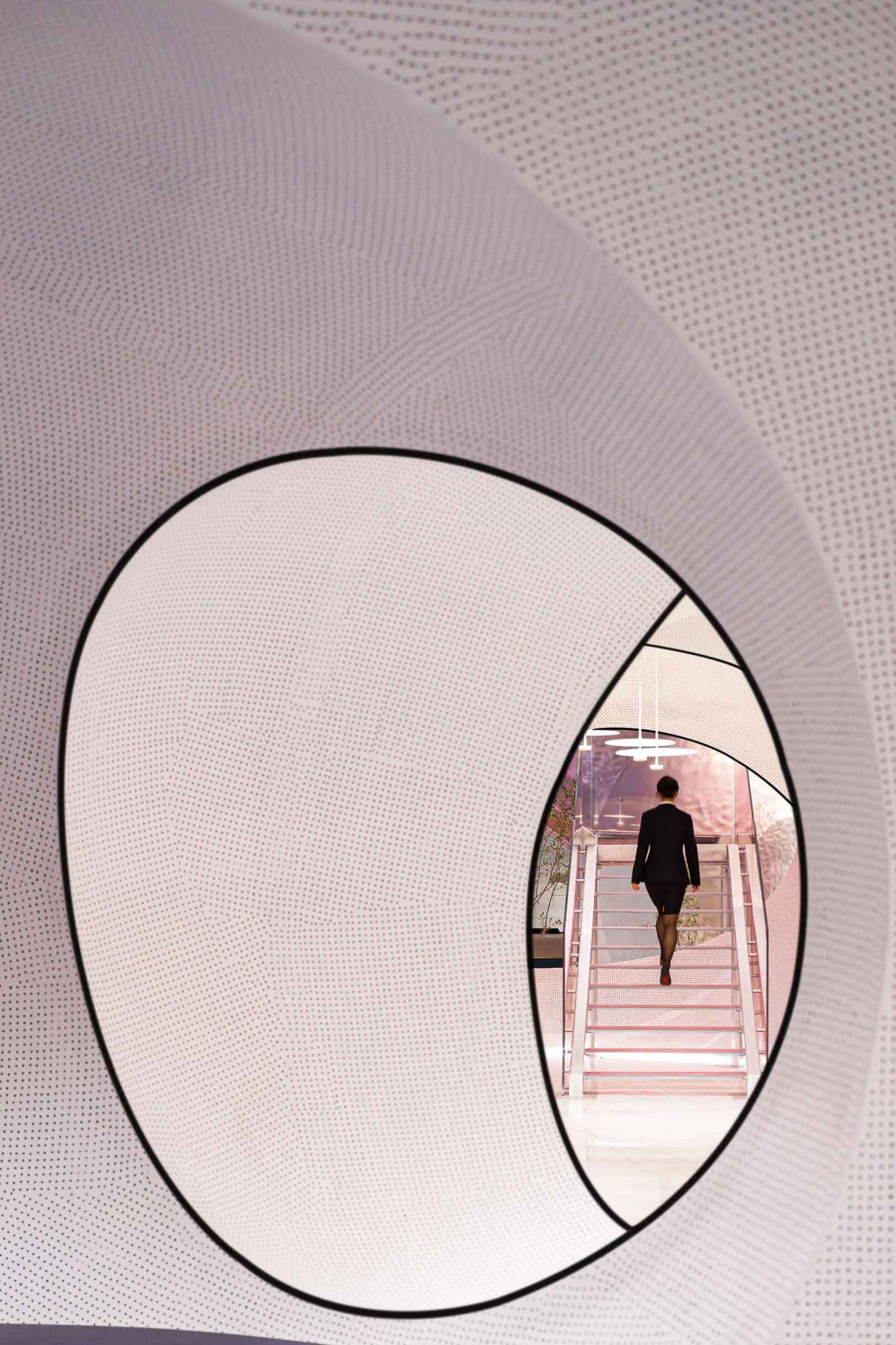
From a more macro perspective, the experience of hotel guests in space and the psychological sense of audience outside the space, as well as the interaction between these two and the space, are all taken into consideration by designers, making the design dimension more complicated.
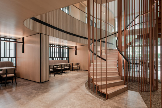
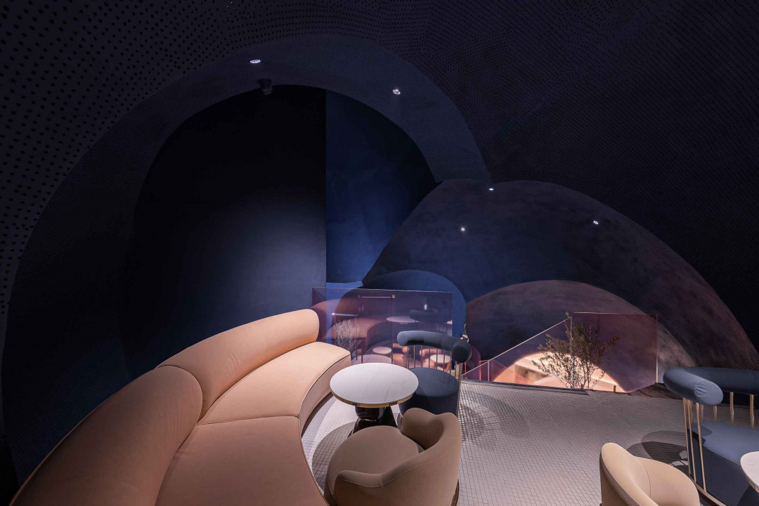
From high to low, it is like a natural falling sphere, a bubble that God sprinkles into the human world from the cloud. A red stairs stretch across the spheres, drawing a touch of sweet and healing color on the silver white background. After climbing up to the lobby bar on the second floor, the color contrast vividly portrayed exudes a strong sense of surrealism. The customers walking up the stairs seem to be subtly integrated into the whole art installation, making it a dynamic interactive art.
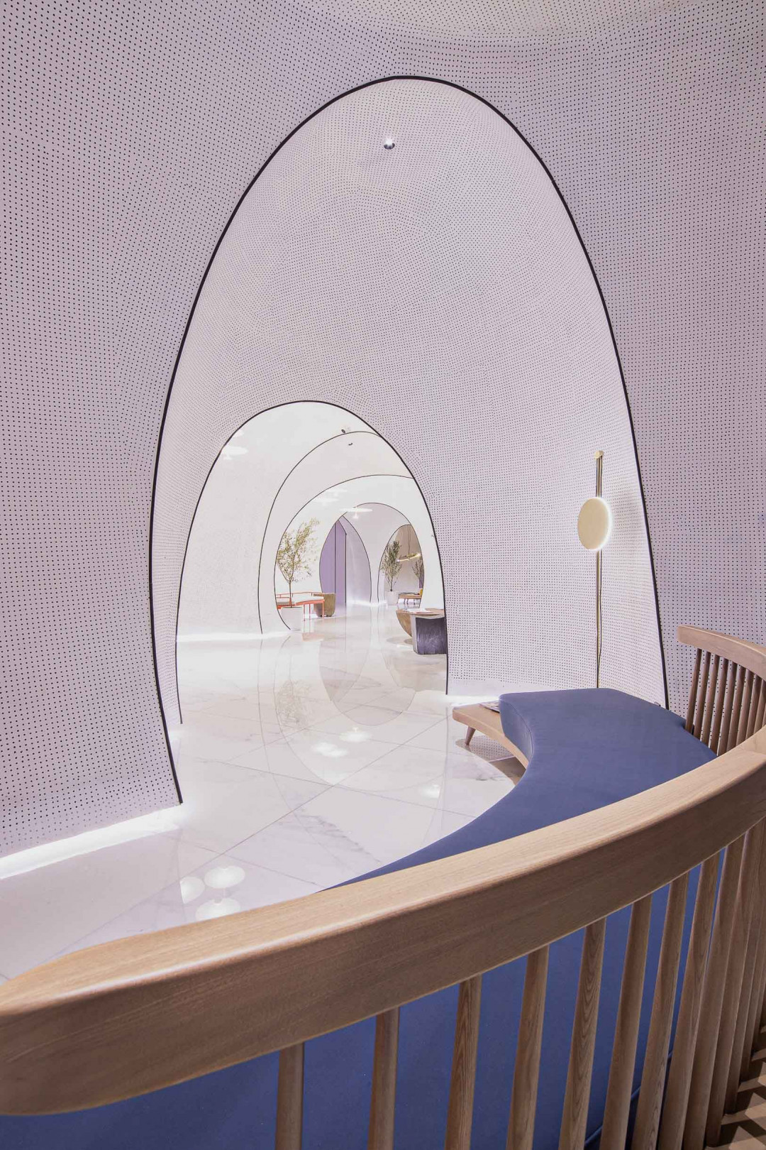
It is the designer's exploratory fantasy to boldly connect the commercial space with the public installation. People walking through the office lobby can enjoy the visual end point with artistic beauty in the space every day. The hazy atmosphere created by the metallic silver white color makes the lobby facade integrate into the pure white space, which not only preserve the harmony of the overall public space, but also maintain a unique sense of existence. The strong surreal impression brought by the huge structure turns the hotel lobby, an artistic public installation, to become a philosophical proposition for the workingman. It is the designer's creation of a dream world for every "hero in ordinary life" in this city and an spiritual echo for every fighter who is eager to break through the shackles of reality.
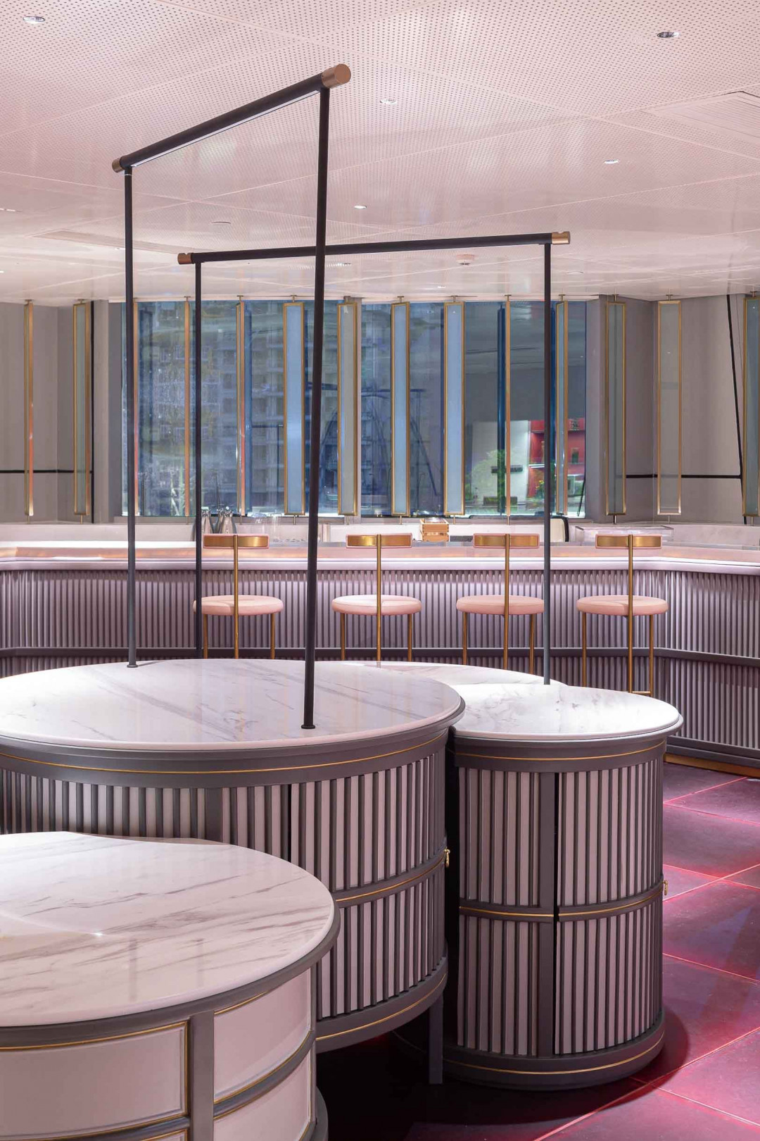
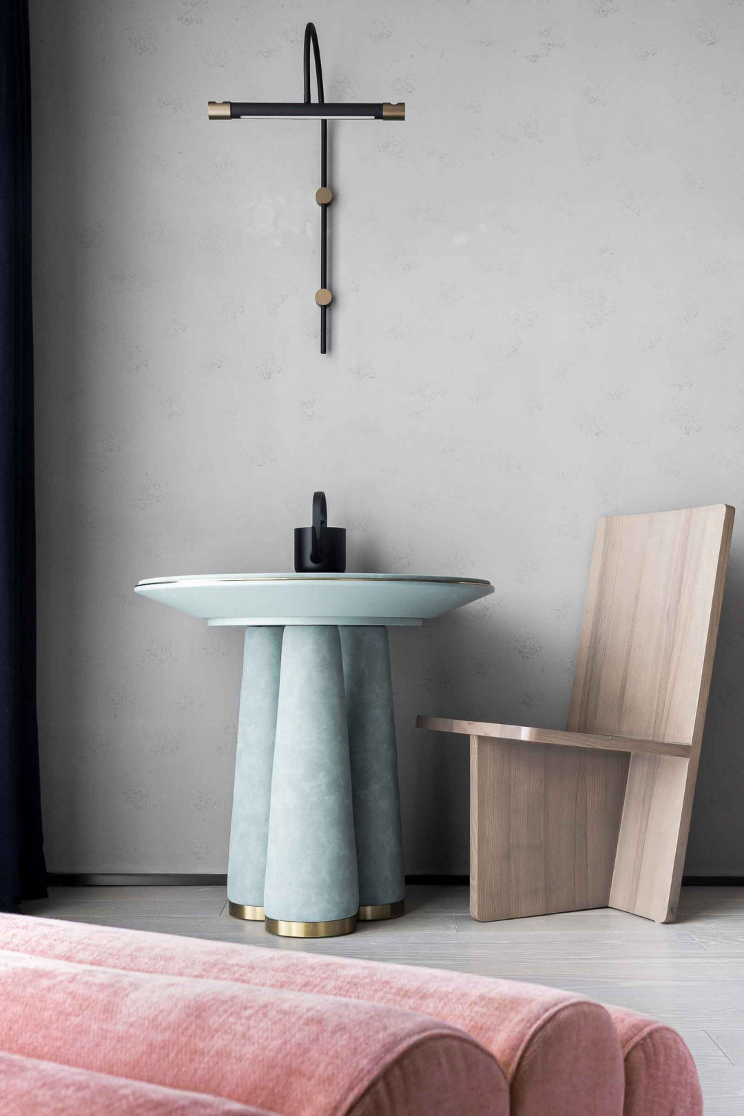
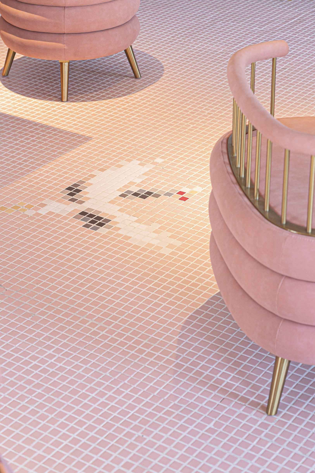
The simple and unsophisticated shape of furniture and the warm and thick texture create a strong dramatic conflict with the future illusory art sense of the whole space. The sense of contradiction refines the atmosphere that the designer wants to set off, and highlights the space theme that is interwoven with nostalgia and dream.
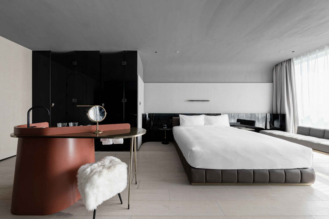
Under the background of simple and unadorned concrete wall, irregular furniture forms the unique characteristics of each room. The inclination of the bed or washstand and the wall creates irregular corner and open space, which meets the storage function. Far from making the space appear crowded, it achieves the transition from aesthetic to practicality and also aims to realize that people can enjoy a friendly and comfortable space perspective and experience.
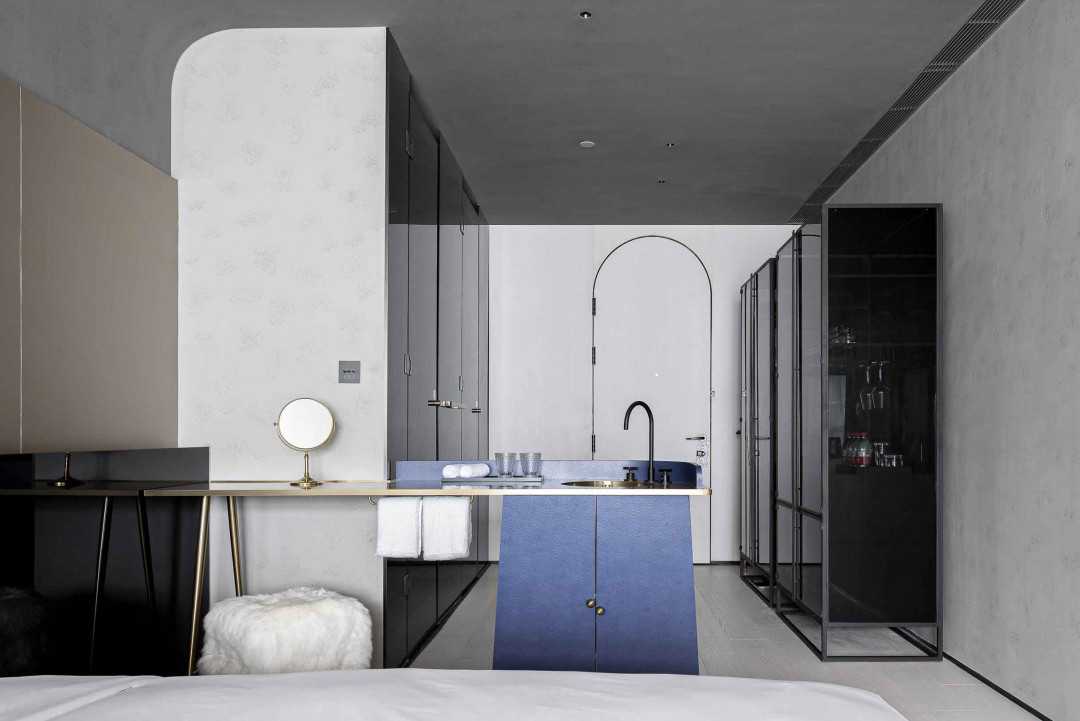
The furniture in memory takes a new breath and temperature of the time, guiding guests to follow the memory resonance and enjoy the wandering. Young children lean alongside their grandmother, falling into a deep dream with soothing chant. The restaurant in summer night is full of satiety and happiness. The change of scenes in different spaces skillfully connects a dynamic traffic flow.
In the construction of Sonmei Hotel, the designer creates scenery for the owner's business idea, establishes profound brand influence with strong visual identity, injects delicate spiritual expression to refresh space, reveals a touch of new ideas in ordinary life, and strengthens the emotional connection between the space and people.
This article originally appeared in xl-muse.com


 Indonesia
 Australia
 New Zealand
 Philippines
 Hongkong
 Singapore


