Studio SKLIM Converts a 32-Square-Metre Space into a Compact Multifunctional Office


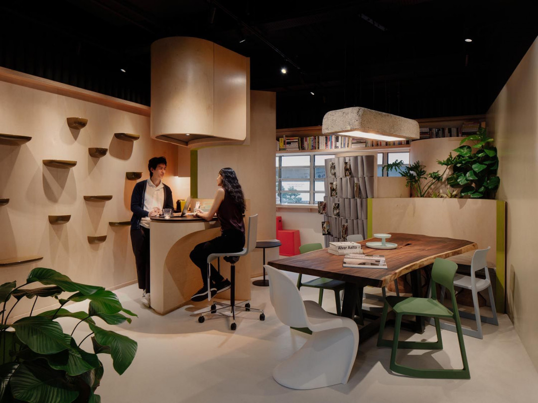
Recently, compact design has gained much popularity as a solution to a denser and more expensive space in cities around the world. In terms of functionality, compact design boasts its spatial flexibility—being able to cover multiple needs within one space. If most compact designs are usually applied for residential buildings, the recently finished Deloitte Center for the Edge (Asia Pacific) office in Singapore explores the possibilities of this design approach for a shared space.
©Studio SKLIM / Khoo Guo Jie
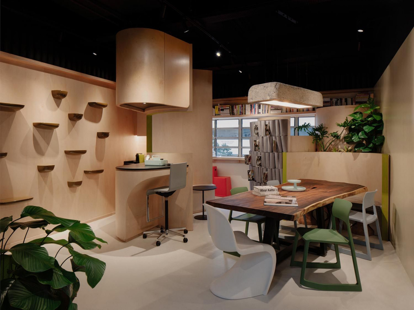
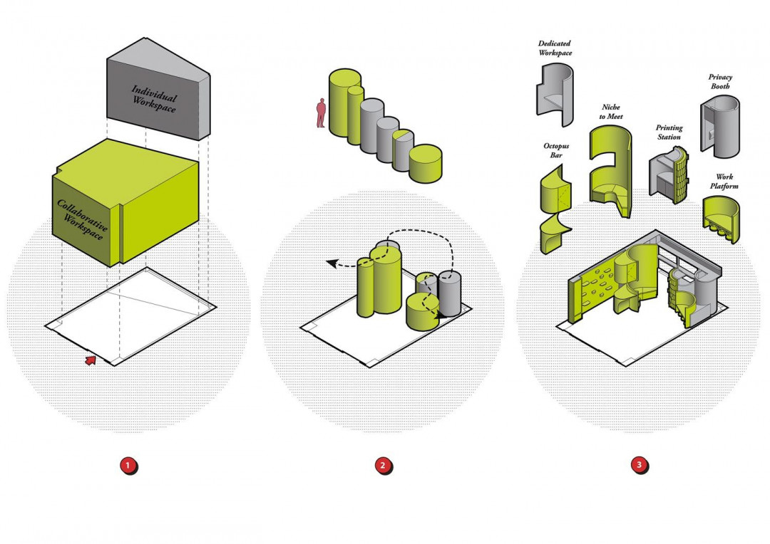
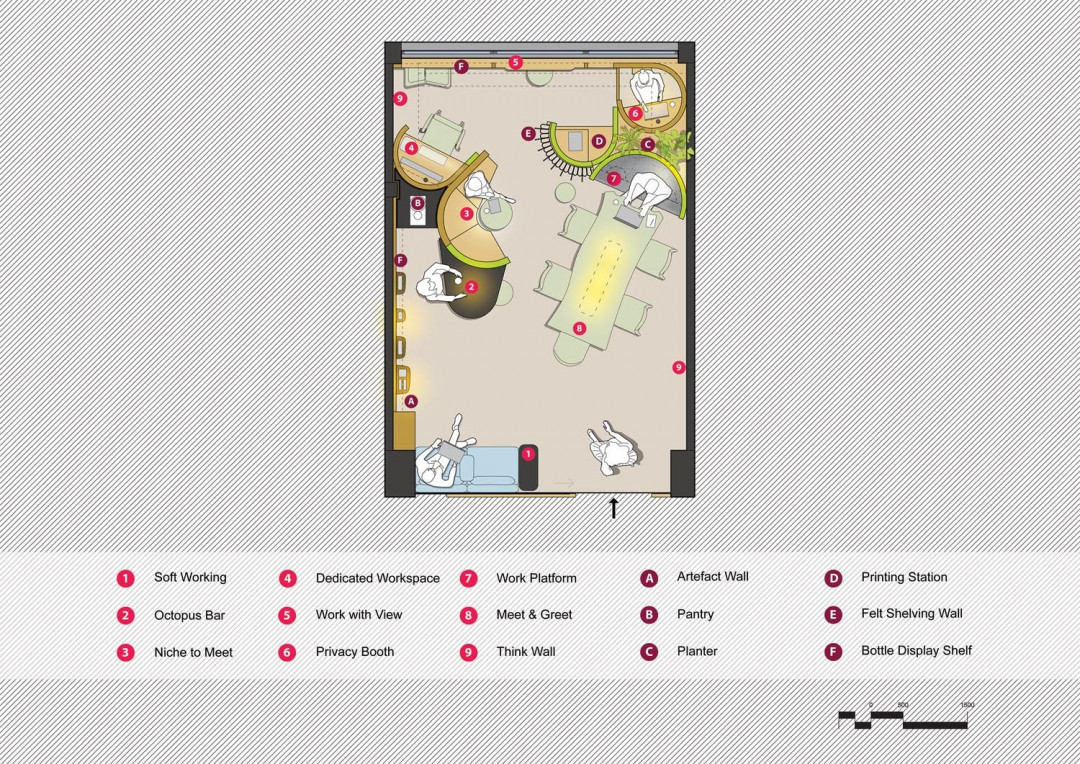
Designed by Studio SKLIM, this compact office maximises the usability of the limited space while also refrains from the usual impression of a compact space. Within the tight 32-square-metre space, nine distinct work zones are developed to allow flexible ways of working, discussing and collaborating. “Different anthropometrical work boundaries and patterns were studied to create the nine distinct work zones,” says Kevin Lim of Studio SKLIM.
©Studio SKLIM
©Studio SKLIM
The designer is also inspired by numerous studies showing that movement improves concentration. Thus, the various workspace setups become the ideal basis for the staff to switch places whenever possible. Staff members can choose to work in various settings from Privacy Booth when in need of a private online meeting to Octopus Bar, which suits perfectly for a small discussion with a colleague.
©Studio SKLIM / Khoo Guo Jie
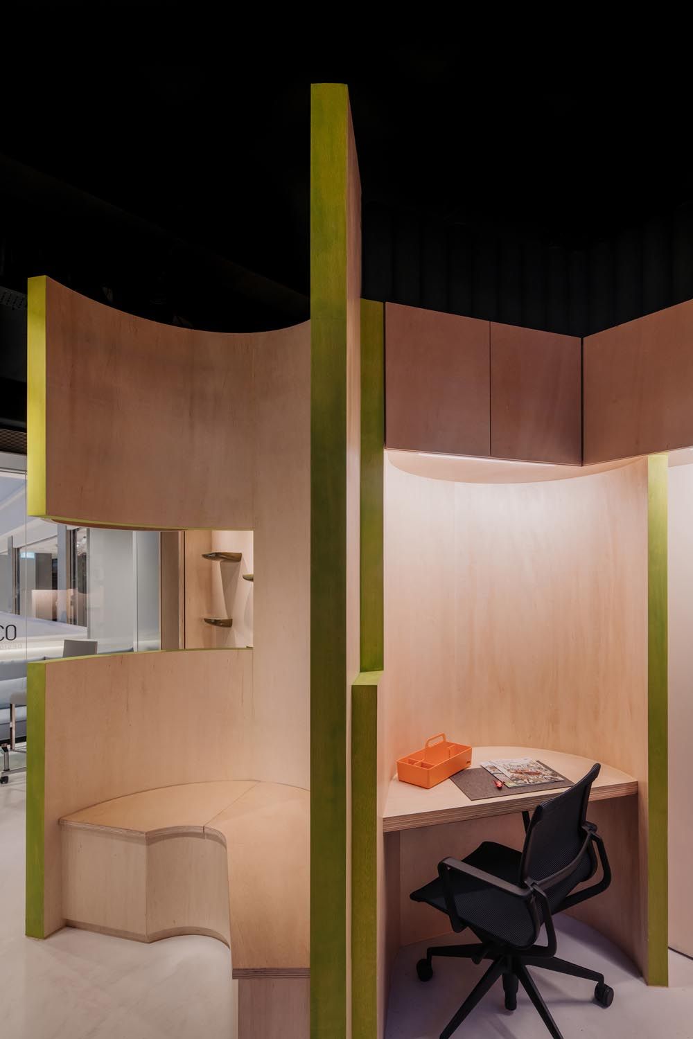
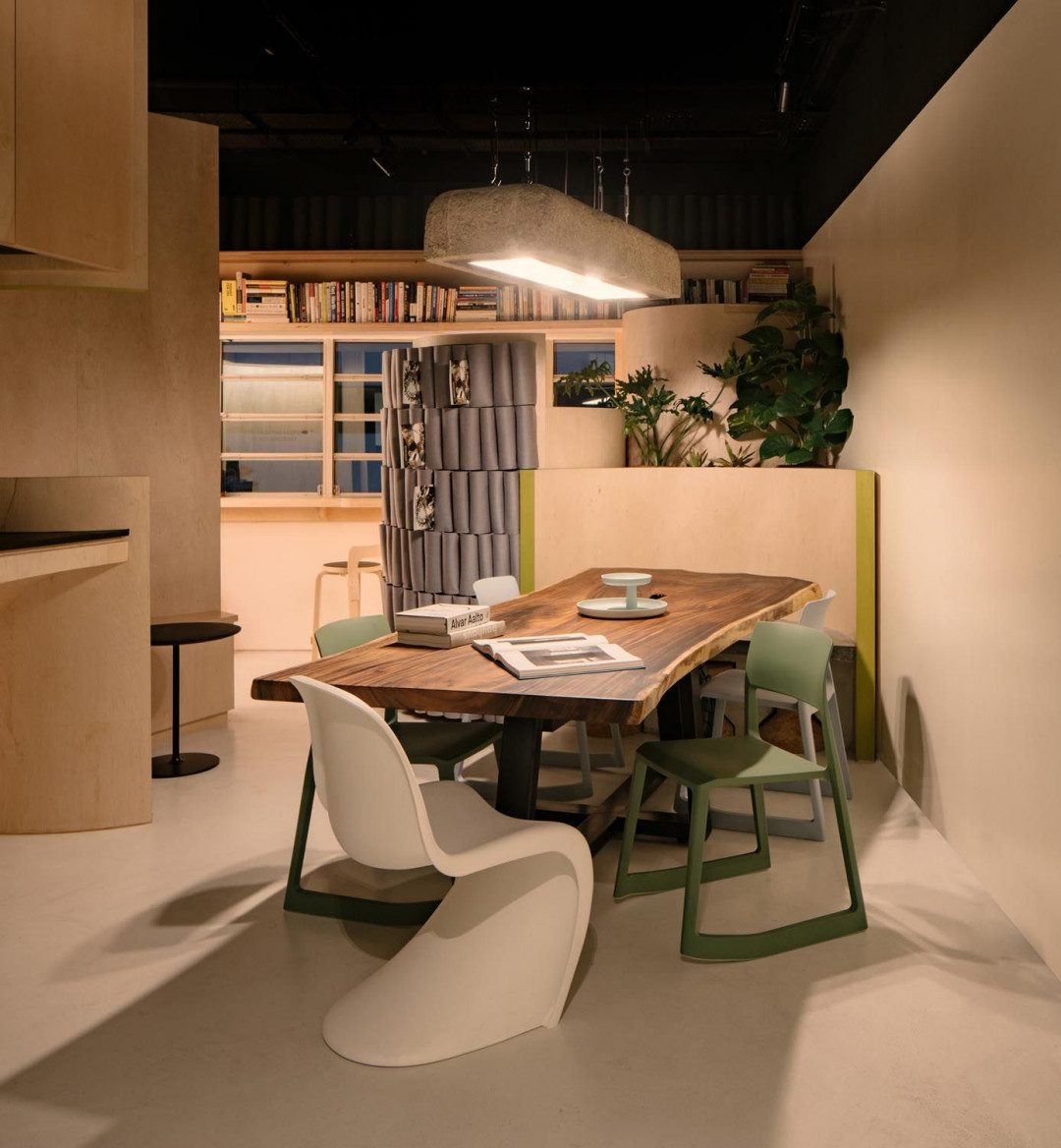
Workstations are housed along curvilinear compartments that are seamlessly fitted in the rectangular room. Without emphasising the usual lack of décor, straight lines and rectangular space, the compactness of the space is not exclusively conveyed through the amount of flexible free open space; rather, through the ability to provide space for staff so that they can work in separate nooks comfortably and afford a small group discussion at the same time.
©Studio SKLIM / Khoo Guo Jie
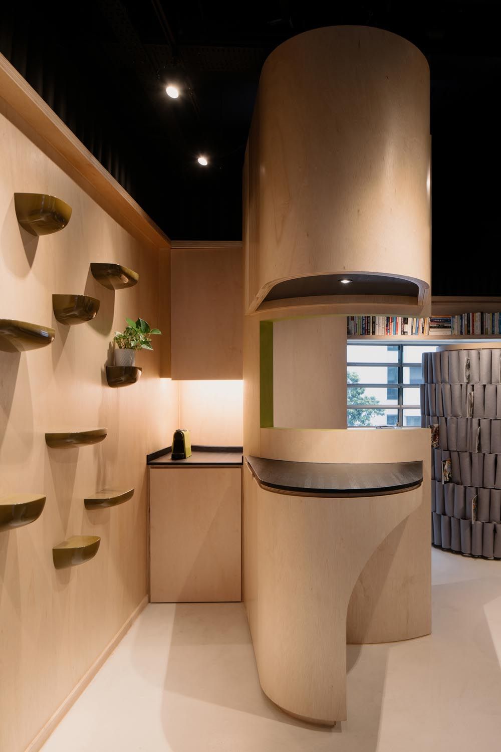
“The geometry of these spaces was derived by experimenting with the client’s research booklets and this inspired the creation of curvilinear plywood shells to cuddle each work zone. The choice of curved surfaces is also qualified by neurological research to be more inviting and calming, allowing for more expansive conversations,” Kevin adds.
Utilising as many surfaces and corners of the space, the design also makes sure that most of the elements are functional. These includes dry erase wall for brainstorming and discussions on one end, and hanging shelves on another to provide spaces for items showcase. Overhead storages are present on some partitions while another partition is fully attached with folded felts that functions as a unique bookshelf complementing the whole visual of the office.
©Studio SKLIM / Khoo Guo Jie
The unconventional approach of compact design of this office not only answers the design brief from the client to create a space that could provoke, inspire, and connect the people. With the office’s multiple settings of workspace that emphasises individualised setups as well as common space, the design also explores the adaptability of a small office in the new normal environment.


 Indonesia
 Australia
 New Zealand
 Philippines
 Hongkong
 Singapore


