Viewfinder: Top five with Andy Spain


Wellington-based architectural photographer Andy Spain shares his top five houses to shoot and revels in some favourite work stories.
Federico Monsalve (FM) Tell us about your photography career back in the UK.
Andy Spain (AS): I started in the early 2000s after an MA in Photography, initially working with friends who were architects who have gone on to have their own practices like Smith Maloney Architects. It was great to have people to explain architecture to me (coming from a photography background) and helped develop my way of seeing.
I photographed a lot of retail interiors for brands, working in the middle of the night (when the customers were gone) in places like Harrods documenting the Nike, Dior, or Fendi concessions for the architect. I then developed great relationships with practices with a heritage angle, BGS Architects who I worked on a number of education projects at Oxford and Cambridge University and Feilden + Mawson who I worked with on numerous shoots across central London whilst they upgraded period townhouses for a large developer. Architects with decades of experience showed me around spaces and enthused about the Georgian architecture, or the sensitive build of a concert hall responding to a Powell and Moya brutalist classic at Wolfson College in Oxford. It was a fantastic architectural education.
Memorable assignments included going up a 40-storeyed tower at dusk (with no lift) which was completely empty apart from me and photographing the views at night over London, photographing the BMW showroom in Paris and spending 5 days photographing a new hospital before anyone was in it. Working with a mix of design agencies, lighting designers and architects kept things fresh for me.
FM: What brought you to NZ?
FM: What have you noticed as the biggest differences between the local and the UK architecture industry in terms of how they work and that architect/photographer relationship?
AS: I’d like to try and avoid the cliche’s but it’s hard to sometimes, everyone here is so much more approachable and friendly. A small country means you end up randomly sitting next to your client on a plane (like I did from Auckland some weeks back). That level of connection is unheard of in the UK. I literally took five years developing a relationship with Foster + Partners and my first shoot was due to happen a few months after I left for New Zealand. The size of the mega-practices means your connections are with junior marketing team members and eventually you might get to meet the head of marketing! But in many other ways, it is the same, different practices have different styles and it comes down to personal relationships and understanding a clients’ architectural style.
FM: You have been doing some interesting personal projects as well (Cuba Street People and Unseen New Zealand), how does that fit within your architectural work?
AS: I enjoy photography as an art form as well as a tool to earn my living. When those things coincide it’s a bonus. I created a panorama of Cuba Street in Wellington for the NZIA architecture festival last year. I turned it into a lightbox and displayed it for the opening evening of the festival where I work from in Egmont Street. It was an expensive 15 metre long folly but I hope it can end up somewhere where it can be seen. I want to turn it into a pull out concertina book so I’ve collaborated with Cuba Dupa on photographing shop owners along the street to add a new element to the panorama. They have since been shown on billboards and screens in Cuba street. It ties in with my interest in preserving a visual record of architecture which was the basis for my Unseen New Zealand series which I called, Love is Understanding. These images are interior spaces across New Zealand and are about to be collected by the National Library which is a perfect result for me. As I get older, the idea of photography as a record and document becomes more and more important.
AS: My Kiwi wife did. We met in London just as I was starting out as an architectural photographer, we talked about coming here for years and years. I didn’t really think it would end up happening but eventually, all the stars aligned and we made the move with our young kids in 2015. Just before Brexit, COVID and Boris hit the UK. I think I was ready for the change more than I realised at the time; years and years photographing the opulent wealth of London was getting a bit repetitive and the opportunity to see a completely new architecture was an exciting prospect.
FM: If you had to select one image as the most reflective of local architecture or one that you feel summarises your view of New Zealand design, which one would it be and why?
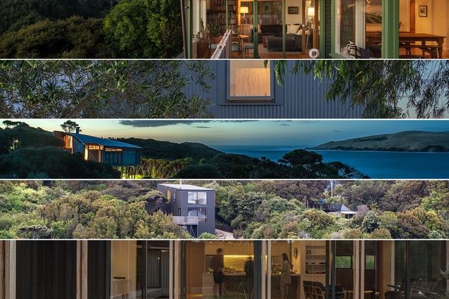
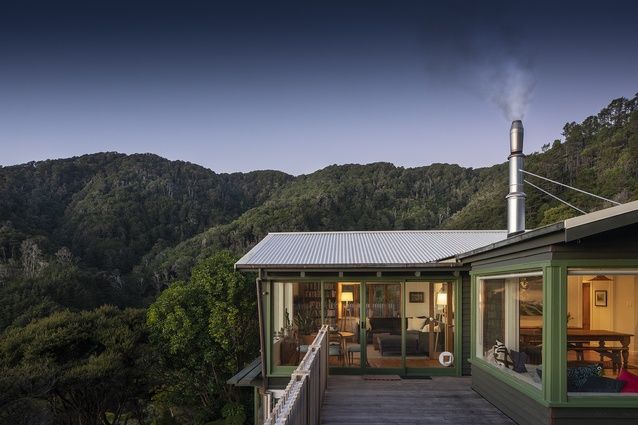
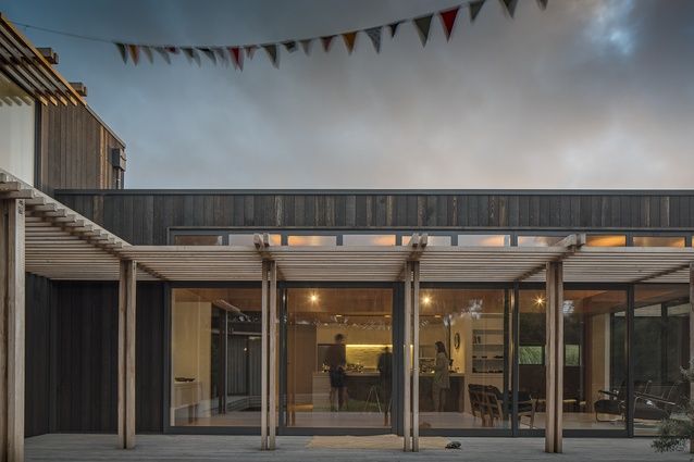
AS: It’s a bit like choosing your favourite album, such things change all the time, but my recent shoot for Judi Keith Brown of a refurbishment she did in Days Bay encapsulates all the things I love about New Zealand and it’s architecture right now. A simple house in the bush with great views, a log fire burning, dusk falling. She barely touched the exterior so the feel, paint and patina of age remains as the quintessential bach but the interior has been completely updated for modern living. I felt the same about the Peka Peka House II for Herriot Melhuish O’Neill Architects, they created a new house by the sea which has a timeless quality. It is hard to describe but it comes down to a feeling when you go to a place and then you slowly realise that this calm response has been created by the architecture, then you have to seek out the elements which make it so and try to photograph them.
FM: Other than those two, why did you select these houses in particular?
AS: I only met Rewi Thompson one time, I was interested in contemporary Māori architecture and had contacted him when I still lived in London and was coming out to New Zealand on holiday. We ended up going to Hokianga and photographing the Wishart House. It was stunning, I didn’t know anything about Rewi at the time but he spoke with such kindness and insight that I was bowled over by his charm and will never forget it. It wasn’t until moving here did I realise how lucky I had been to have spent that time with him.
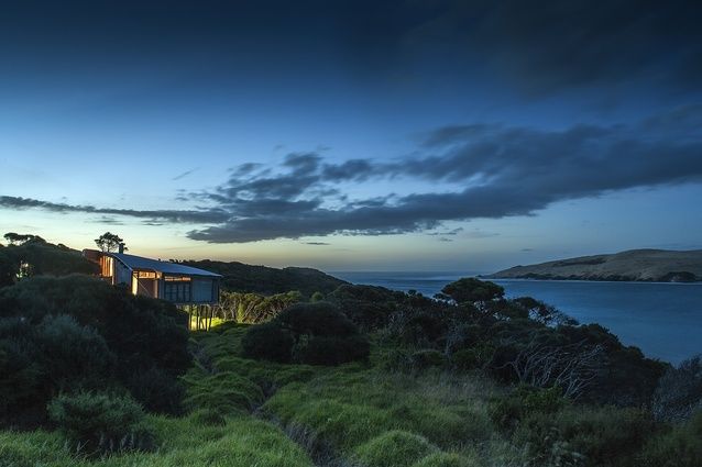
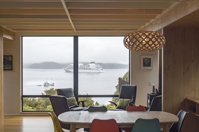
Tennent Brown’s Stewart Island Crib managed to tuck itself so well into the bush that it was barely visible (it was a long walk to another hill that enabled me to photograph it in context). Yet when you are inside the space it commands an amazing view. The framing of each view through the every window is either a landscape or seascape. The sound of the native birds was overwhelming, a magical home shrouded in mist. It was a fun 24 hours on the Island, driving around the tiniest of vans and crunching through the gears on the narrow, hilly road.
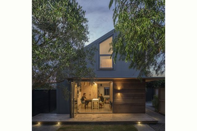
The Petone House by First Light Studio might be a more unusual choice, it is very modest in size, sitting on the footprint of the double garage that previously stood there. But I was so impressed with the use of the garden to create a seperate new home for a family that was juggling different housing needs (splitting time between countries, their children at University in Wellington) that I wanted to include it. This isn’t a “tiny house” in the strict sense of the term but it is very small, it feels spacious through its clever design, doors that recess into the walls, mezzanine bedroom and disguised storage.
FM: How do you approach a home for photography, what are your initial processes before you actually step into the house?
AS: A decent chat with the architect about the space, a look through photos that have been taken by them, a good look at google maps and sun maps to get an idea about where the sun will move around and also a good check of the weather forecast. None of it is rocket science, just getting the chance to familiarise yourself with the scale and style that the architect is expressing and considering the best ways to express this in the imagery.
FM: What are you looking for on that first visit, what is capturing your attention as you do the first walk through, etc.
AS: After as little as 15 minutes walking around with the architect you start to get the feel of how it needs to be photographed. Is it all about: light, scale, colour, detail, materials. Is it subtle, bold, warm and cosy or stark and modern? All these things inform how you photograph it, at the same time you need to be thinking about the way the sun will fall at different times of day on the exterior elevations, where hero shots may come from, where the best place for the dusk shot is. Often my impulse is to rush and get some exterior images completed in case the cloud comes over.
FM: Tell us about your post-production process, what do you do, what are you hoping to achieve?
AS: My brother in law in the UK is a very good amateur photographer and he asked me a few years back how I get that style. I wasn’t sure what he meant but I guess by spending 15 years taking photos of buildings and then processing those images you create your own style both in camera and post processing. I can’t tell you how though; it’s just what I see. I love the idea of documenting the image, not adding in too much light of my own, not making things too perfect. I like to see the world as a stage set (like my images from Love is Understanding), so I like to take an objective view of the space without too much interference. There was a really good online lockdown architectural photography festival from the UK which I keep recommending to people (available here), amongst many subjects they spoke about the US style of architectural photography and the European style. It is a generalisation, but the US style is far more processed in the computer and made up of many images that are lit carefully whereas the European style is more of a document. I do a bit of both (which sums up the New Zealand style) but I’m much closer to the European style and get frustrated with an image when it looks too much like an architectural render.


 Indonesia
 Australia
 New Zealand
 Philippines
 Hongkong
 Singapore


