-
Malaysia
Copyright © 2025 Powered by BCI Media Group Pty Ltd
Confirm Submission
Are you sure want to adding all Products to your Library?
Contact Detail
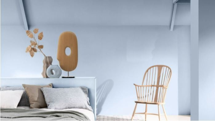
To help us select our Color of the Year, we ask a panel of international design experts to help us understand the mood of the moment and to share their insights about what’s influencing the way we live. This year, our discussion went digital before our team of color experts set to work choosing a shade that reflected those findings – a shade that will feel just right for our homes over the next few years.
Over the past 18 months, our lives have been turned upside down, but we’ve also had time to rethink the way we live and to reassess what’s really important. At our Trend Forecast, we talked about how the role of the home has been transformed; about how essential nature is in our lives; how creativity and the arts have brought us comfort and inspiration during lockdown; and how important it is to embrace new ideas and opinions as we try to shape the world for the better.
These discussions led us to a theme for Dulux Color of the Year 2022 – a breath of fresh air – and to the shade itself, which encapsulates what we will need from our spaces in 2022. Bright Skies™ (Blueberry Mash 14 BB 55/113) is a light and airy blue; it’s a color that feels vibrant, optimistic and good for the soul. And it’s a shade that can open up and revitalize our homes. Around it, we’ve created four easy-to-use color palettes, so you can refresh your living space in any way you choose.
1. Combine Dulux Color of the Year 2022 with Workshop colors to create a vibrant space that works for living, working, relaxing and more
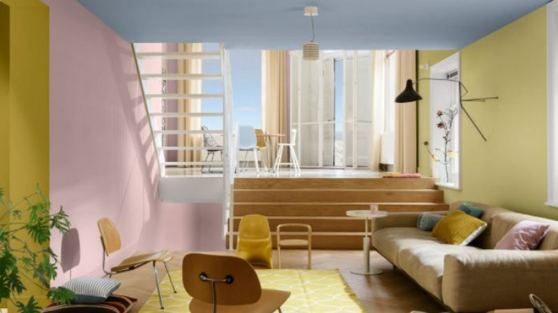
When a living area needs to switch in an instant from home to office to classroom, we need a flexible do-it-all space. Used with Bright Skies™ (Blueberry Mash 14 BB 55/113), the multicolored Workshop palette with its combination of light, uplifting tones, can help you create an inspirational backdrop for any activity.
For more ideas and inspiration for using Workshop colors, click here.
Which colors?
Bright Skies (Blueberry Mash 14 BB 55/113)
Olive Fantasy (34YY 31/502)
Puccini Pink (10YR 57/080)
Tuscan Green (49YY 54/251)
2. Bring the positive effects of nature into a dining room with the fresh greens and blues of the Greenhouse palette
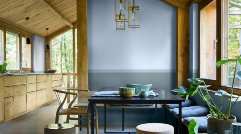
With the light, natural tones of the Greenhouse palette, combined with Color of the Year 2022, Bright Skies™ (Blueberry Mash 14 BB 55/113), it’s easy to bring the freshness of the outdoors inside. In a rural location, these colors can complement the surroundings; in an urban space, they can help us feel in touch with nature.
For more ideas and inspiration for using Greenhouse colors, click here.
Which colors?
Horizon (10BB 73/039)
Bright Skies™ (Blueberry Mash 14 BB 55/113)
Wilton Blue (50BG 44/094)
Brooding Storm (87BG 27/077)
3. Choose the soft, airy tones of the Studio palette with Color of the Year 2022, Bright Skies™, for a soothing space that feels good for the soul
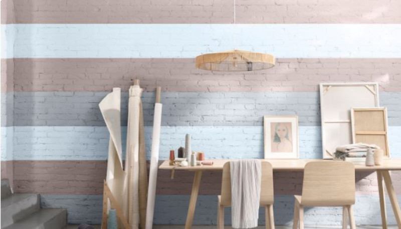
We all need somewhere to recharge and feel inspired; somewhere we can escape the everyday. Painting your walls with Studio colors can give a room a comfortable, consoling feel and, if you go for stripes, you’ll create a dramatic focal point too.
For more ideas and inspiration for using Studio colors, click here.
Which colors?
Bright Skies™ (14BB 55/113)
Swordplay (30BB 45/049)
Fog Grey (50RR 32/029)
4. Experiment with Salon colors to create a space that feels fresh, open and welcoming
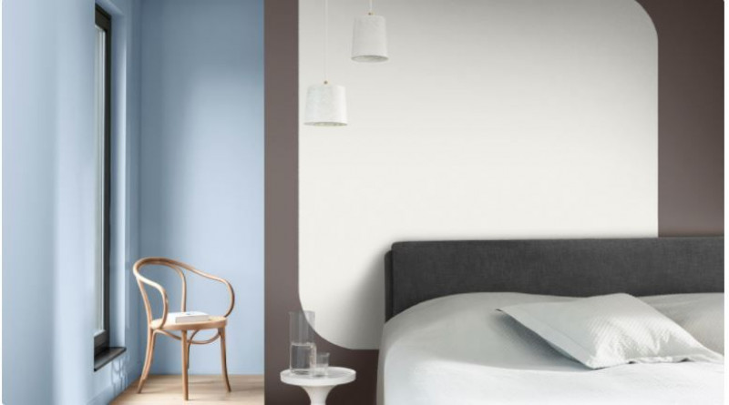
We want our homes to be somewhere we can feel safe and embrace new ideas. A combination of soft neutrals and warming tones, the Salon palette can help provide the perfect blank canvas for any room in the house.
For more ideas and inspiration for using Salon colors, click here.
Which colors?
Bright Skies™ (14BB 55/113)
Stone Road (95YR 16/038)
Purest Frost (71YY 90/027)
Want ideas for zoning a room with different colors? Find inspiration in our how-to video.


