The site is located in one of the busiest commercial districts in Surakarta, Central Java, Indonesia. The project is built on the former site of the shop, the previous shop experienced a massive fire accident and as a result the whole building was razed to the ground. The owner wanted the new building to not only reflect the past glory of the shop but instead to take it a step further, to make a grand comeback.
To achieve this, we choose a unified design approach.
This means that the various elements in the design are in agreement, visually or conceptually. The typography, colour, shapes and layout work together as a whole and are well-integrated.
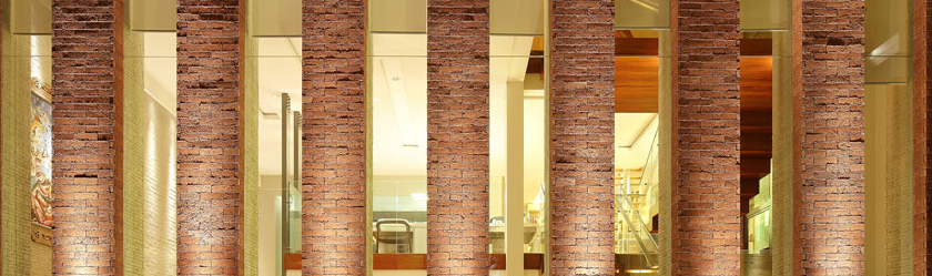
The facade and interior are merged together into one unit. When a person looks at the building, he can immediately see the facade and interior of the shop in one frame. The advantage of this design is that we can showcase the interior of the building to outside world.
The form of the building is the simple basic warehouse. The front of the building is grandeur and eye catching enough to draw the attention of passersby. The front side is made of wood flexible cladding and is slightly curved inside creating a warm and yet inviting atmosphere. The centre is made of glass panels which are adorned with many single vertical madrix lighting, which serve to enhance the design during night time. The massive front red gate can be lighted up during night time.
For the interior, we divided it into 2 sections. For the front electronic division, we choose white as the dominant colour, creating a clean and inviting look. Since white is a neutral colour, this helps us to shift the customers’ main focus to our display products.
The plafond shape, lighting, and the main position of the cashier and customer service are in the middle. This serves as a point of view. The dropping plafond part in the centre is integrated with store operations (cashier, customer service, & office).
We choose to avoid downlights and spotlights, instead lighting is in the form of a line to support the ceiling formation and looks visible from the outside to the inside.
For the latter section, we use a completely opposite color and materials to show the difference in type of products display.
Here, black is dominant. The plafond is not needed, instead we choose to display its raw structure.
The back section which displays kitchen appliances leads to parking, making it one smooth interaction and at the same time. The design took form as light and dark balance each other.
The site is located in one of the busiest commercial districts in Surakarta, Central Java, Indonesia. The project is built on the former site of the shop, the previous shop experienced a massive fire accident and as a result the whole building was razed to the ground. The owner wanted the new building to not only reflect the past glory of the shop but instead to take it a step further, to make a grand comeback.
To achieve this, we choose a unified design approach.
This means that the various elements in the design are in agreement, visually or conceptually. The typography, colour, shapes and layout work together as a whole and are well-integrated.
The facade and interior are merged together into one unit. When a person looks at the building, he can immediately see the facade and interior of the shop in one frame. The advantage of this design is that we can showcase the interior of the building to outside world.
The form of the building is the simple basic warehouse. The front of the building is grandeur and eye catching enough to draw the attention of passersby. The front side is made of wood flexible cladding and is slightly curved inside creating a warm and yet inviting atmosphere. The centre is made of glass panels which are adorned with many single vertical madrix lighting, which serve to enhance the design during night time. The massive front red gate can be lighted up during night time.
For the interior, we divided it into 2 sections. For the front electronic division, we choose white as the dominant colour, creating a clean and inviting look. Since white is a neutral colour, this helps us to shift the customers’ main focus to our display products.
The plafond shape, lighting, and the main position of the cashier and customer service are in the middle. This serves as a point of view. The dropping plafond part in the centre is integrated with store operations (cashier, customer service, & office).
We choose to avoid downlights and spotlights, instead lighting is in the form of a line to support the ceiling formation and looks visible from the outside to the inside.
For the latter section, we use a completely opposite color and materials to show the difference in type of products display.
Here, black is dominant. The plafond is not needed, instead we choose to display its raw structure.
The back section which displays kitchen appliances leads to parking, making it one smooth interaction and at the same time. The design took form as light and dark balance each other.
 Indonesia