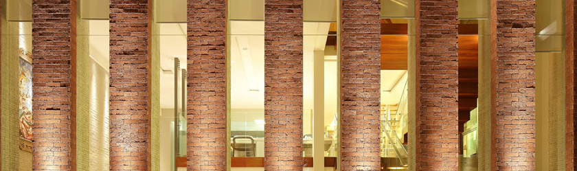
Many interior designers nowadays incorporate ‘feng shui’ analysis into their spatial programming as it provides one of the means to create balance and harmony. For the Nestle Reception, Holding & Training Centre, this is certainly the case. Upon its inception, the spatial planning has meticulously takes into consideration the flow of ‘chi energy’ –represented by the fluid curves from the entrance through to the center of the reception area. Typically, the location that is believed to contain the strongest ‘chi energy’ therefore the focus of all the luck and good fortune, becomes the focal point, or the central core, of the space. Through this understanding, the designer reinterprets an otherwise site constraint into a design opportunity as reflected through the large column in the middle of the hall. Instead of being an obstacle, the column is re-emphasized and turned into a central display area. The structure is cleverly boxed up into a circular shape, enlarging the original proportion. Subsequently, a curved stretch membrane fabric is then wrapped around the now-round column at the bottom to simulate the blooming of a flower, creating a functional ledge where Nestle’s important merchandises and upcoming products can be displayed –elevating the auspicious energy of this sector. In contrast, the least ‘energy’ area, upon identification, is filled up with visitor seating and discussion room. The ‘feng shui’ analysis also further identifies the top sector of the building as ‘Knowledge,’ inevitably assisting the designer to position all learning and training rooms where the energy is strongest, and likewise, the pre-function and breakout areas where they are weakest. However, the ‘feng shui’ analysis does not stop merely at the spatial planning and design alone. The designer goes further by also incorporating ‘feng shui’ elements to highlight the importance of Nestle’s corporate branding. Using Nestle’s corporate logo as a reference, the designer mimics the egg through the shape of the reception counter, and the seating booth as the ‘nest’ –reflecting symbolically that the nest is not empty and will always contain abundance. Furthermore, a good balance of auspicious colors, the interior material selections –both reflective and non-reflective, and a strong presence of wood element from the ceiling coupled with a small zen miniature Japanese-like garden –representing peace and tranquility –certainly fulfills all the ‘feng shui’ and client’s requirement. It was no easy task to ensure the corporate outlook is maintained, but no less fulfilling.
Many interior designers nowadays incorporate ‘feng shui’ analysis into their spatial programming as it provides one of the means to create balance and harmony. For the Nestle Reception, Holding & Training Centre, this is certainly the case. Upon its inception, the spatial planning has meticulously takes into consideration the flow of ‘chi energy’ –represented by the fluid curves from the entrance through to the center of the reception area. Typically, the location that is believed to contain the strongest ‘chi energy’ therefore the focus of all the luck and good fortune, becomes the focal point, or the central core, of the space. Through this understanding, the designer reinterprets an otherwise site constraint into a design opportunity as reflected through the large column in the middle of the hall. Instead of being an obstacle, the column is re-emphasized and turned into a central display area. The structure is cleverly boxed up into a circular shape, enlarging the original proportion. Subsequently, a curved stretch membrane fabric is then wrapped around the now-round column at the bottom to simulate the blooming of a flower, creating a functional ledge where Nestle’s important merchandises and upcoming products can be displayed –elevating the auspicious energy of this sector. In contrast, the least ‘energy’ area, upon identification, is filled up with visitor seating and discussion room. The ‘feng shui’ analysis also further identifies the top sector of the building as ‘Knowledge,’ inevitably assisting the designer to position all learning and training rooms where the energy is strongest, and likewise, the pre-function and breakout areas where they are weakest. However, the ‘feng shui’ analysis does not stop merely at the spatial planning and design alone. The designer goes further by also incorporating ‘feng shui’ elements to highlight the importance of Nestle’s corporate branding. Using Nestle’s corporate logo as a reference, the designer mimics the egg through the shape of the reception counter, and the seating booth as the ‘nest’ –reflecting symbolically that the nest is not empty and will always contain abundance. Furthermore, a good balance of auspicious colors, the interior material selections –both reflective and non-reflective, and a strong presence of wood element from the ceiling coupled with a small zen miniature Japanese-like garden –representing peace and tranquility –certainly fulfills all the ‘feng shui’ and client’s requirement. It was no easy task to ensure the corporate outlook is maintained, but no less fulfilling.
Many interior designers nowadays incorporate ‘feng shui’ analysis into their spatial programming as it provides one of the means to create balance and harmony. For the Nestle Reception, Holding & Training Centre, this is certainly the case. Upon its inception, the spatial planning has meticulously takes into consideration the flow of ‘chi energy’ –represented by the fluid curves from the entrance through to the center of the reception area. Typically, the location that is believed to contain the strongest ‘chi energy’ therefore the focus of all the luck and good fortune, becomes the focal point, or the central core, of the space. Through this understanding, the designer reinterprets an otherwise site constraint into a design opportunity as reflected through the large column in the middle of the hall. Instead of being an obstacle, the column is re-emphasized and turned into a central display area. The structure is cleverly boxed up into a circular shape, enlarging the original proportion. Subsequently, a curved stretch membrane fabric is then wrapped around the now-round column at the bottom to simulate the blooming of a flower, creating a functional ledge where Nestle’s important merchandises and upcoming products can be displayed –elevating the auspicious energy of this sector. In contrast, the least ‘energy’ area, upon identification, is filled up with visitor seating and discussion room. The ‘feng shui’ analysis also further identifies the top sector of the building as ‘Knowledge,’ inevitably assisting the designer to position all learning and training rooms where the energy is strongest, and likewise, the pre-function and breakout areas where they are weakest. However, the ‘feng shui’ analysis does not stop merely at the spatial planning and design alone. The designer goes further by also incorporating ‘feng shui’ elements to highlight the importance of Nestle’s corporate branding. Using Nestle’s corporate logo as a reference, the designer mimics the egg through the shape of the reception counter, and the seating booth as the ‘nest’ –reflecting symbolically that the nest is not empty and will always contain abundance. Furthermore, a good balance of auspicious colors, the interior material selections –both reflective and non-reflective, and a strong presence of wood element from the ceiling coupled with a small zen miniature Japanese-like garden –representing peace and tranquility –certainly fulfills all the ‘feng shui’ and client’s requirement. It was no easy task to ensure the corporate outlook is maintained, but no less fulfilling.
 Malaysia