A date with the city


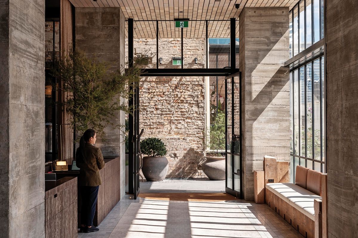
A discreet black canopy overhead signals the city-side entrance to The Hotel Britomart on Customs Street East, flanked either side by oversized planters encroaching on a busy downtown pavement. A first glance through the heritage façade opening gives little away – a bustling bread shop serving fresh pastries and loaves and a scattering of small, well-occupied tables in a covered laneway. But we look a little deeper and, in the distance, a row of tall, black-steel-framed doors is opened wide, revealing what looks like a sophisticated, softly lit living room.
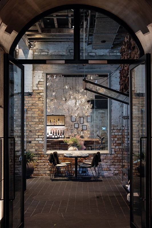
To effectively lower the ceiling at the hotel’s restaurant, Kingi, the architects designed a handmade-glass light installation, which floats above the kauri bar. Image: Samuel Hartnett
The hotel may seem hard to find at first, but the magic is in the journey. We follow the city’s bluestone paving through the laneway and around a dog-leg and it crosses the threshold into the hotel lobby, albeit now marble, made to look like bluestone. And, just as the outside comes in under our feet, so, too, does the brick exterior façade, wrapping under the cantilevered verandah above and slipping into the lobby, seamlessly connecting with timber of a matching profile and hue.
It is this sense of well-crafted connection and the interaction it facilitates that underpins the thinking behind the hotel. “Britomart itself is the hotel,” explains project architect, Dajiang Tai. “The form of the building didn’t appear in the first instance; we wanted to craft the experience first. The idea of staying in a hotel is that you’re having a date with the city, so the moment you step into Britomart, that is the moment when the hotel starts.”
The hotel lobby subtly engages with our senses on a number of levels. Almost every detail is tactile, handcrafted and bespoke. The handles on the front doors are cast in solid bronze: the first a branch from a tree in Tai’s back garden, the second a piece of driftwood that he picked up on Tāmaki Drive.
Already, there is a sense that Cheshire Architects’ trademark eye for detail will imbue every inch of this project so it’s not surprising, when we pass a native tōtara, that Tai says he can’t wait for Christmas to start decorating the trees. “They live happily here but they are more happy if they can have a break from the air con and the northern sun,” he points out. They holiday at a nursery every three to four weeks.
Hotel staff (the hotel is owned by Cooper and Company and managed by TFE Hotels) are dotted throughout the lobby, of no apparent fixed abode, dressed in comfortable organic linens, in natural hues, teamed with Allbirds shoes. The earthy palette is very much of Aotearoa, as is the dramatic textured black wall straight ahead.
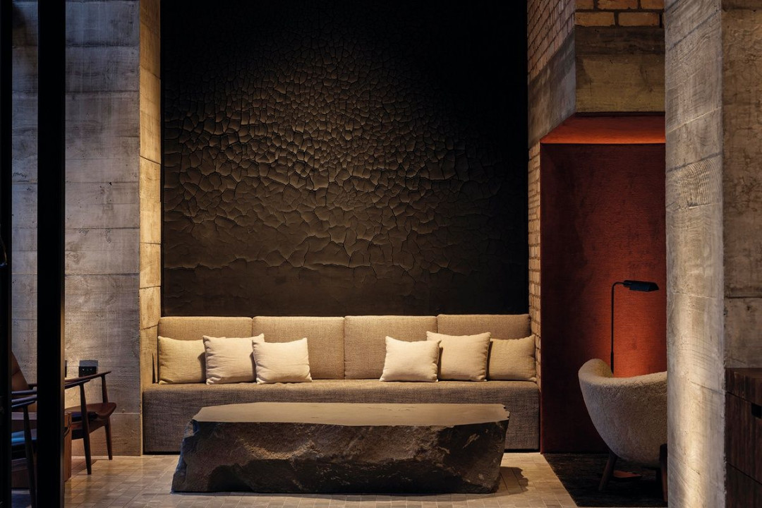
Artist Alan Drayton’s dramatic black textured wall is on the lobby’s eastern wall. Image: Samuel Hartnett
“The intent was to create a plaster finish that speaks about its clay nature and which cracks like a dried riverbed,” explains Tai. “After many working samples, artist Alan Drayton was able to get the plaster to crack in a very controlled way.” The effect is part black sands of Muriwai, part charred timber – a nod to the
New Zealand vernacular, both coastal and farming, and an imposing focal point on entry.
Below this wall, a weighty piece of Timaru bluestone, fabricated and installed on site, anchors the space, and collections of upright kauri offcuts from the adjacent Masonic Buckland renovation stand sentinel at the window.
While the lobby’s acoustics are already hushed, Tai points out a snug space tucked below a back-of-house mezzanine and lined in orange velvet that is even more silent. “We were trying to create a variety of seating,” he says. “Some temporary, some seen, some private and not seen. Guests can have a quiet conversation here.” He is right; the space rivals the acoustic isolation of a sound-recording booth.
On our way to the lifts, a deep, copper-lined door jamb catches our eye. “When it was installed, it was like a mirror so we spent a day polishing it. It’s very hard to describe on a drawing how much you need to polish.”
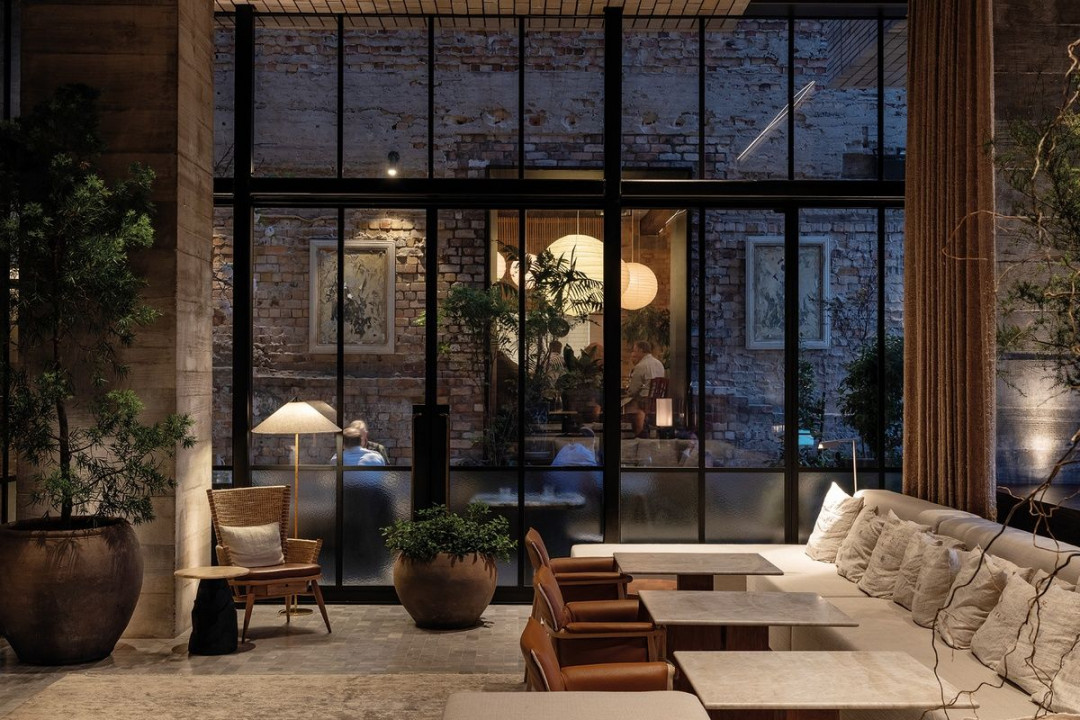
Café Hanoi, Kingi, Mr Morris and a new Asian-fusion eatery all contribute to the ‘deconstructed’ hotel. Image: Samuel Hartnett
Good point. And yet drawings are precisely how the team at Cheshire Architects described their original vision to developer Peter Cooper, poetically presenting it as an opera of many parts. “It was a series of acts,” explains Tai. “Stages that guests would go through. And we were drawing the memories we wanted people to have – so it was a fully immersive experience.”
There’s real power in this type of storytelling – vision-making drawings that create a reality and engage with the brain and the heart. The psychology of artwork.
We journey skywards in what Tai describes as the “richness of the lift” – an isolated bubble lined with an uncharacteristically abstract piece of art from Cooper’s personal collection – and step out into a sliver of light overlooking the historic Stanbeth House. As we head down an inky hallway between the north and south-facing brick masses, which the architect refers to as “blades”, the black gives way to a light timber near the eastern window shaft. A clever ruse to emphasise the sense of thickness of the blades when viewed from Takutai Square, the light-stained timber wall and doors directly behind the corridor glazing match the brick to appear as a much deeper return on the façade.
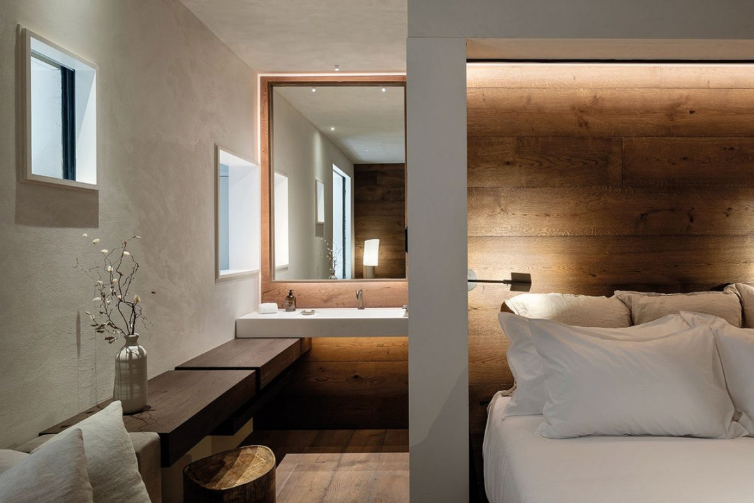
When pulled, the cavity slider slices through the cabinetry to rest against the wall. Image: Samuel Hartnett
Refreshingly, the hotel’s guest room layout departs from the traditional. Clever spatial design has seen the architects tuck the bathroom around the corner and behind the bed, instead of right beside the entry. The glimpse of this corner provides a sense of generosity and the order of things feels right – the bathroom being a nice surprise at the end. While the basin and mirror are separated from the cave-like shower and toilet space, they, too, can be separated from the bedroom by way of a cavity sliding door.
Aside, perhaps, from the ceiling lights, almost everything is bespoke – the bedside lights, table lamp, stool, vase – even the beautiful tūī wallpaper illustration within the mini-bar cupboard is designed by a Cheshire – tattoo artist, Hal.
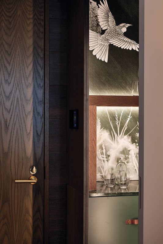
Meticulously detailed mini-bar cupboards reveal bespoke wallpaper. Image: Samuel Hartnett
The overall feeling is part hygge, part zen and it’s clear the deft hand of Cheshire principal and creative director Emily Priest has been at play. Soft, hand-woven rugs sit on natural timber flooring, the wide oak planks continuing up the wall to offer a sense of cabin-like retreat. The bathroom is lined with dark, stone-textured tiles in a herringbone pattern, designed to reflect that of the laneway bricks below. Even the lighting has been designed to adjust automatically, according to the time of day.
But to attain this sense of calm was no mean feat. Tai says the team set up a prototype guest room in the basement of Sofrana House in mid-2018 and was there every day, testing. Lighting, carpet positioning, cabinetry – every conceivable detail. And then the project’s Green Star rating called for recycling, reuse, FSC-rated timber, water-controlling bathroom fittings and low-carbon emission operations. A labour of love.
The only thing that seems slightly out of place amongst the flush surfaces is the architrave detail around the windows, which, we are told, was a matter of practicality. But, in a way, it provides some respite from the clean lines and a subtle foil to the iPhone architecture exterior.
We leave the cocoon-like guest room to travel to the top floor, where three of the hotel’s five guest suites are located; the other two are housed in glass pavilions atop the adjacent Masonic Buckland building. The luxury dial is turned right up – although we already thought the bar was set high – the suites a collaboration with American interior designers, Lucas Design Associates (the team behind another Cheshire project, The Landing, in the Bay of Islands).
Generous outdoor terraces off the east and west suites channel New York rooftops, afforded a sense of enclosure and privacy from the city skyline by deep, brick parapets. Inside, across a hallway-cum-gallery running the length of the suite, large picture windows in the north-facing bedroom and living spaces frame the Waitematā, with comfortable window seats tucked underneath.
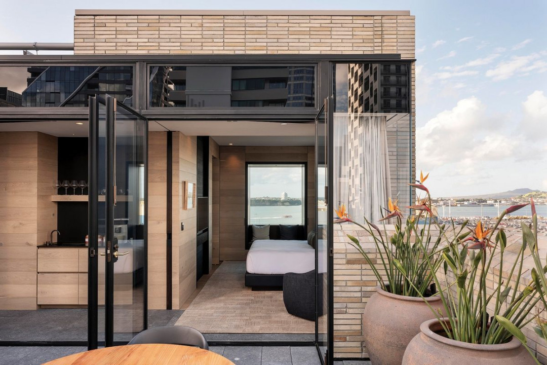
The Rangihoua Suite is one of three situated on the top floor of the hotel. Image: Samuel Hartnett
As with the guest rooms, everything has been carefully curated and layered: a selection of books chosen by writer and editor Jeremy Hansen, moody photographs of The Landing up north and the creations of local makers Rachel Carter, Elena Renker and Antonia De Vere. The vibe they are after, explains Tai, “is that you feel like you’re at your best friend’s house in a foreign city and your friend has really good taste”.
There’s no denying the team has achieved that in spades but perhaps Cheshire’s true achievement on this project harks back to the making of an opera – a highly orchestrated collaboration of many moving parts and stages. Here, The Hotel Britomart’s success appears to be the result of an enduring relationship between developer, architect, builder and makers, and the implicit trust upon which that relationship is built.
No wonder Tai says he and the team don’t know where architecture starts and stops – their job is to design and realise the vision in concert with a host of talented partners and, if that comes down to looking for a branch in your own back garden, then so be it. And, yes, while the architects might have successfully created the experience of our feeling as though we’re on a date with the city, the risk here is that we might just be tempted to order room service from Kingi below and stay in for the night.


 Indonesia
 Australia
 Philippines
 Hongkong
 Singapore
 Malaysia


