CASA X


“The house has been designed to be silhouettic in the landscape - One which will age gracefully and grey with time”.
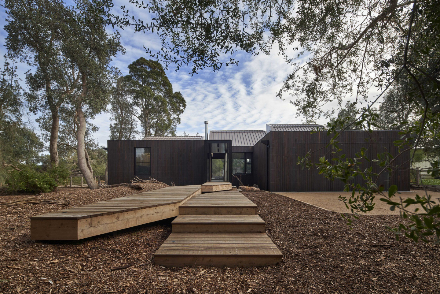
Casa X is a new single level residence located on Phillip Island, Victoria, Australia - 140km from Melbourne.
The site is heavily vegetated with a foreshore reserve to the northern boundary. The site offers no direct beach/ocean views - even at maximum allowable build height.
There is a flood inundation overlay over the site and as a result the finished floor level of the house has been elevated to the required AHD level of 3.1 as specified by Melbourne Water.
Phillip Island is a popular coastal destination which consists of a high number of beach - holiday houses which lay dormant for many months of the year as well as a high number permanent residences. Specifically - the area in which Casa X is situated has a higher ratio of permanent residences to holiday houses. The formal vernacular of the local context is highly conservative. Interestingly, most houses in the area do not have perimeter fences, particularly those with direct connection to the foreshore and beach. Paradoxically to the highly conservative nature of the area - a fairly open visual condition is present. We felt this was a particularly important factor in how we approached the house within its site and surrounds. As a result the design of the house within its site and wider surrounds - has been designed to become its own ‘compound’ or ‘fence’ of sorts without the need of creating a secondary perimeter.
Our client came to us with a single idea of creating a courtyard house, mainly as they wanted a certain level of privacy. We used this as a primary driver but given the nature of the site - particularly the dune-scape to the northern boundary - we felt it was important to re-rationalise the typically closed-off courtyard house model into ‘open courtyard house’ - which would allow a certain level of privacy but importantly - ‘allow the landscape to come into the courtyard & house’
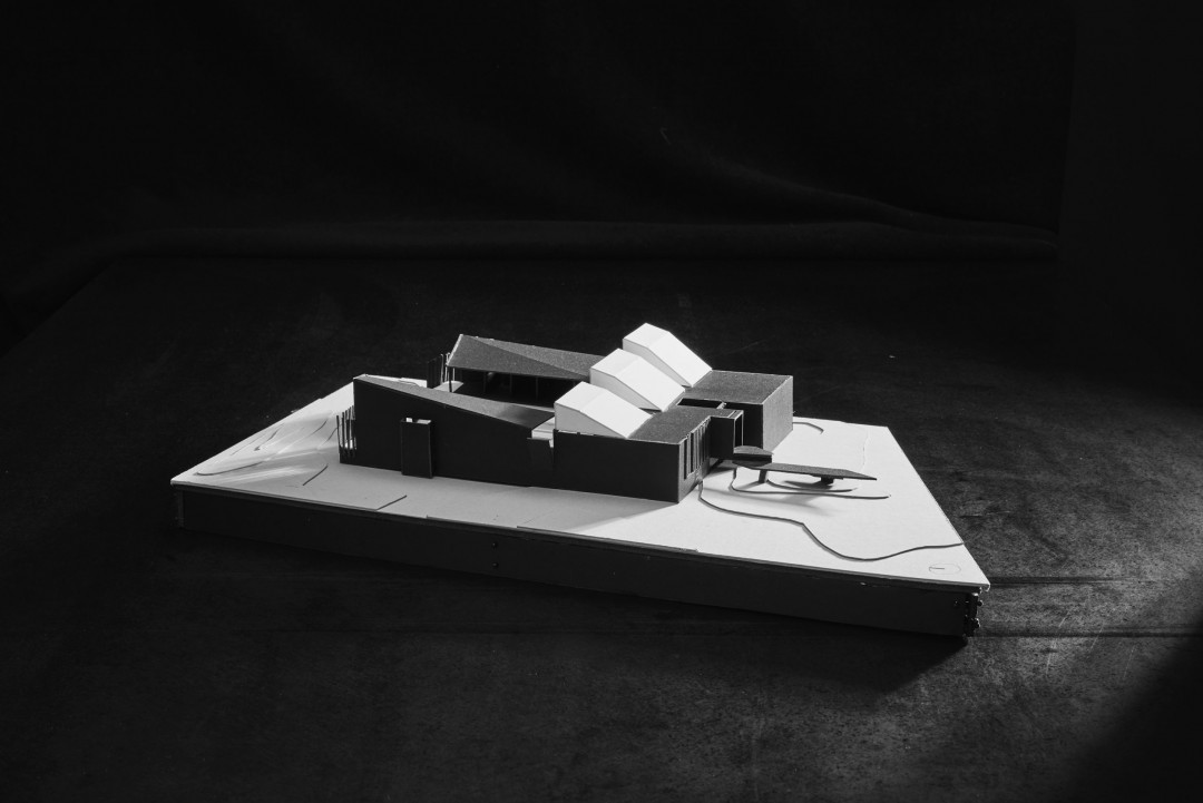
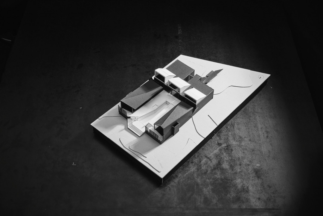
The figure/ground relationship of the house within the site has been conceived as a ‘open courtyard’ configuration, with a central internal sanctuary that provides a direct visual and physical link into the foreshore dunes and beyond the the beach.
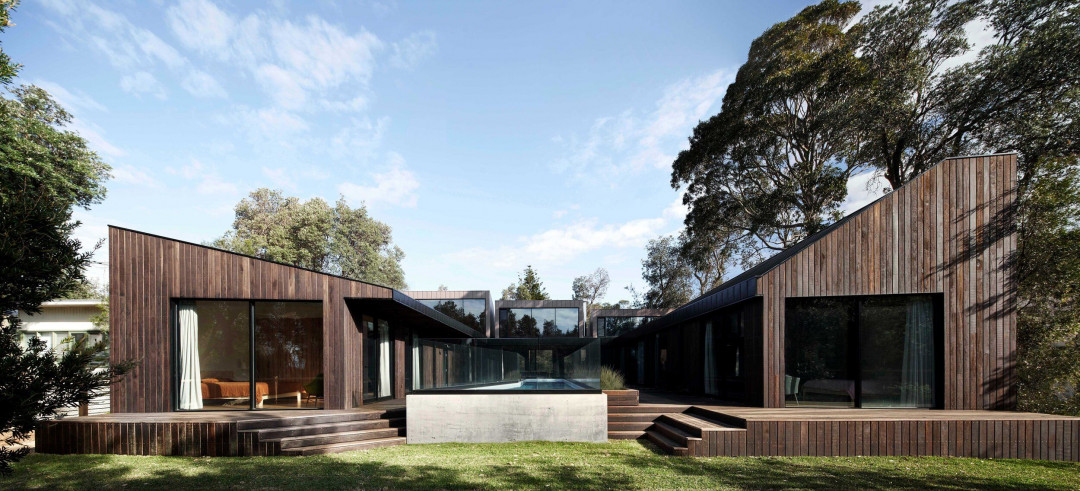
The configuration of the house is 3 interconnected pavilions. One for kitchen, dining and living with associated service areas, one master pavilion and one guest pavilion.
Connecting each of the ‘pavilions’ is a central deck area [sanctuary space] with planted gardens and a central pool. The form of the pool, specifically the ‘crank’ in the pool form, has been designed to create a subtle conversation and formal relationship with the lineage of a fairly discrete path leading through the dune-scape and onto the beach.
A series of steps at the end of the deck create both a visual and physical transitional connection from the height of the house into the dune-scape beyond.
There was an early tendency to push the primary living, kitchen and dining areas to the most northern part of the site in order to be physically closer to the dunes and beach. However, given the visual and primarily the formal impact on site - we felt this was too harsh. As a result the main kitchen, dining and living zone has been configured to the rear, southern end of the site. This also created improved access for the clients in terms of performing simple everyday tasks - such as loading groceries from their car into the kitchen as an example, as they get older.
This area is orientated east-west across the site with a large internal expanse of glass to allow northern light to enter the internal areas. In addition, three ‘pop-up’ high-level windows or light-catchers allow northern light to penetrate deep into the house throughout the day. The progressive height of each of the three ‘pop-ups’ builds an external, hierarchical language to the streetscape given the importance of each space within.
The kitchen is seen as the most important, primary 'heart’ of the house and hierarchically responds with the biggest pop-up above it. The dining is slightly smaller and the living smaller again. Similarly this scaled hierarchy of the light catchers creates an internal light condition responding to the intimacy of each space within. The kitchen is communal, flooded with light and at the other end of the spectrum - the living space is for retreat, hence the light is slightly more withdrawn creating a space of intimacy.
.jpg)
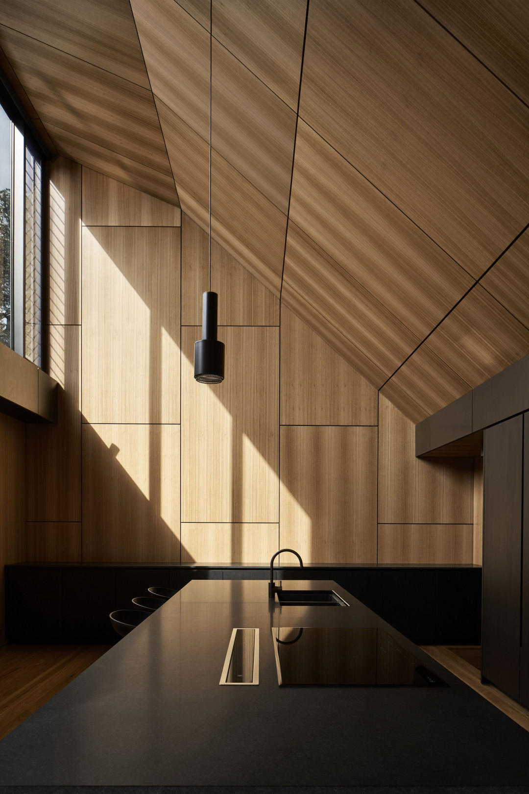
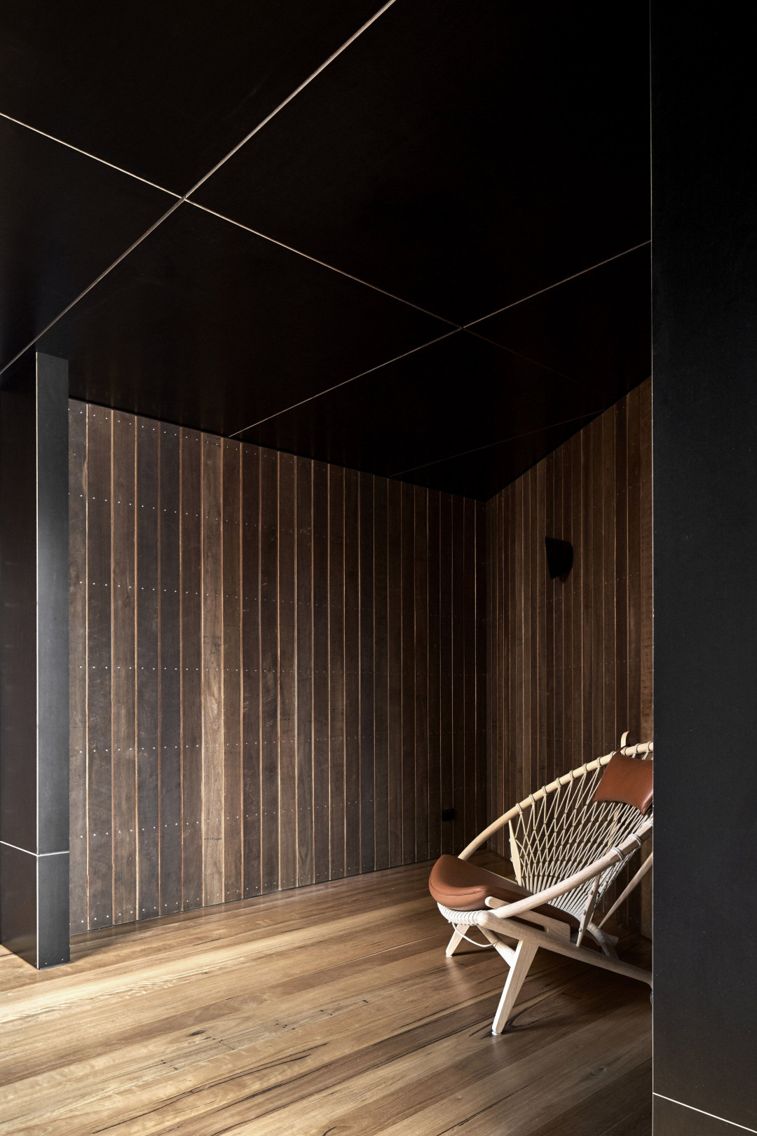
Directly off the main living space, a residual library & retreat area is sectionally lower [2400mm h] as well as ceiling clad in black, slightly reflective formply to further enhance the spatial and light condition of a place of retreat and intimacy.
Light & Dark, particularly in relation to the control of light and materials are important elements within the house. Our clients had extensively travelled throughout Morocco in previous years prior to commissioning us to design the house and loved the light and dark qualities created within the portico bounded courtyards of Moorish Architecture.
.jpg)
The angled roof/volumetric profiles of both the master zone and guest zone pavilions create sun protection to the internal courtyard at various times of the day. The master zone pavilion is higher and slightly more raked to provide, mid-late afternoon sun protection in hotter months. The guest zone pavilion has a protective extended eave line to reduce sun loading during hotter periods of the day.
Internally - spaces are openly configured - which flow from one to the next. Wall heights, particularly in the Master wing are specifically not full-height to create a cohesion of space and program. For example: The plan of the master wing has been designed around the sequential daily rituals of the client:
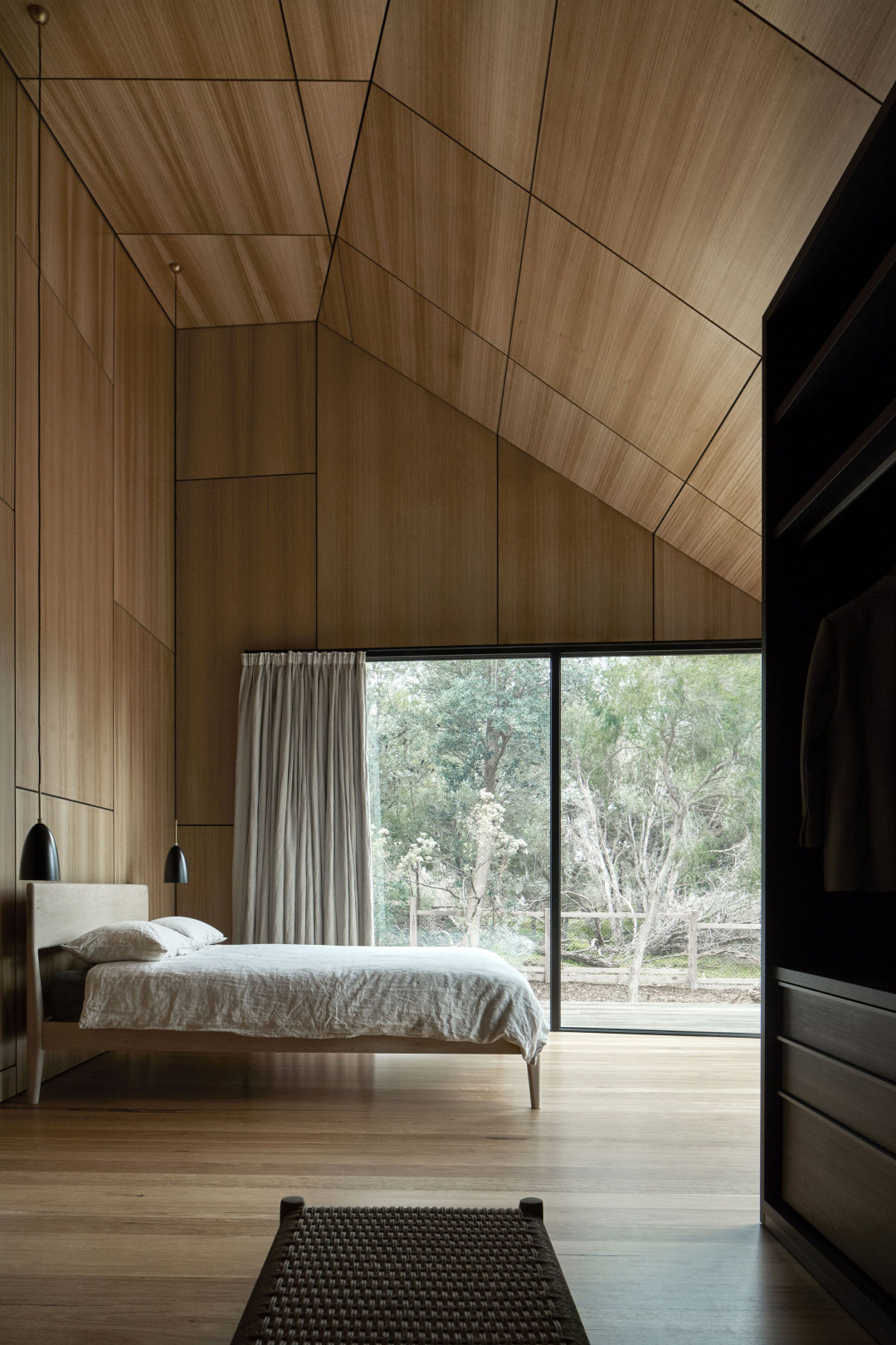
1. Primary sleeping area is located on the most northern end of the wing creating the condition of ‘sleeping amongst the foreshore dunes’. The ceiling height in this area is the highest in the wing. Sectionally - the height was an important element as we wanted to create a feeling of verticality - similar to siting outside under the large foreshore grey-gums.
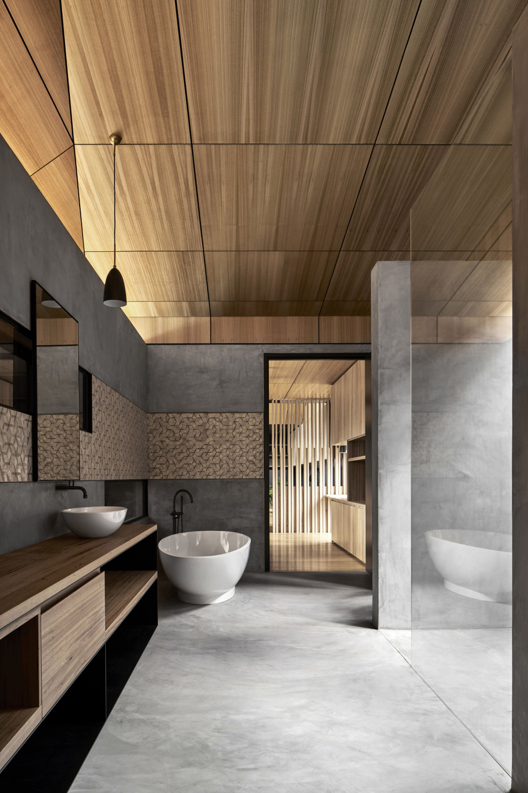
2. Dressing area [Robe] leading into Washing [Ensuite] area. These spaces are formalised as a singular ‘lidless box’ insertion within the overall space.
Each ritual, no matter how mundane such as brushing teeth or having a shower or bath, has a specific visual relationship to nature in this area. On the eastern side of the bathroom a long slot portal window is sliced through the space at eye-level when undertaking tasks while standing. Another is sliced through at the level of lying in the bath. We wanted to create a condition where you could be ‘standing at the basin putting make-up on whilst looking out into the courtyard at the plants swaying the breeze and the glistening water reflecting off the pool’.
On the western side of the bathroom - when taking a shower, using the toilet or the clients requirement for a sauna - one has a continuous view into the small minimally landscaped and totally private courtyard - which can be physically opened or closed to the elements. This courtyard was also specifically placed directly next to the most impressive and largest grey-gum tree on the site in order to capture the shadows its foliage creates during various times of the day. The vertically orientated blackbutt timber lining boards of the courtyard, further enhances the relationship of the space to this gum tree.
The material palette within the ensuite bathroom is specifically stripped back - with raw grey concrete floors and walls which contrast with a singular hand-made tile band to visually further enhance the space to the surrounding landscape. There is an element of reductive utilitarianism to provide the highlighting and celebration of specific elements and wider landscape.
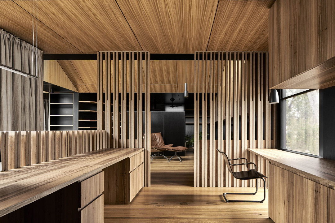
3. Morning ritual of checking daily emails in the study. The study is the final space within the wing before moving into the kitchen, living and dining space for a morning coffee and breakfast.
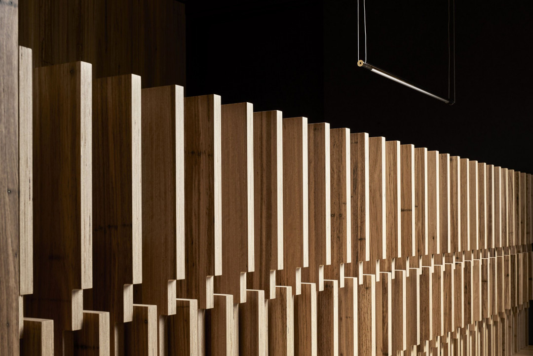
Again - the study offers primary views into the courtyard from that at a level of sitting at a desk at a computer on the Eastern side of the space and again on the Western side of the space which looks out of the house and into the local landscape. The study is crafted from a repetitious and rhythmic timber battened enclosure which was derived and elaborated from the ‘skeletal’ like tree trunks & branch systems of nearby native coastal tree species.
Outside of the ensuite - the entire perimeter of the wing [walls, floors and ceilings] are clad in a combination of natural Australian Blackbutt and Tasmanian oak timbers to create a cocoon-like cohesion of form and space. Similarly the overall sensibility of the house from an internal and external material condition was to create a sense of cohesion and singularity.
The exterior of the house is completely clad in vertically shiplapped native Australian Spotted Gum solid timber with a natural timber oil. The master and guest pavilion wing roofs are clad in a black standing-seam colourbond cladding. The house has been designed to be almost silhouettic in the landscape. One which will age gracefully and grey, more and more into the landscape with time.
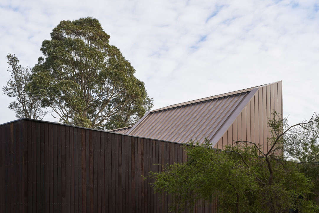
The high-level light catchers, are clad in an ‘Autumn red’ standing-seam colourbond cladding.
The ‘black and red’ tonal palette of the exterior of the house also comes from an extensive examination of the local coastal landscape - where black volcanic granite rocks build up with a red / pink, coarse, porphyritic, potassium rich coloured sediment over time.

.jpg)
.jpg)
This article originally appeared in branchstudioarchitects.com


 Indonesia
 Australia
 Philippines
 Hongkong
 Singapore
 Malaysia


