Collaborative campus


In 1999, the American bookstore chain Borders opened a huge outlet on Queen Street. Its stock must have been as large as every other central city bookstore put together, with shelves of magazines, books, music, videos and two cafés threaded through a warren of spaces and levels that burrowed down into the basement of a flamboyant new cinema multiplex.
Borders was the first of a new style of superstore to arrive in New Zealand – stores that included a café and a programme of events – and marked in retail the start of a casualisation that had begun in institutions a few years earlier with café-equipped libraries designed by Athfield.
Like every idea, this one could be executed with varying levels of commitment and success. At its best, it instigated a rising sense of hospitality, with businesses and institutions seeking to help the users of their buildings feel comfortable and to enrich their experience. At the other end of the scale, it gave rise to interiors becoming a scattering of café tables and couches only marginally inflected by the activities being carried out within them.
This has led us to the situation in which vast swathes of the interiors we occupy – from local branches of banks to university libraries – look like a Koru Lounge. That might prompt us to ask the question of why so much of our working and learning world resembles a place designed to keep you comfortable while you do nothing.
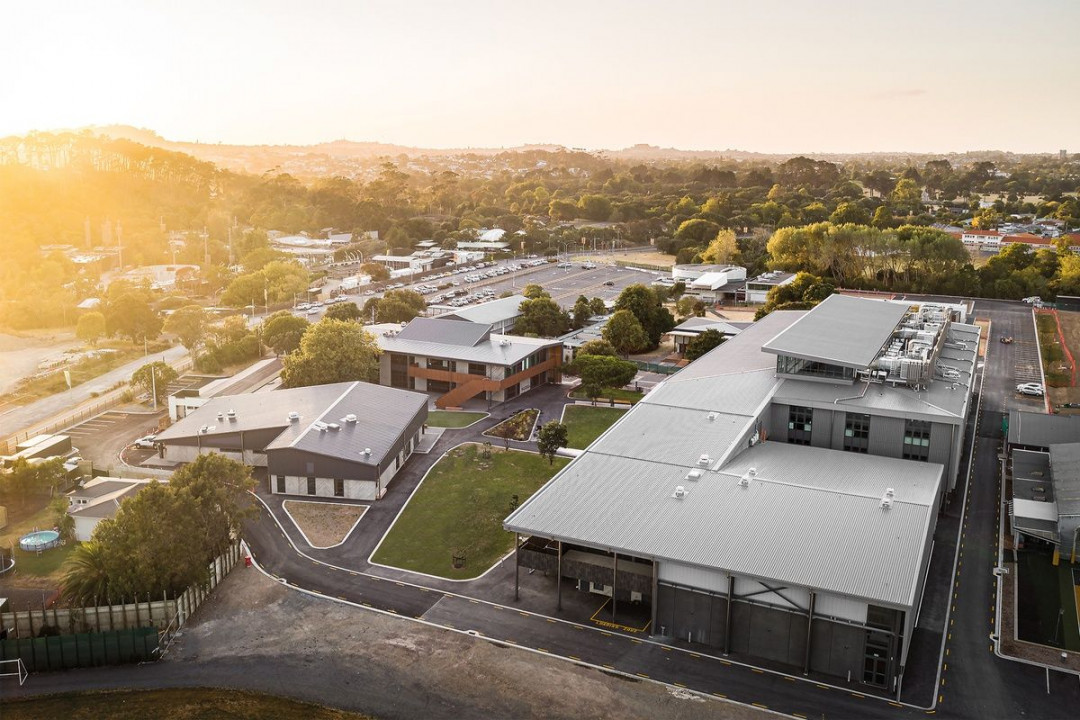
The new buildings are arranged around a linear green space that runs through the centre of the campus. Image: Dennis Radermacher
This casualisation has also been central to developments in educational architecture. Key to this has been the wholesale adoption by education policymakers of ‘innovative learning environments’ (ILEs), which see several teachers collaboratively overseeing 90-odd students in open-plan spaces. Again, the levels of success achieved have varied; problems usually arising when insufficient effort has gone into developings chool culture and equipping teachers to operate in the new spaces.
A fascinating contribution to this rapidly evolving field has recently been made by Jasmax, with the largest redevelopment to date of an existing state school in New Zealand. This reshaped campus is home to two institutions in operating partnership: Ngā Puna o Waiōrea (NPoW), a Te Reo Māori immersion kura, now housed in a pair of new buildings beside an existing wharenui, and Western Springs College (WSC), which occupies a huge three-story block that includes a gymnasium.
The school, originally built in the 1960s, was sited on a former landfill and subsidence problems required almost the entire campus to be replaced. This created opportunity both to comprehensively rebuild and to shift the education approach from traditional modes to collaborative teaching in ILE spaces.
The Ken Havill Learning Centre (named after a former principal) is organised around a triple-height atrium, open learning areas flowing around enclosed spaces such as meeting pods, presentation rooms, resource rooms and teacher workrooms. The building can be extended to accommodate roll growth from 1700 to an anticipated 2500 by 2030.
The new buildings are accompanied by invisible new structures. These include changes to the teaching style, the curriculum and even the timetable, which was switched to 90-minute classes to reduce the crushes created when 1700 people all switch places at the same moment.
Coinciding with the opening of the new buildings, WSC-NPoW has boldly sought to enact their shift in school culture almost instantly. It seems to be working. Attendance is up, and even behavioural issues have diminished, as the openness of the space makes everyone more conscious of their own conduct. As one student put it: “No one will be a dick when 90 people are watching.”
Jasmax describes its design as feeling like a university. This may be a step too far, with most new university buildings still largely occupied by closed, functionally defined spaces for lecturing, seminars, labs, staff offices and so on. If the Havill Centre interiors resemble those of a university, it is not the teaching spaces but the student common areas – the study and hangout spaces students occupy when they aren’t being actively taught.
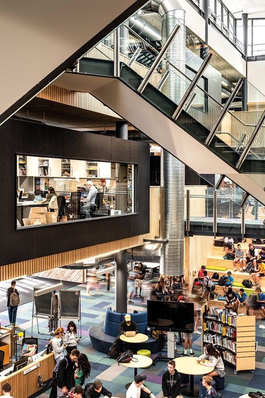
The library has been placed on the ground floor of the atrium, adjacent to the entry. Image: Dennis Radermacher
The scrupulous openness of the Havill Centre suggests an atmosphere of hushed work, such that it feels more like a corporate office. In fact, the building is a restrained timber and chipboard version of Jasmax’s slick steel-and-glass 2010 NZI Centre. The parti of both buildings can be described in identical terms: open workspaces arranged around a multi-storey atrium, the airy void enlivened by projecting meeting rooms and dramatic stairs.
The thing about the Havill Centre that is most suggestive of corporate atmosphere is the absence of anything that suggests it isn’t. The learning spaces of previous generations were saturated with bookshelves, charts, maps, drawings and student work displayed around the walls. While the Havill Centre’s specialist facilities, such as wood workshops and fab labs, are housed in enclosed spaces, even some dedicated areas are scarcely identifiable – the science zone is marked only by a row of benches along one wall.
Most of the learning spaces are occupied only by furniture and large mobile TV screens. Whiteboards are a rarity, and lockers – the iconic objects of high school life – have been eliminated. The building is clear of educational and personal ‘stuff’. Here, learning comes direct from people or the computer screen.
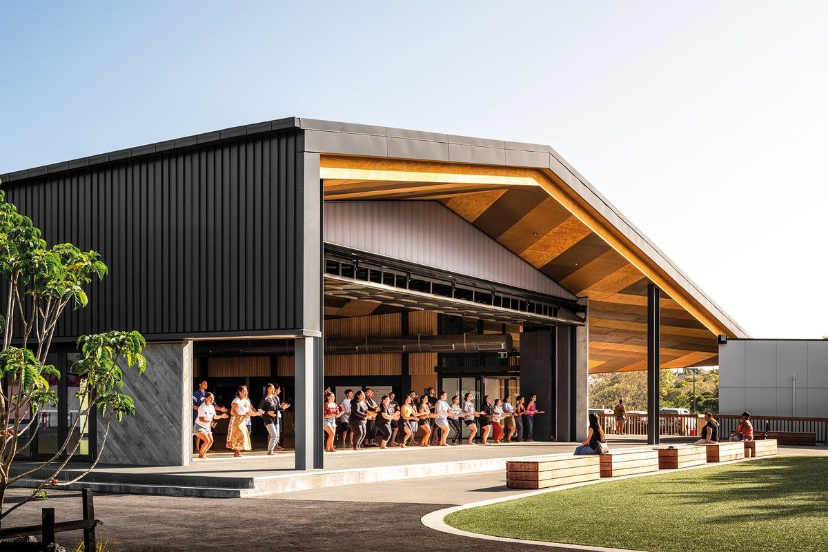
Perhaps unsurprisingly, it is the two Māori immersion buildings that are architecturally the most distinctive. The Whare Tapere is a multipurpose hall designed to be the same size as a kapahaka stage. A huge, operable wall allows it to be opened up to the adjacent courtyard for performances and events. Its plywood ceiling has been stained in a pattern representing the eels found in nearby waters, while Graham Tipene, a Ngāti Whātua artist, was engaged to create an eel design for its feature concrete precast panels. The surfaces that, in the Havill Centre, are left clear of educational content are, in the kura spaces, used to convey cultural meaning.
As a whole, the buildings are spatially exciting, have a dramatic scale and just look modern. Readers will sense, though, my anxiety about what has been stripped out of the environment. But, perhaps the energy and openness of the space compensate for the absence of educational ‘stuff’. Perhaps that stuff never did much good anyway. There are few in the education world that would disagree with the notion that the critical ingredients in any learning environment are the skills and energy of the teachers.
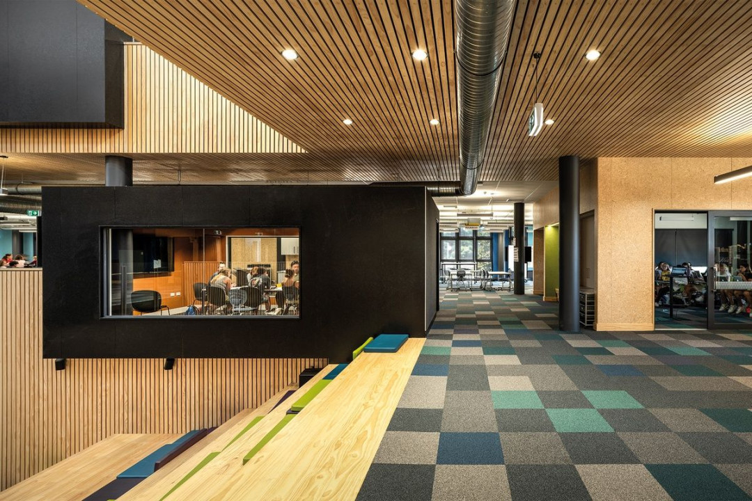
Open plan learning areas in the Havill Block are shaped by enclosed teaching spaces, offices and meeting rooms. Image: Dennis Radermacher
Our contemporary obsession with technology and infatuation with rapid change means that, for many, a seamless connection between school days and work life is highly attractive. I write this on day nine of the COVID-19 lockdown. There is much in the air about how our collective isolation will reconfigure the relationships between home and work at many levels. It will no doubt also influence the possibilities for schools. Will we continue to see continuity between school and what follows as a positive thing? If we can so effectively make a school in the image of an office, perhaps we could make schools like other places we might find energising? Could we make schools like houses, like art galleries, like markets, or like parks?
The scale and thoroughness of the re-imagination of ‘school’ at WSC-NPoW is arresting. It prompts many fascinating questions but we can be confident that WSC-NPoW will find answers. It has a solid record of innovation – it was the first secondary school to become a green-gold Enviroschool, to become a Living Wage employer and to be co-governed.
Borders lasted only a decade, overtaken by swift changes in the retail industry. WSC-NPoW is fleet-footed and deeply committed, and Jasmax’s design is full of good ideas used well. This is a campus with a future.


 Indonesia
 Australia
 Philippines
 Hongkong
 Singapore
 Malaysia


