Ministry of Business, Innovation & Employment


Sometimes buildings reveal themselves in ways that are most unexpected. The new mother ship for the Ministry of Business, Innovation & Employment (MBIE) is just such a building.
By exterior bulk, the building is actually more the scale of an ocean liner, occupying almost an entire city block and offering 21,000m2 of floor-space within its seven-to-eight-storeyed superstructure.
Even so, it manages to sit quite anonymously and snugly into the closely knit and historic Stout Street precinct of Wellington that has been its home for 75 years and counting.
This building’s robust, round-cornered, ‘Moderne’ or art deco style – designed successfully to be seismically sound – was never going to require or be subject to a major new external treatment.
First impressions did matter for Warren and Mahoney associate David Giera, though more in the preserving and revealing of clean lines and integrity of materials, so central to the form and heritage values of the property.
The story inside was a markedly different matter with latent potential for creating what Giera calls an “inner urban environment”.
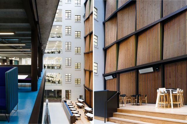
Re-purposed Oregon pine battens provide a veiled backdrop to the lifted podium of public café Home. Image: Jason Mann.
The building had fallen into disuse after its life as Defence HQ and the instincts and understanding of Wellington developer Maurice Clark that the interior could be de-cluttered, refurbished, sensitively made over and repopulated for office use have been spot on. While no stranger to similar projects, MBIE’s Nicola Bowler, General Manager Property, is herself still awed by the bringing together of so many people – 1,800 now under the one roof – as a result of the new life given to the site.
The experience of entering the building, via a cruciform-shaped entrance foyer, remains austerely understated. The character of the space has been fortified and enhanced – including by a new work by artist Rangi Kipa (Te Atiawa, Taranaki Tuturu, Ngāti Tama ki te Tauihu) in the form of a modern treatment of a ko-rupe, traditionally placed above a door-frame. It breaks with tradition in its bright-orange colour – used by Kipa to explore the concept of ‘te haeata’, the glow that heralds a new day, a new future.
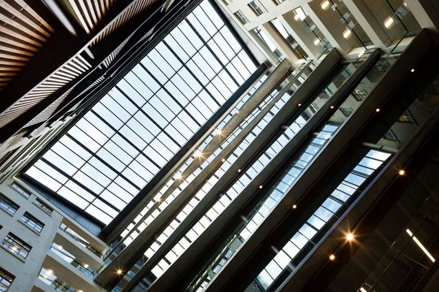
The eyes are then immediately drawn through to the glow of what Giera proudly describes as the building’s ‘new heart’, a former dead space and forlorn courtyard transformed into a light-filled, multi-levelled internal atrium, which is an unexpected, energising hub. It’s a space that certainly has what Giera rightly calls a “magnetic effect”.
MBIE’s welcoming and innovative reception module is “still at the historic axis of the building but not rigidly so,” and is placed directly opposite the thriving public café (known as Home).
Any resident ship-going public servant or passing visitor – be they a member of the public or a Minister of the Crown, for that matter – will suddenly find themselves brought into a teeming slice of activity, abuzz with the sounds of people meeting and greeting each other.
This is where the unexpected tangents of the building really begin to stack up. Even a brief encounter with this moving nexus of ground-level arrivals and departures, communication and conversation, sets a broader context with the mere act of looking up… and up.
Up to the ambient ‘back wall’: this features internally salvaged, re-purposed sets of Oregon pine battens, which provide 300m2 of acoustic absorption – all as a minimally gymnastic ballustrade, designed to beguile the eye.
Then the gaze moves up to the narrow side walls with their geometrically logical window frames and a uniform palette in keeping with the conventional bones of the building.
And, finally, another reveal: neither hub nor atrium, but open offices extended to engage on the very brink of the public space below, where MBIE employees above go securely about their daily business, moving at oblique angles akin to the edges of the glass-bordered floor plates.
What’s perhaps most striking about this space is the seamlessness of the interactions occurring within sight of each other.
David Giera: “The dynamic here shows that the business role that a building has can be multi-purpose… it can be bold… it can be lively.”
Originally commissioned as a ‘Departmental Building’ to house the lion’s share of the public service of the time, 15 Stout Street could be said to have come full circle.
Reflecting on results, Nicola Bowler says it has been heartening to witness the engagement with and the pride being shown by MBIE staff towards their new workplace, coupled with hoped-for effects such as the increased productivity of working on cross-agency tasks with colleagues formerly spread across five Wellington office towers.
The move reflects a growing momentum driven by the Government’s Property Management Centre of Excellence towards better accommodation solutions that bring value-for-money and, one way or another, align to Better Public Services.
Bowler: “(In our case) not only are New Zealand taxpayers saving $40 million over the next 20 years, but the visible benefits from our new home are adding up – things like a positive, open working culture in a building that has a classy feeling from its marriage of old and new, and that delivers a highly functional, highly enabled working environment”.
It may be obvious to say but if there was going to be a government agency ready and willing to be an exemplar for setting a new benchmark, it’s certainly fitting that it should be the Ministry of Business, Innovation and Employment.
This article was originally published on ArchitectureNow


 Indonesia
 Australia
 Philippines
 Hongkong
 Singapore
 Malaysia


