The Magic of Muted Colours: Why choose a muted colour palette?


What are muted colours?
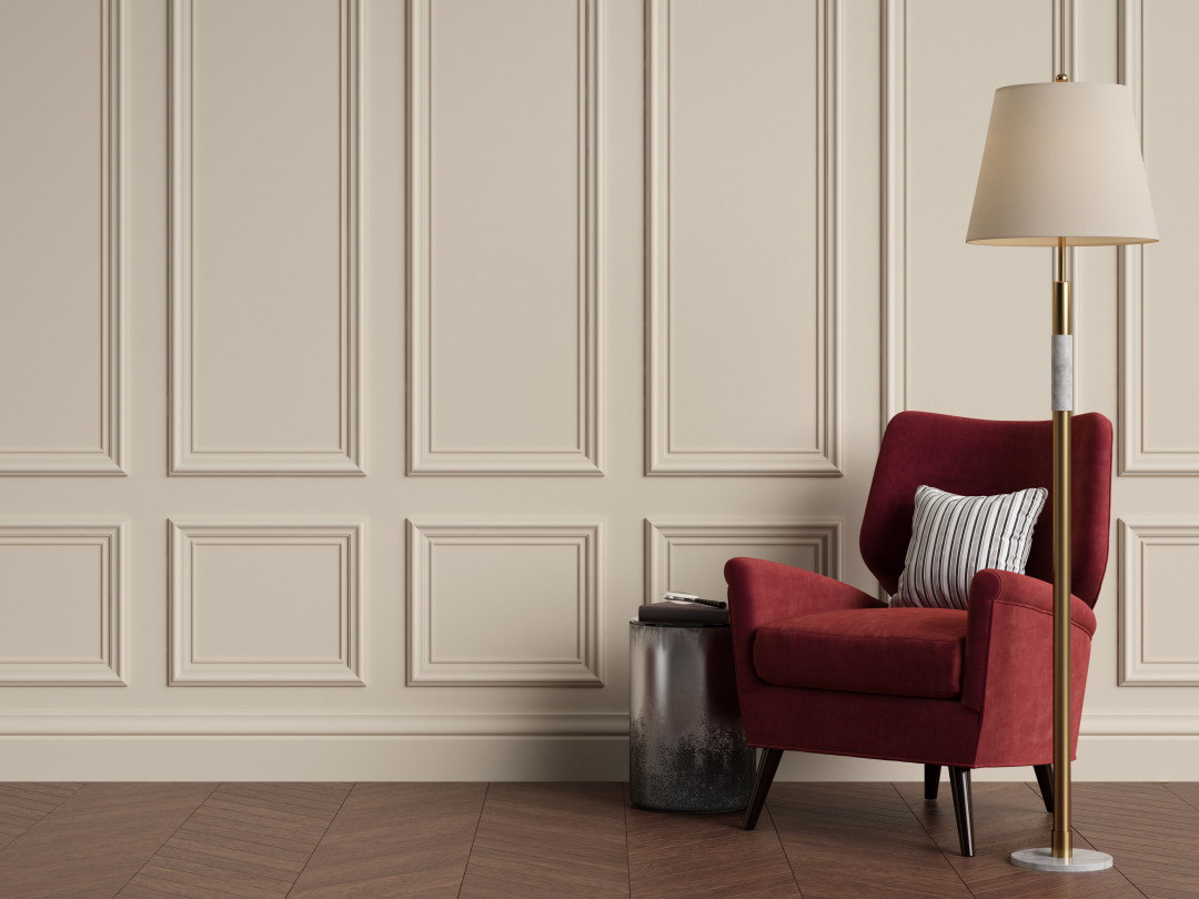
A muted colour is created by altering the tint, tone or shade of a hue or pure colour. For example, green becomes a muted colour when mixed with either white, grey or black, creating pistachio, sage and forest green respectively. To put it simply, muted colours are hues which have a low saturation.
Why use muted colours?
Do you enjoy using vivid colours and perhaps even flirt with fluorescent shades in your interiors, designs and art? Perhaps you love how these colours make you feel and revel in the bold statement they make. Well, muted colours can also have this effect when used strategically.
They focus your attention
If you love bright colours, you should love muted colours even more! Muted colours make vibrant reds pop, peacock blues sing and golden yellows shine. Bright colours are more effective when used in combination with muted colours as they are not competing for attention. If you have a vivid feature artwork or bold furniture piece, consider pairing it with complimentary muted colours to ensure that your visitors notice that expensive new purchase!
Image by Remuhin via Shutterstock
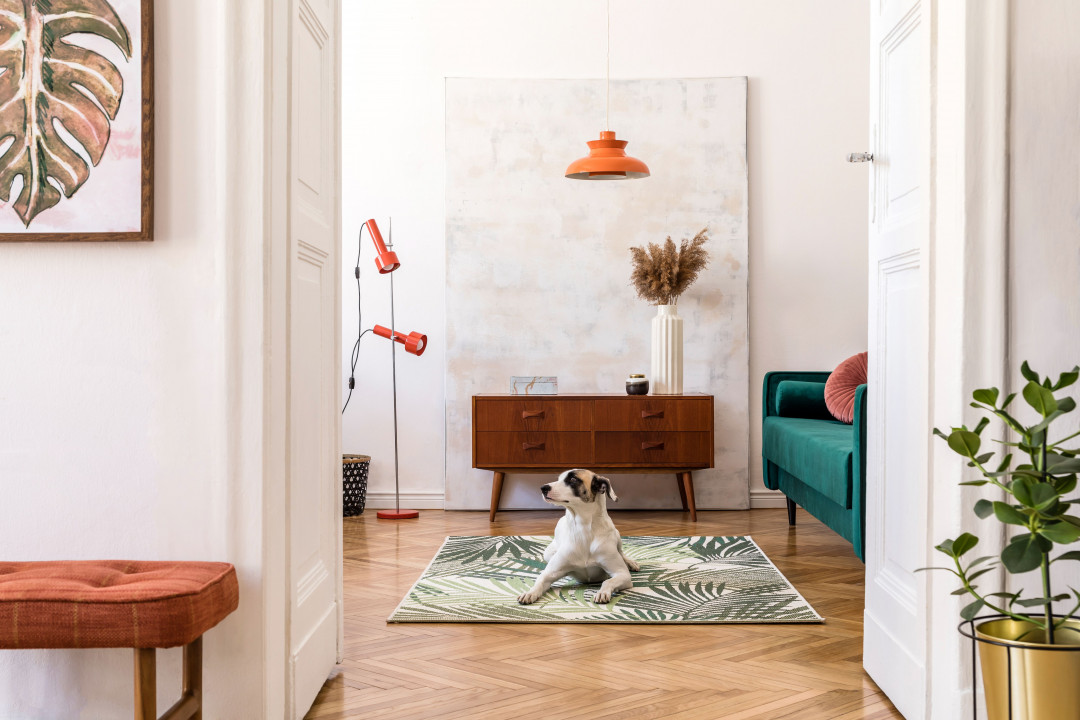
Image by Follow the flow via Shutterstock
They are calming
Like the soft glow of candlelight, colours too can alter the mood and atmosphere of a space. Muted colours are more soothing and calming, perfect for those spaces where you want to relax and unwind after a long day. Lime green might be great at work to help you feel energised but not so good when you’re trying to relaxing in your bathtub with a glass of wine at night. Did you know, several ancient cultures practiced Chromotherapy which is the use of colours to heal. This technique is still used today as a holistic or alternative treatment, emphasising the importance and impact of colour.
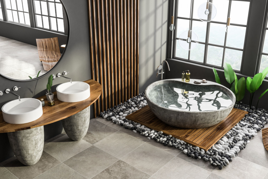
Image by ImageFlow via Shutterstock
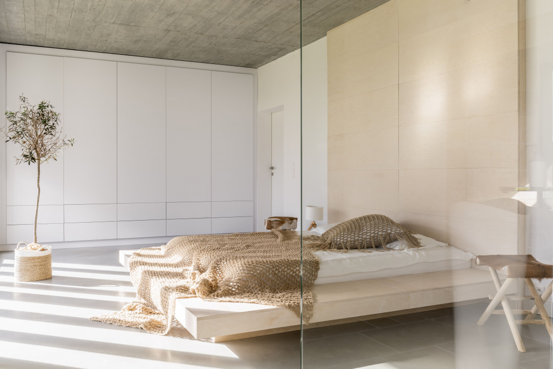
Image by Photographee.eu via Shutterstock
They Are Timeless
One of my favourite things to do is take a tour of celebrity homes. No, I’m not connected, but I do have unlimited data. Architectural Digest recently took me on a tour of Dita Von Teese’s eclectic and vibrant home. My gosh, it’s tempted to be inspired but be warned, paint and upholstery - not so easy or cheap to replace! Be careful when selecting trendy or vibrant colours and patterns as they are more likely to date.
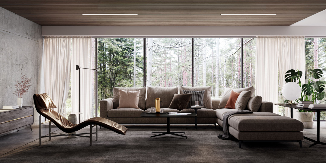
Image by Ilija Erceg via Shutterstock
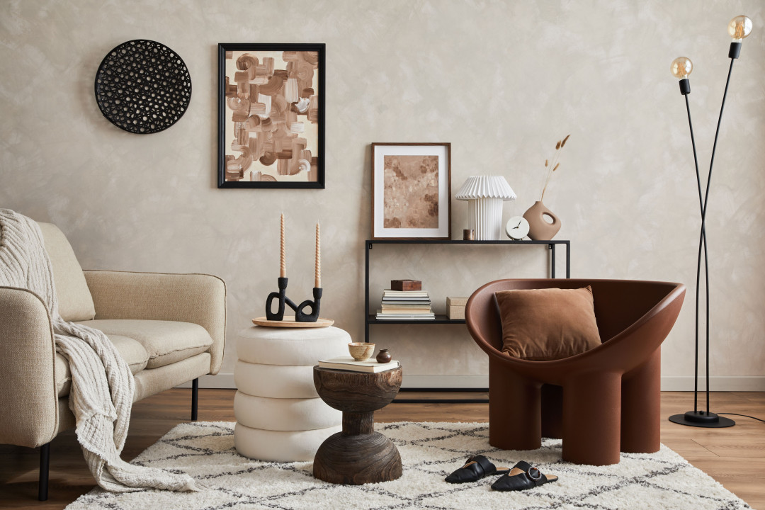
Image by Follow the flow via Shutterstock
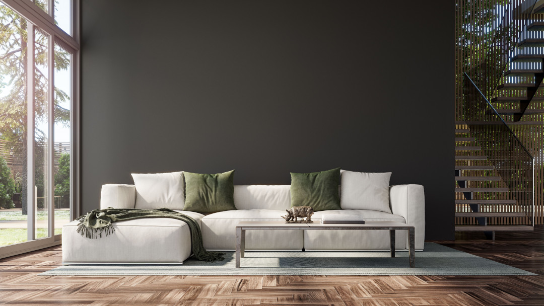
Image by Ilija Erceg via Shutterstock


 Indonesia
 Australia
 Philippines
 Hongkong
 Singapore
 Malaysia


