Te Pātaka Kōrero o Te Hau Kapua: Devonport Library


At last, the seaside suburb of Devonport has a new library after many years, many reports and many meetings. The site is the same as that of the old library and the one before that: a short walk from the ferry terminal, on the edge of a reserve, at the corner where the main street and the marine parade meet. A library has been there for as long as has Devonport.
It was originally the site of Edward Bartley’s Council Chambers, built in 1886: a building that included a public reading room. In 1954, that was knocked down and replaced by a public library, which was extended and amended over the years until no more could be done. After much local government politics, a firm decision to replace the library was made and an open competition held. Athfields won.
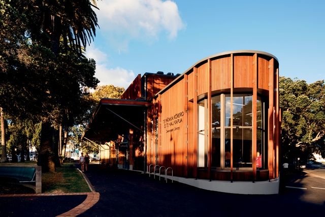
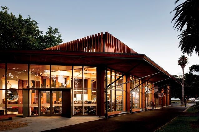
A bold curve of red-cedar cladding and glass squeezes the building into the corner of Victoria Road and King Edward Parade. Image: Jason Mann.
The design, made by a team led by Jon Rennie, is bold in that it makes no concessions to the town. In modern public architecture, context is everything and, usually, buildings are weighted with history – references to previous uses of the site and to the buildings that surround it.
A report prepared in 2010 by Salmond Reed recommended just that – a building that would reflect the vocabulary and design elements of the shops in Victoria Road on which it stands. Athfield Architects would have none of that.
Instead of a design that looks for context in the street, Athfields’ building belongs to the trees. While architects and councils were building and rebuilding on the site, Phoenix palms planted to the front were growing, as was the Moreton Bay fig tree to one side, the po-hutukawa to the other and the plane trees at the back, among others.
The new library nestles among these palms and trees. Clad in North American red cedar, it has no truck with the painted and plastered buildings of the main street: it is a building that, visually, is in the town but not of it.
The building has two main parts. Facing the street is a glass box of double height that contains most of the bookshelves and the lending area. Attached is a two-storeyed block with timber-clad walls and windows to the park; this contains the library office and the children’s library on the ground floor and reading areas above. An open staircase connects the box to the upper floor of the block.
Inside, the box mostly serves for shelving books, while the block mostly provides spaces for reading them. The library has many reading spaces – window seats and comfy chairs. It also has two fireplaces, a lot of art and a cat. It is something of a domestic setting. It is inside and in the domestic that context can be found.
The box has a clerestory, like so many modernist houses of the 1950s. The ceiling of the block is a wide, low-pitched asymmetrical gable of the kind found in the Group Architects’ First House and many other modernist houses of New Zealand. Its panels suggest the tin ceilings of Victorian houses.
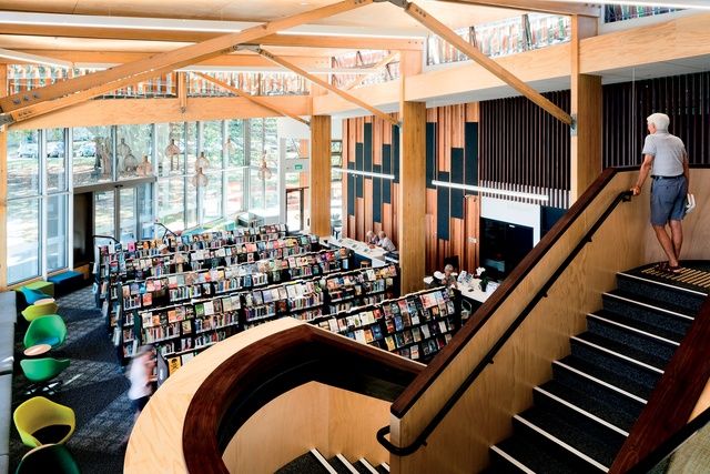
A staircase leads up to the mezzanine and looks out to exposed glue-laminated pine trusses over the double-height library ‘living room’. Image: Jason Mann.
Downstairs, there is a wall of boards painted white and another that looks creosoted. It seems the architects, rather than make an outward public show of context, imitating the shops of Victoria Road, have chosen to make associations with the domestic interiors of the region. The lining of the interior in pine plywood panels, also, is reminiscent of the Group and of their contemporary, Dick Hobin, who designed a house in nearby Mays Street with both plywood panels and the asymmetric gable. Possibly, the double-height box and the open upper floor are intended to evoke the Rotherham House in Stanley Bay.
Devonport is home to many architects, so references to architectural homes are not out of place here. This library might be a place for free architectural association. Perhaps something can be read from the exposed glue-laminated pine trusses that support the main ceiling. Perhaps the single metal pole, painted white, that confronts the visitor in the main entrance alludes to the post supporting a carport that Nikolaus Pevsner described as “crude” and Bill Toomath and Allan Wild defended as “straightforward”.
Then there is the large circular window, with a sill wide enough to lie in, that dominates the room for teens. This surely must refer to the sort of element, something that can be enjoyed by children, to be found in the houses Ian Athfield designed in his early career. It is perhaps an homage to the founder of the firm and his own home.
For this is the first Athfield building after Athfield. It was designed by his firm and it was opened two weeks after his death. A lot will be read into it about how the firm will continue. But also, a lot of reading will be done in it.
This article was originally published on ArchitectureNow


 Indonesia
 Australia
 Philippines
 Hongkong
 Singapore
 Malaysia


