Erskine House


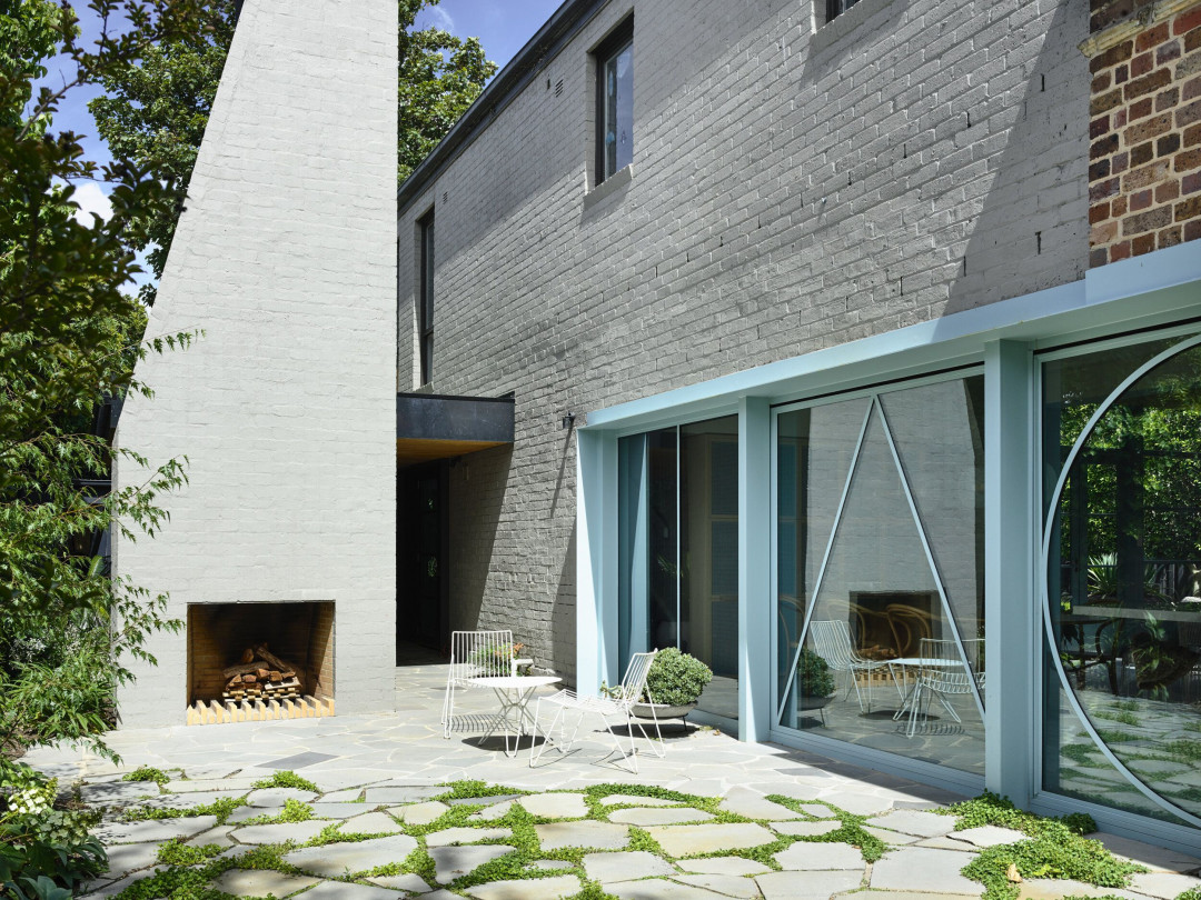
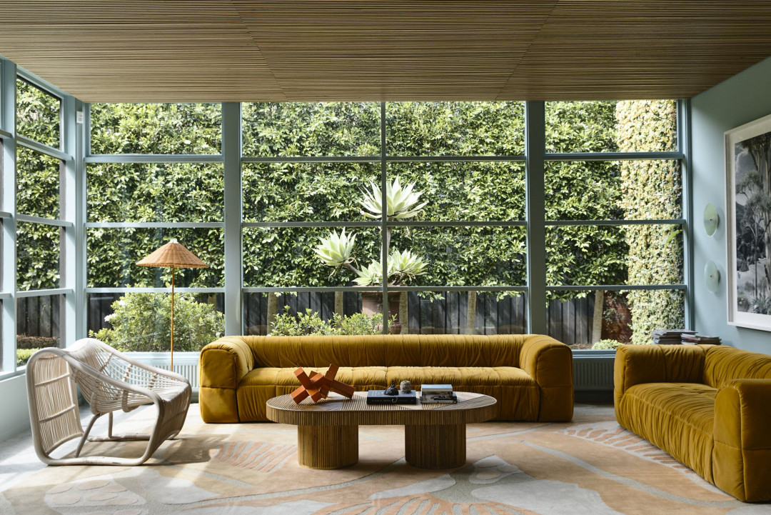
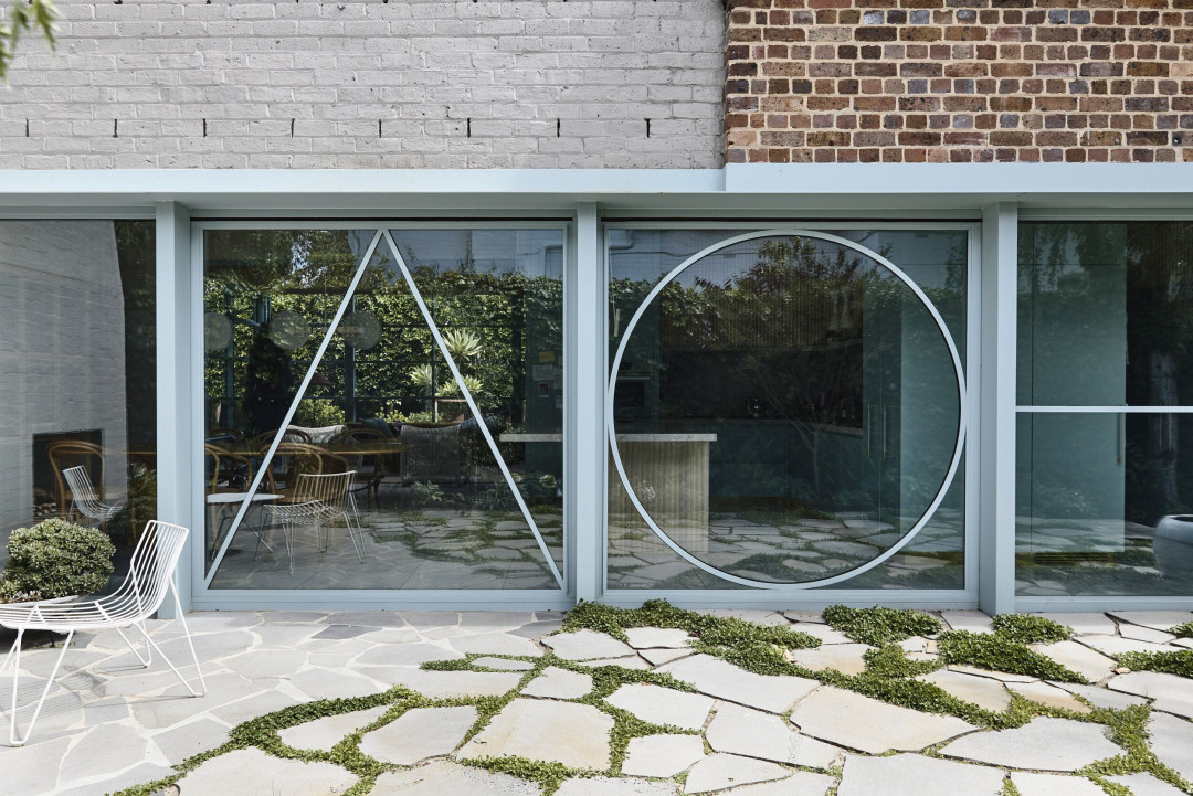
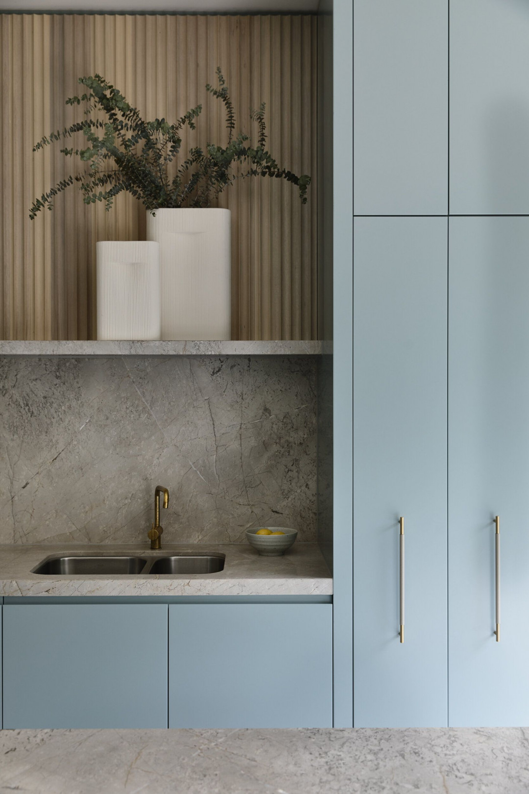
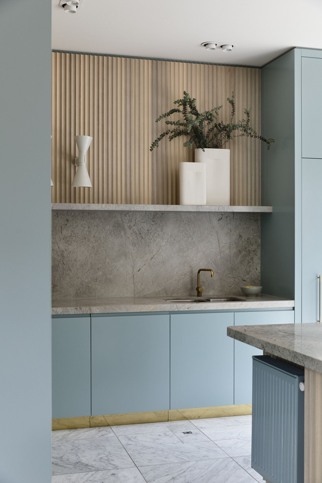
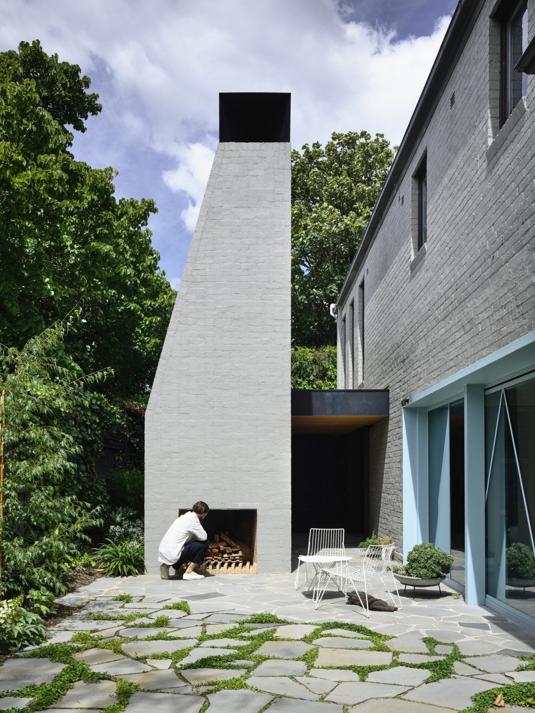
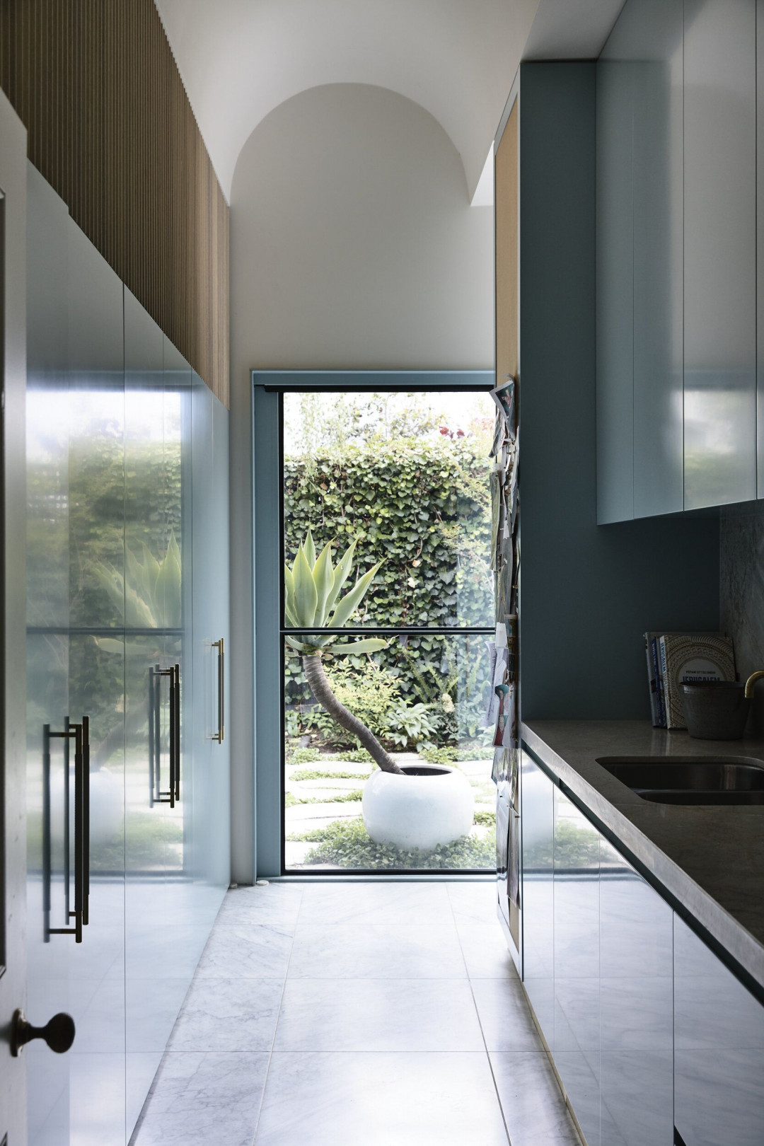
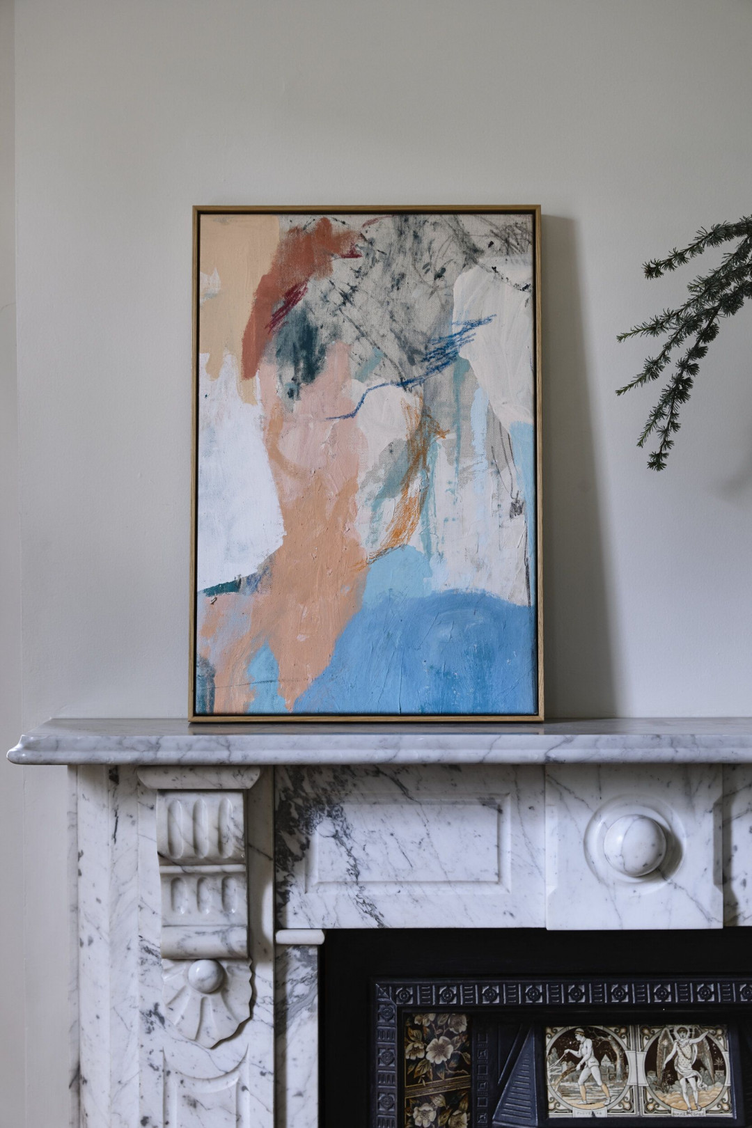
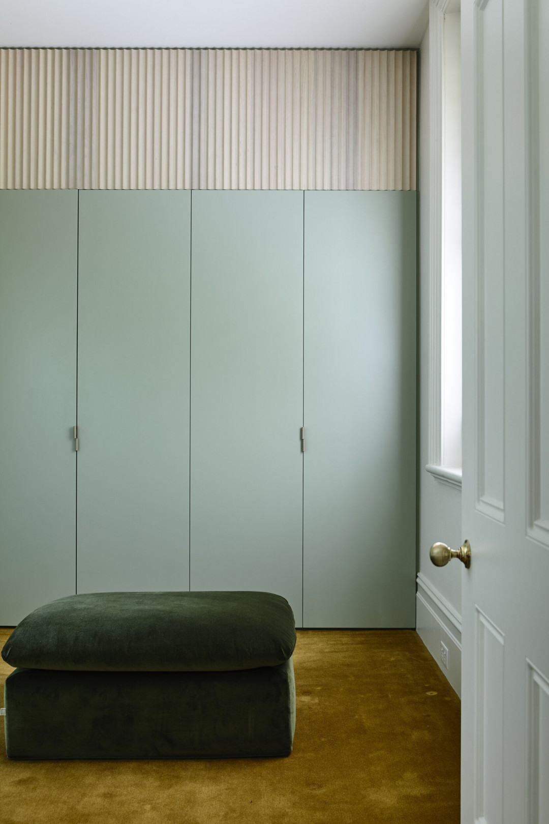
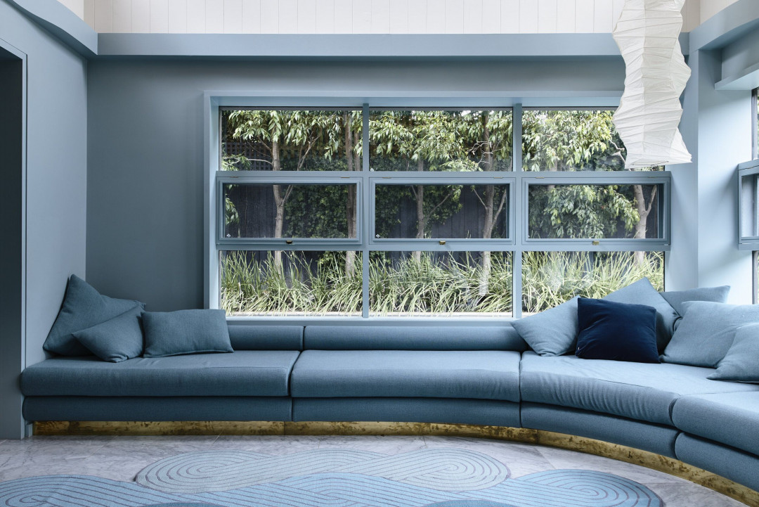
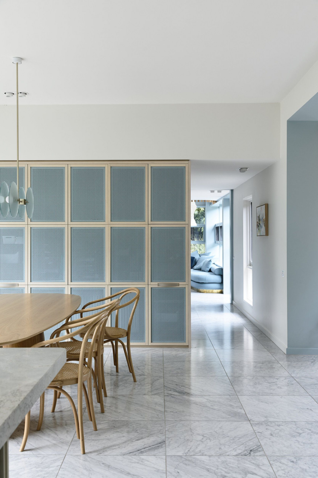
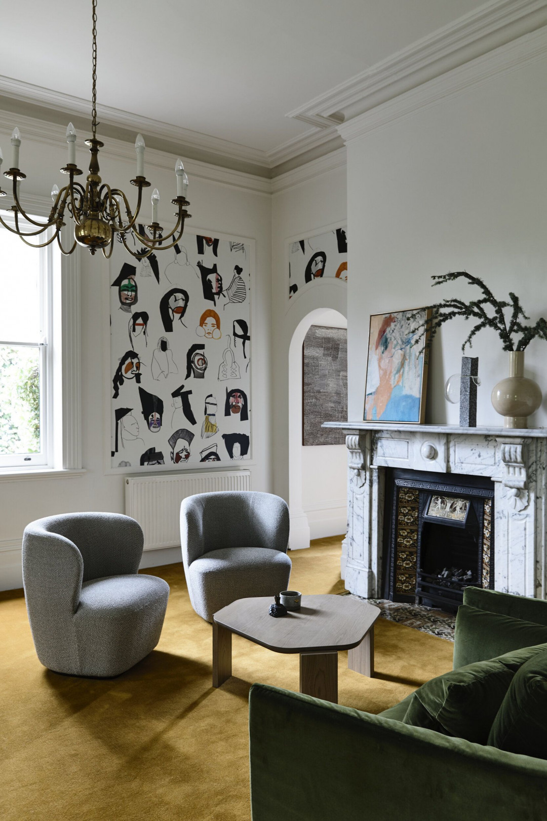
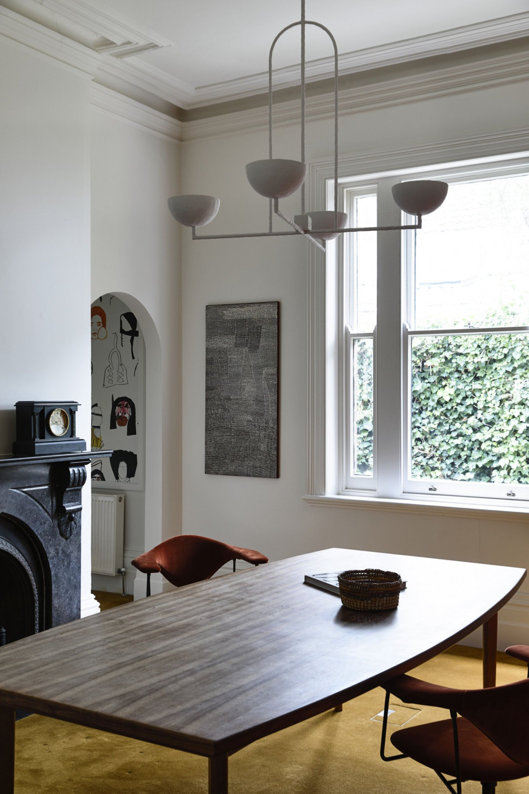
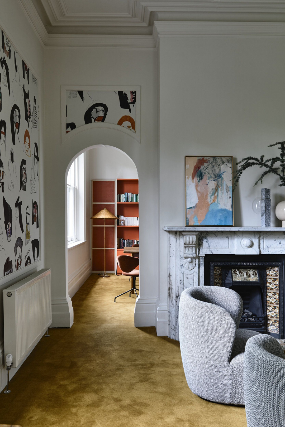
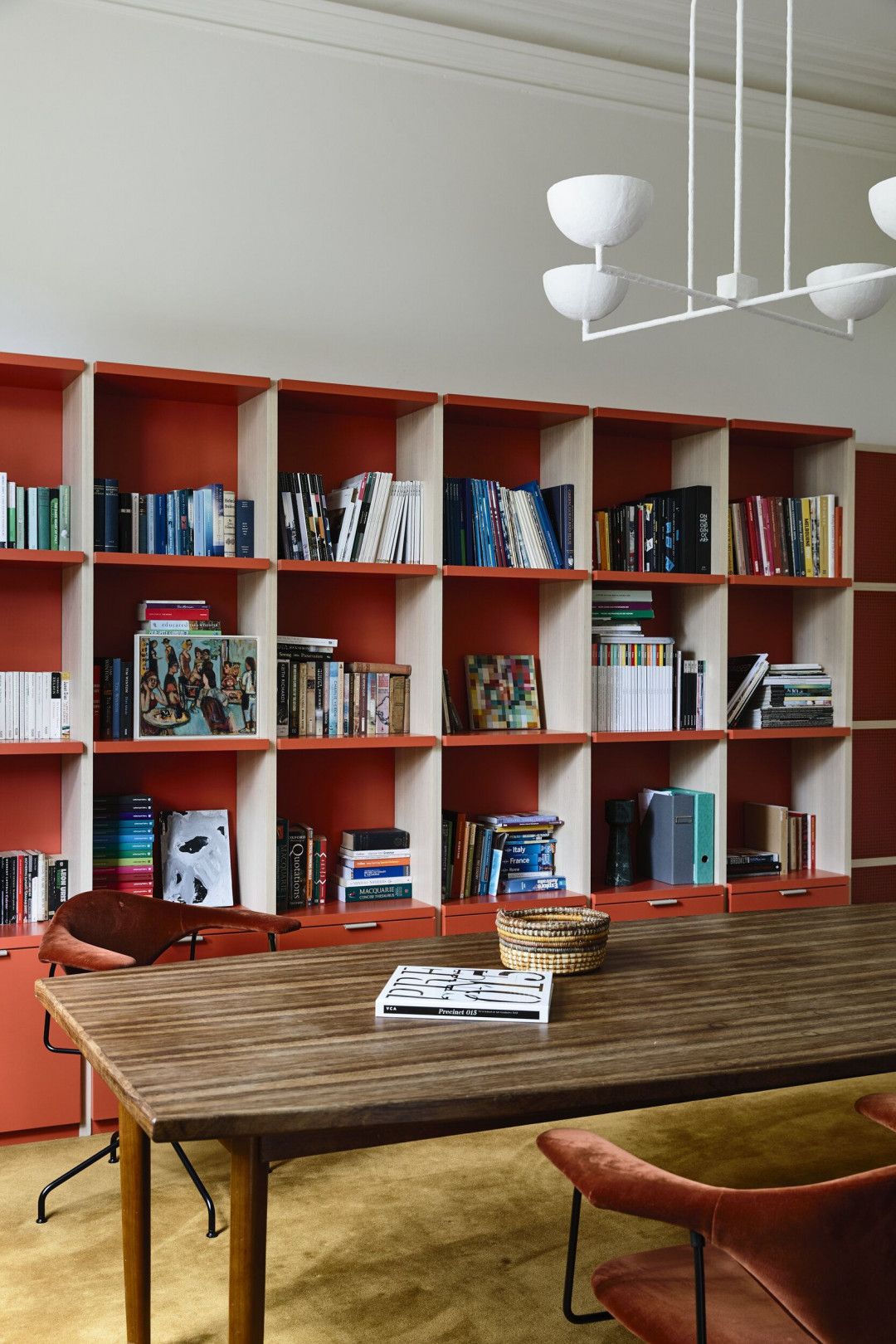
Another important task was to unify the house visually and make a connection between disparate design expressions – high Victorian, high eighties and pragmatic spatial extensions. Finally, we identified an interior strangely disconnected from the garden. We started with a colour palette which defined a particular mood – cool, quiet, but with some intensity and playfulness. Once we had established the palette, we felt we understood the personality of this house, which meant we could interrogate this personality to answer all our design questions.
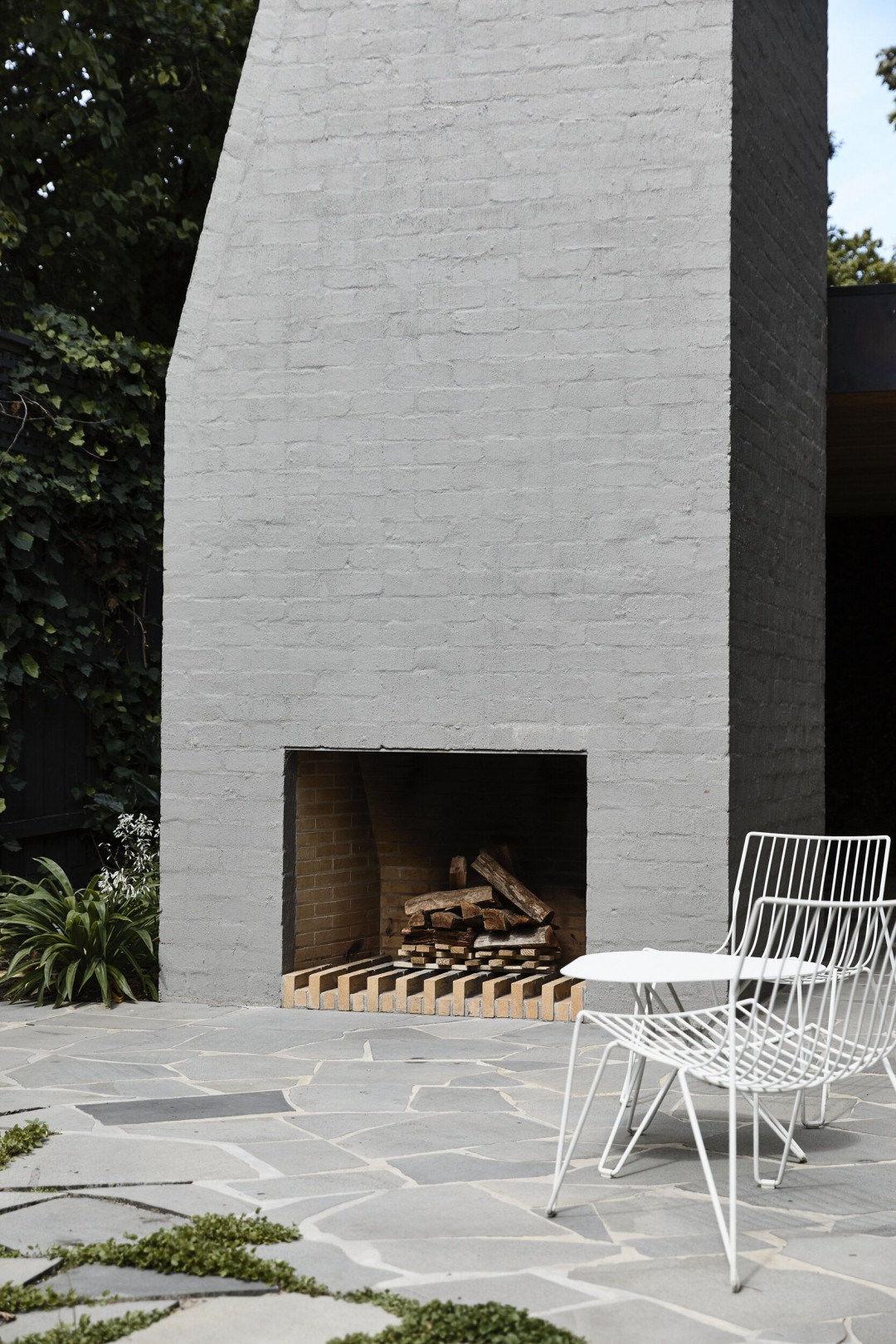
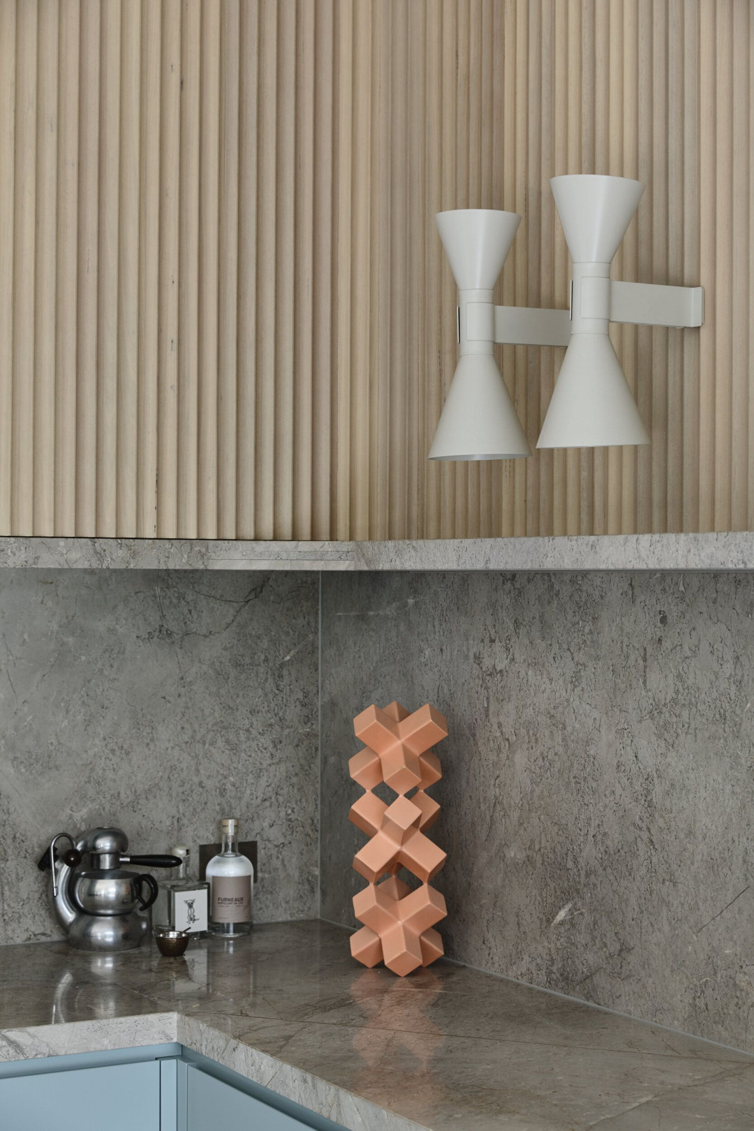
The various elements of the house now feel like parts of a single expression. The palette, combined with an emphasis on textured materials, playful platonic shapes and a disciplined, coordinated layering approach to furniture and lighting has resulted in a family house which is comfortable, light, connected to its garden, and a sophisticated setting for playful grown-ups and serious children.
.jpg)
This article originally featured in kennedynolan.com.au


 Indonesia
 Australia
 New Zealand
 Hongkong
 Singapore
 Malaysia


