Open Spaces Adds a Spacious Look on Bias House


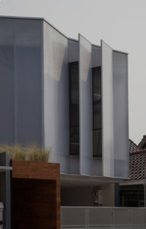
Bias House is a home for a family of four in Sleman, Yogyakarta. The site is located in the hook of a square land of 29 x 29 meters with a building measurement of 21 x 16.5 metres. Thanks to the paddy fields landscape at the back of the land for beautiful natural scenery and good airflow into the whole building.
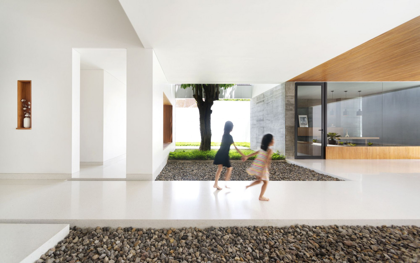
As the initial project brief is to have a lot of open spaces yet privacy at the same time, the architect, Adria Yurike Architects, started the design by classifying space programs that are detached from one another and put a spacious area in the centre of the building.
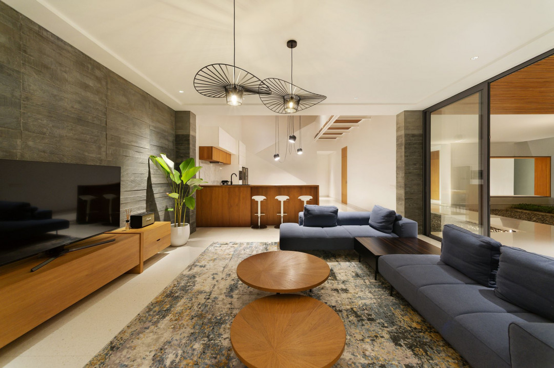
The building structure is seen as a box within a box with a little opening to the exterior facade. On the contrary, the rooms inside of the building have a sense of openness within each other and are centered on the semi-outdoor terrace in the middle of the house.
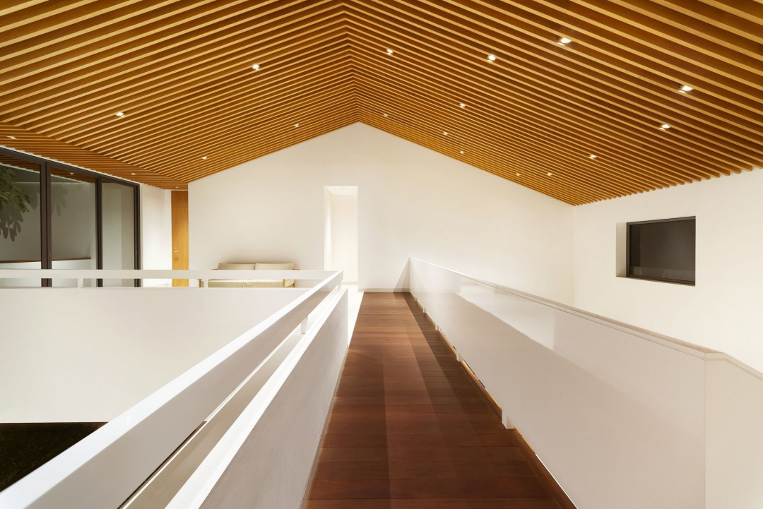
Some voids connect the multifunction room on the upper floor to the interior and exterior of the first floor to create the impression of openness and spaciousness on the second floor. The family room, dining room, study room, and all the bedrooms, made it possible for the user to breathe fresh air and access the natural light while doing their daily activities around and in the house.
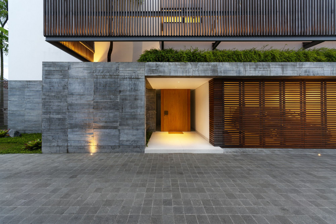
Second skin is applied to protect the interiors from heat radiation from the west side to respond to the tropical climate. The ironwood material is stacked vertically in front of the openings and garden voids that are facing west.
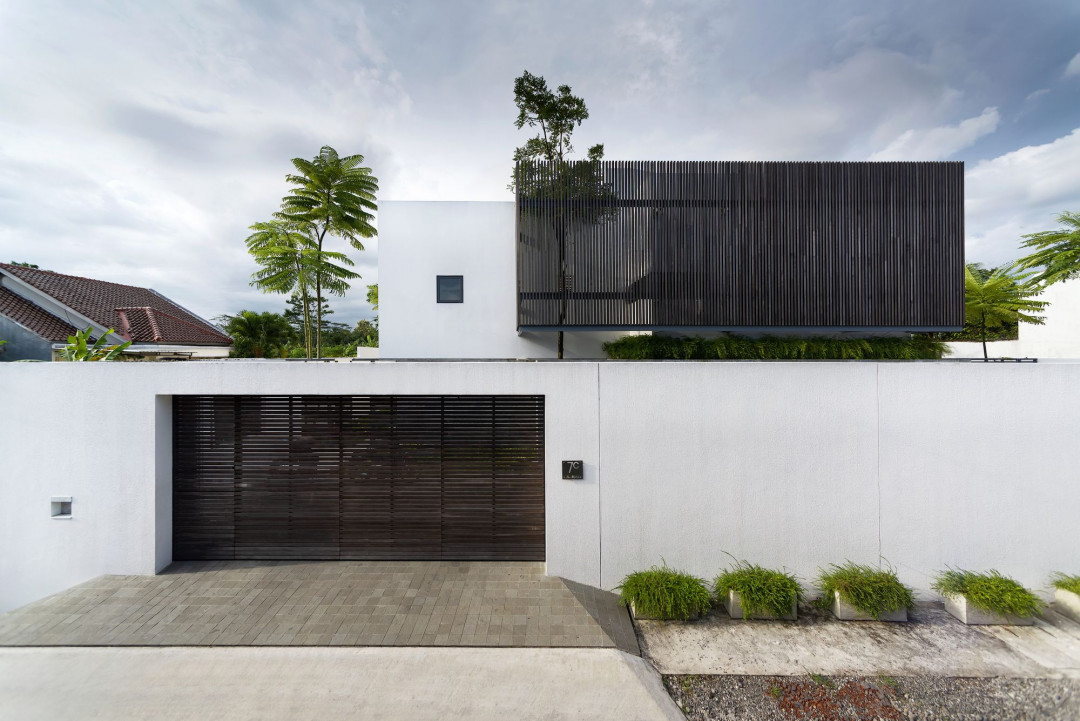
The design plays with additive and subtractive transformation, vertically and horizontally, for natural lighting and air circulation. Besides, it also creates an impression that the rooms are more connected and spacious.


 Indonesia
 Australia
 New Zealand
 Hongkong
 Singapore
 Malaysia


