TA House, A Practical Living Space in Monochromatic Tones


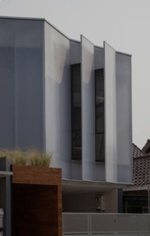
W+W Design Studio completed a challenge to modify a developer-constructed townhouse into a compact living space to accommodate the young executive lifestyle by designing an optimal layout and reducing unnecessary spaces.
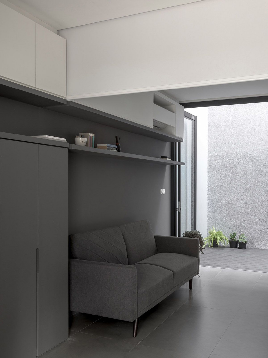
The guest bedroom on the first floor was removed and the pantry/kitchen was repositioned to the front of the house; leaving space to add large folding windows and an extended garden at the rear that becomes the focal point of this house.

The living room can be turned into a more private room for relatives/family staying, utilising a roller blind to separate the living room and entrance foyer area. The living room being shifted to be in closer proximity with the backyard also creates a special relationship between the indoor and outdoor spaces.

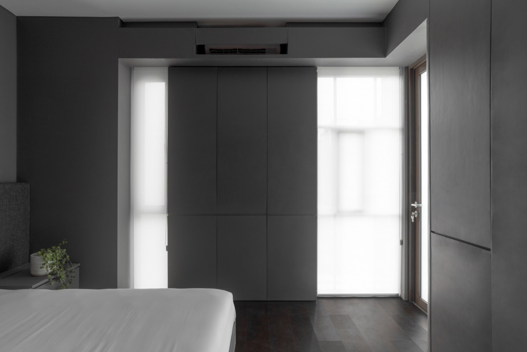
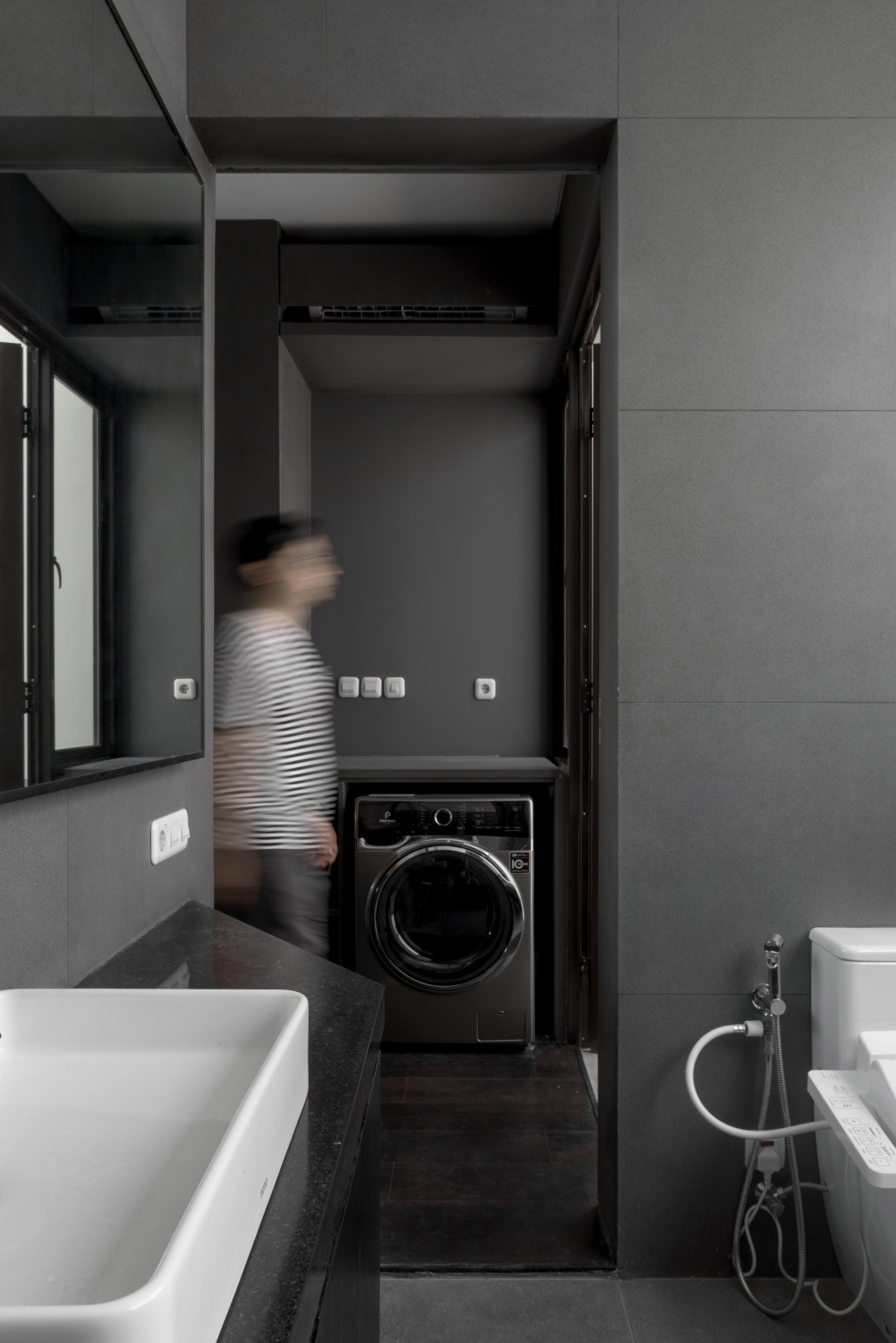
A penthouse unit is on the second floor. It comprises a master bedroom at the front; a walk-in closet with integrated laundry along the corridor; and a spacious master bathroom transformed from what was previously a kid’s bedroom facing the backyard. A large window opening to the rear brings in the backyard greenery, making it feel like part of the bathroom.

The living space becomes a canvas to celebrate the sunlight and dancing shadows from the trees outside that transform and move over time. Dark and monochrome colour tones and textures of the interior walls are applied to the built-in furniture to present a clean and crisp look. The band of the white colour is placed just above head-level to maintain the proportion and balance of the room.


 Indonesia
 Australia
 New Zealand
 Hongkong
 Singapore
 Malaysia


