Anti Office


.jpg)
.jpg)
Concept and Context
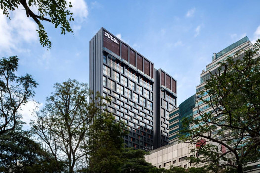
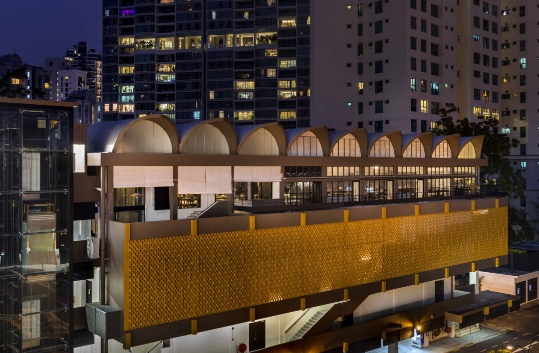
The site is a former school compound which was built in the 60s. The school was vacated in 2001 and the building was subsequently converted into a commercial development in 2013.
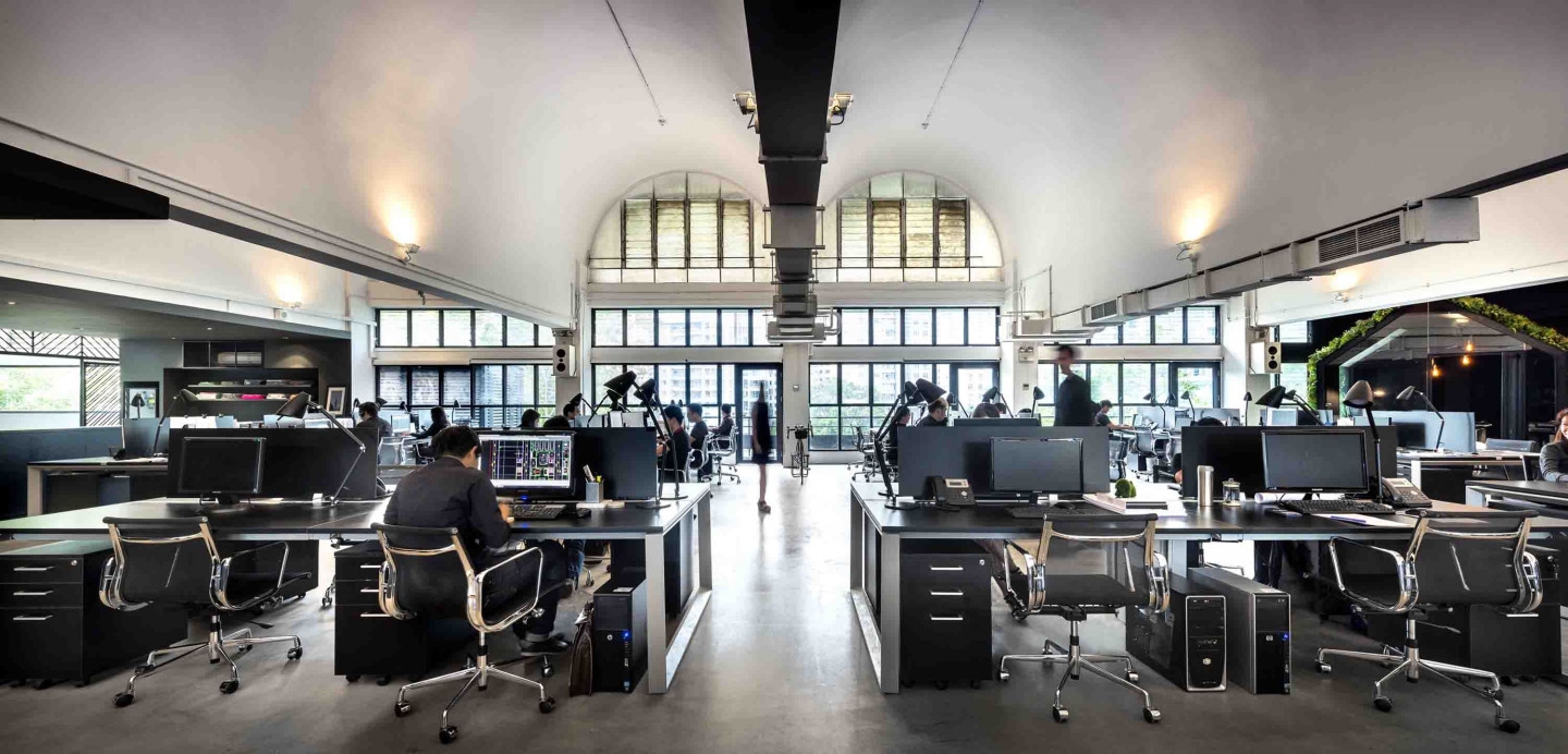
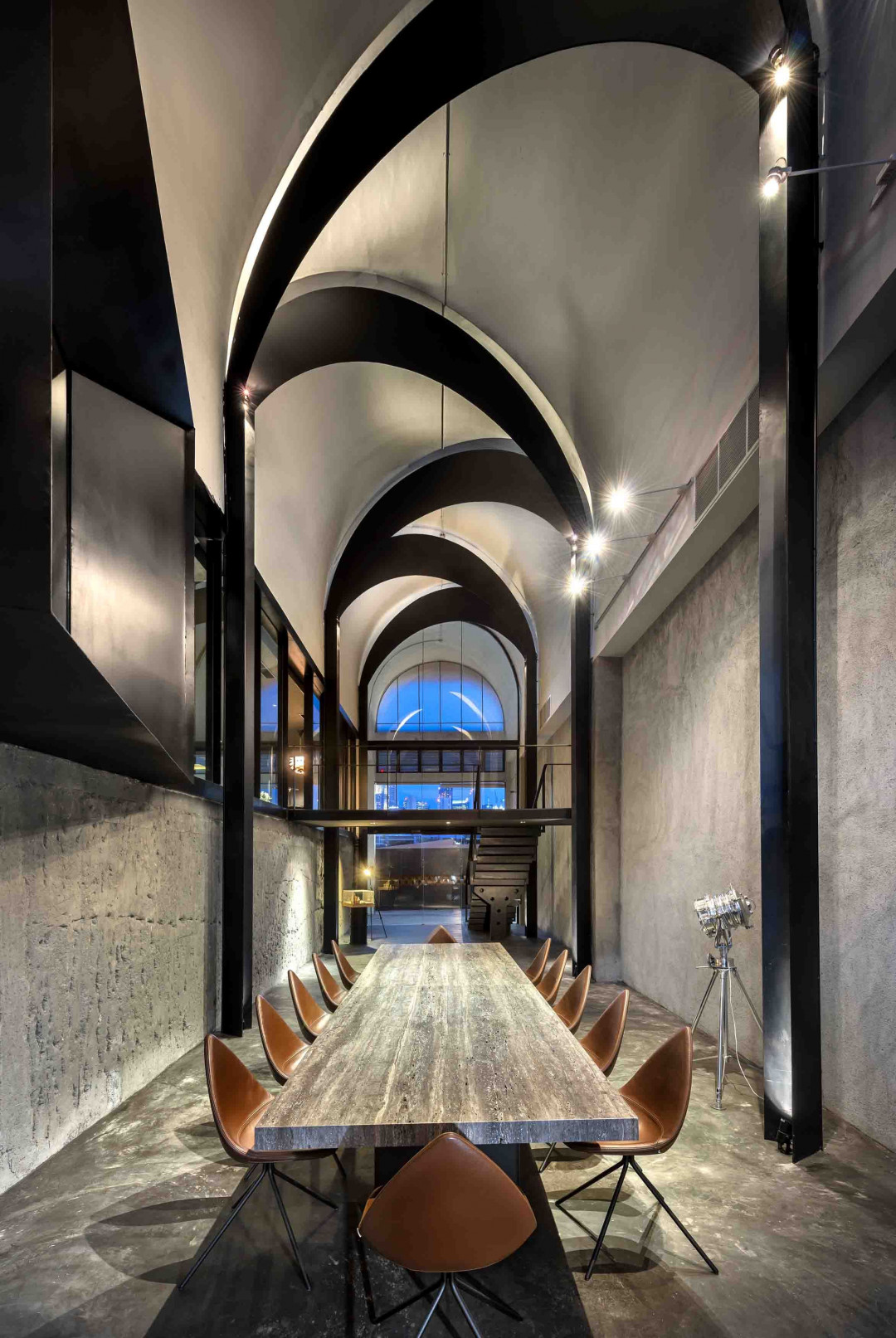
The premise is located where the old library hall used to be. Situated at the highest part of the building, it contains an expanse of column free space crowned by a series of barrel vaults.
Louvre windows that extend from floor to arch allow natural light and air to flow through in abundance.
Even though the existing space was taken over in a derelict state its immense potential was immediately recognised. Like Kahn’s brick, the space was articulate in what it wants to be, which provided the point of departure for the project.
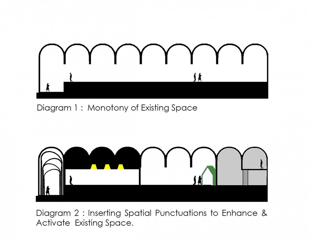
Seeking to celebrate and activate the intrinsic qualities of the existing space, the scheme is conceived as an orchestration of varied and contextually sensitive spatial experiences instead of the function-centric approach typical of office design.
It dovetails with the design direction, which rejects the rigidity of the typical bureau in favour of a creative environment that challenges conventions and celebrates informal spaces – an Anti-Office.
This approach creates seamless informal spaces where functional boundaries become ambiguous. The resultant plethora of physical settings accommodates the manifold activities of an Anti-Office fluidly.
Prelude
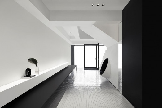
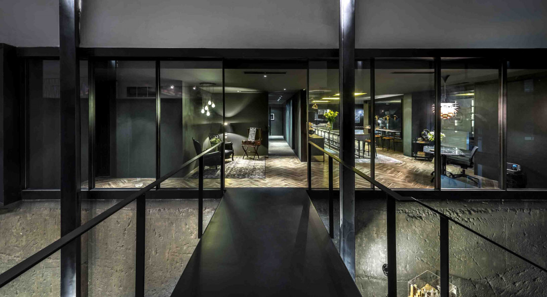
The journey begins at a triple volume high initial bay that was originally a run-down corridor leading to the common toilets. It is now home to a grand entrance foyer that contains conference and gallery space.
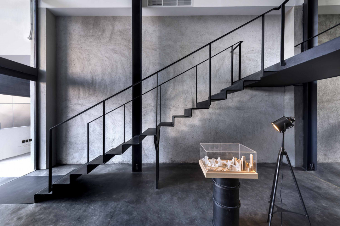
A black steel staircase, which connects to the guest lounge above, is located at one end of the elongated space. An existing metal screen that was restored and retained in its original location and marks the opposite end. The meeting table punctuates the space in between while a green wall at the far end of this visual axis leads the eye through.
The strategic placement of objects and furniture in foreground, mid-ground and background allows the full depth of the space to be read while a series of black arcs that criss-crosses between two offset rows of V-section steel posts accentuates the curvature of the white ceiling.
These two simple gestures, namely the placing of visual cues and highlighting the ceiling, not only introduce the qualities of the existing space but mark one’s arrival with a subtle sense of occasion as well.
To reinforce this narrative, the plaster finish of the existing wall was stripped - almost archaeologically – to reveal the timeless texture of the original concrete structure.
Warm Darkness
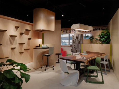
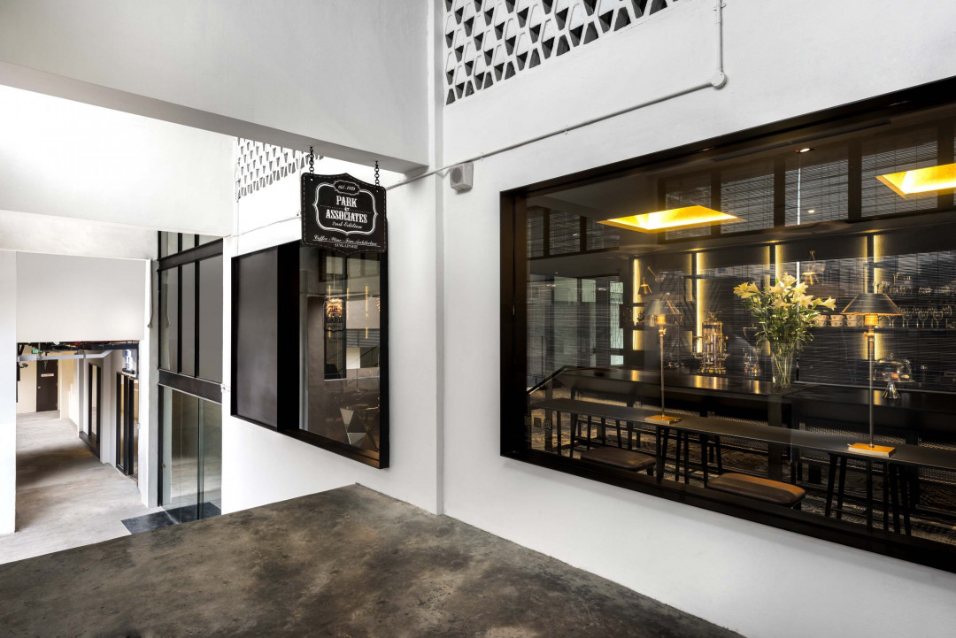
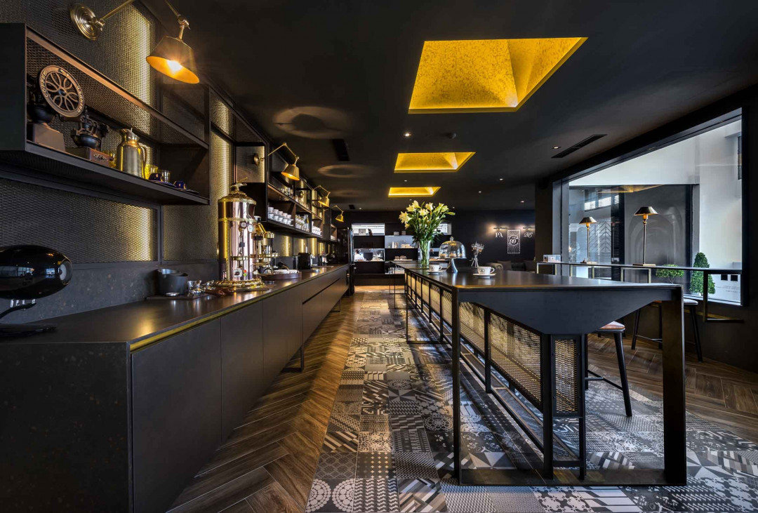
A short flight of steps leads one onto the social heart of the office. Here, instead of hiding the conventional pantry area as a “back-of-house” it is celebrated as a hip café – informal and inviting.
The ceiling of this space is deliberately lowered to create a compressed space. This play of spatial volume punctuates the journey with a pause and helps to focus one’s experience of the barrel vaults.
A series of golden lighted ceiling coves blanket the dark space with warm light. This perceived warmth is enhanced through the tactility of the rough plastered wall, textured timber flooring and printed tiles.
The intimate scale of the space and material palette creates a cosy and relaxing environment which enables it to comfortably host a variety of functions – reception, guest lounge, casual events and informal discussions.
The Open Platform
The ensuing juncture releases into a wide column-free space framed by several bays of barrel vault ceiling. Abundant light flows through the ceiling high glass fenestrations on both sides of the space. The main productive space coincides here to take advantage of the light and space.
The rational and orderly insertion of furniture and mechanical equipment takes on a neutral but complementary stance so as not to distract from one’s reading of the space.
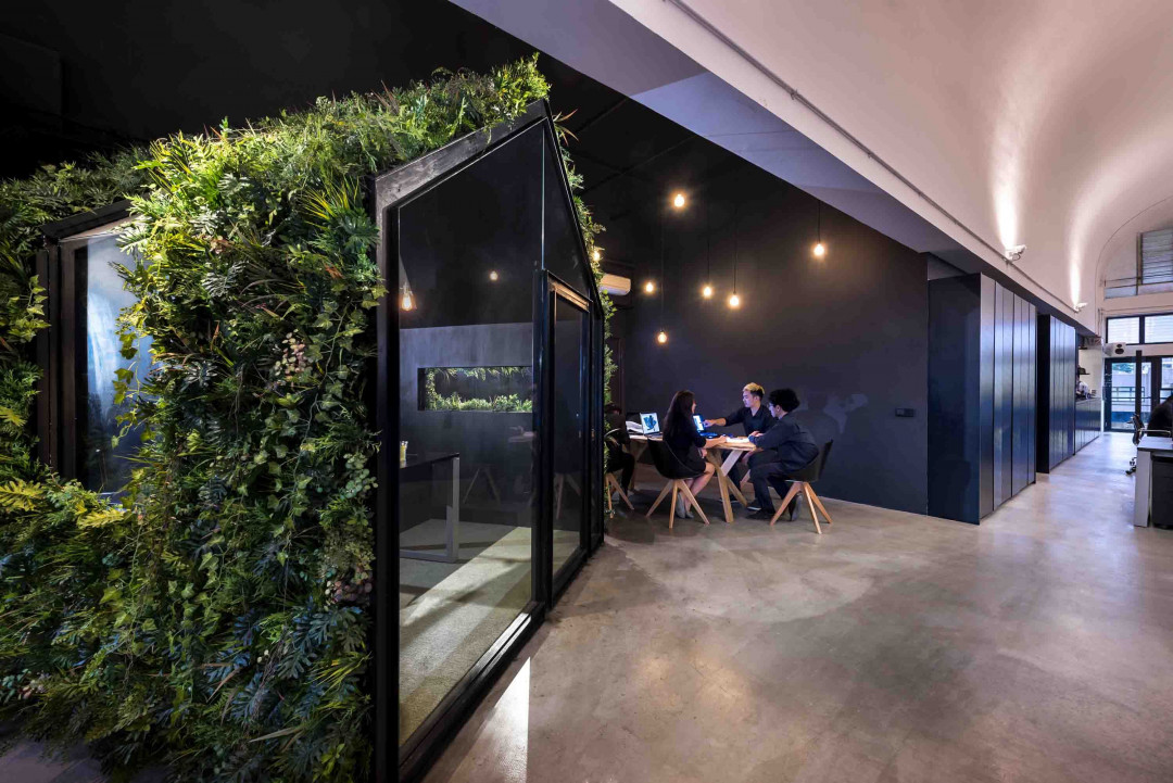
At a corner in this open platform, a green house – the director’s office - stands quietly. Designed as an objet d’art, it provides an interesting visual anchor as well as addresses the final bay of barrel vault in a subtle manner.
This article originally appeared in parkassociates.com


 Indonesia
 Australia
 New Zealand
 Philippines
 Hongkong
 Malaysia


