Beijing Wanhao Century Center


Nine Concepts
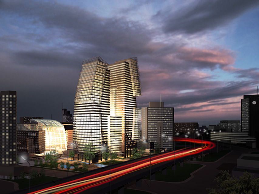
With its rapid transformation into a 21st Century world city, Beijing faces extraordinary challenges and opportunities. The Wanhao Century Center offers the opportunity to demonstrate how contemporary architecture can meet this unique set of conditions, while bringing exceptional value and prestige to an important new project. With its very auspicious location in the city, Wanhao Century Center can become a fulcrum, a turning point between the past and future, between the grand scale of the Capitol City and the unique diplomatic districts on either side of the site, setting an important example for new development in Beijing. To achieve this challenging program we offer Nine Concepts, based on the principle of Yin-Yang, the dynamic balance of opposites:
Landmark and Gateway
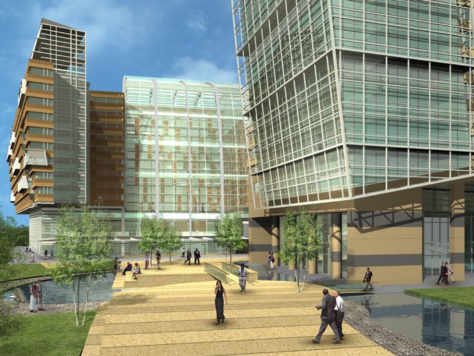
The powerful form of the paired office towers marks both the site and its surrounding district on Beijing’s Third Ring Road. At the street level this gateway quality is continued by the park-like treatment of the open plaza at the corner, providing a welcoming gesture, a place of gathering and arrival for the neighborhood and the Center itself.
Activity and Rest
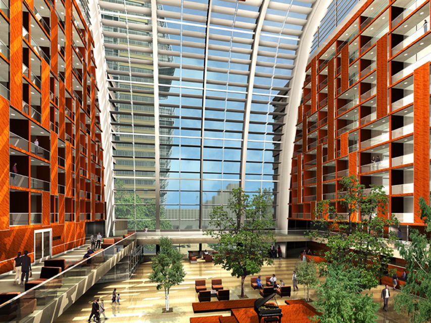
The program for the Century Center includes a lively mix of commercial and public activity. The design of buildings and site enhances this activity by focusing office entry, hotel entry, and retail activity as a sequence moving from all four sides into the center of the site. The focal point of activity is the Hotel’s Garden Court- a beautiful, glass-enclosed volume oriented toward the corner plaza. Surrounding the Garden Court are the inner set of hotel rooms with a warm pattern of wood paneling and balconies.
Center and District
The Century Center provides multiple connections, both visual axes and lines of movement, to link the central place of the project with its surrounding district. The special geometry of the site and the streets around it are brought into and through the planning of buildings and landscape, capturing the energy of this unique urban place.
Horizontal and Vertical
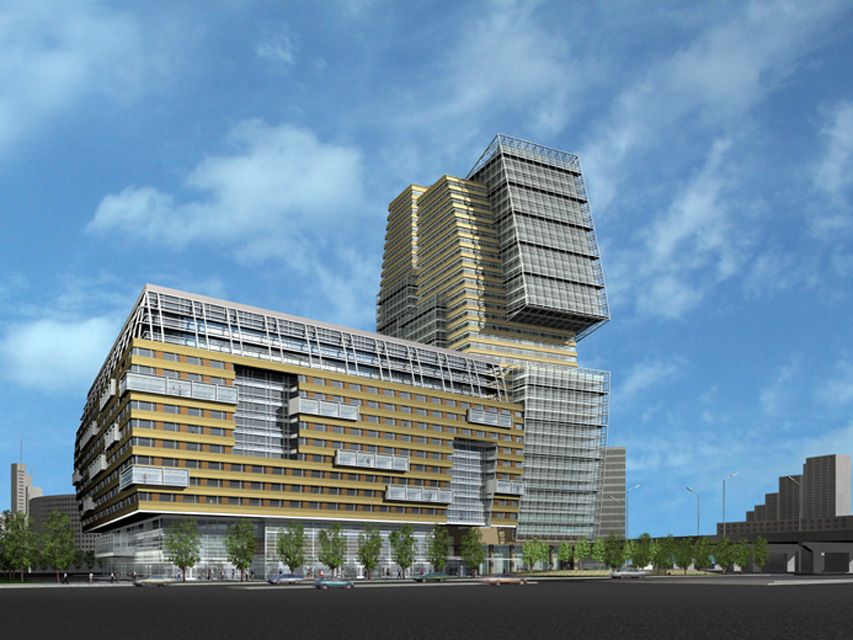
The massing of the Century Center’s architecture creates a clear distinction between the verticality of the office towers and the horizontal proportions of the hotel. Changes of plane and volume on each building reinforce the theme. On the hotel horizontal bay windows and a strong division of base, middle, and top floors help to express the different parts of the complex program, and keep the horizontal texture of the facades. The office towers are boldly formed with a base shaft of stone and glass bands, from which large vertical volumes of metal frame and glass are suspended and appear to move up towards the sky.
Curved and Straight
Both the buildings and the landscape play straight-line geometries against soft curves. This formal yin-yang concept is grandly declared by the office tower, with its nearly-symmetrical curved volumes of glass giving the towers a memorable profile. The curved profile is picked up by the hotel with the raised volume of the rooms. A languid curving line, like the meander of a stream, is woven through the landscape of the site as well, beginning as the edge of land and water, and continued as a series of lanterns lighting the paved plazas and walks through the site. Against this gentle curve the rectangular grid of terraces sweeps over the land, passing into and through the entrances to hotel and offices.
Solid and Open
Like the great rock formations of China’s classic gardens, the solid, sculptural form of the office towers and the hotel heightens our awareness of the open space between and around them. Within the mass of each building, this balance of solidity and openness is continued with the mix of stone and glass and the even more open framework of sunshades which add a lacy texture at the edges.
Office: Tower and Window
The office towers each function as separate buildings, with separate cores and systems, but are also joined on the lower floors. The bridge floors offer the chance for much larger floor plates, which is increasingly desirable in modern commercial developments. Above the bridge floors, the space between the towers suggests a monumental window oriented to the grand arterial of the Third Ring Road. On this same axis, entry to the towers is from both sides, to a central lobby, where the parking elevators also arrive. Shared facilities such as video conference suites, a café or cafeteria, and the bridge link to the hotel’s fitness center provide common amenities with greater efficiency.
Hotel: Wall and Court
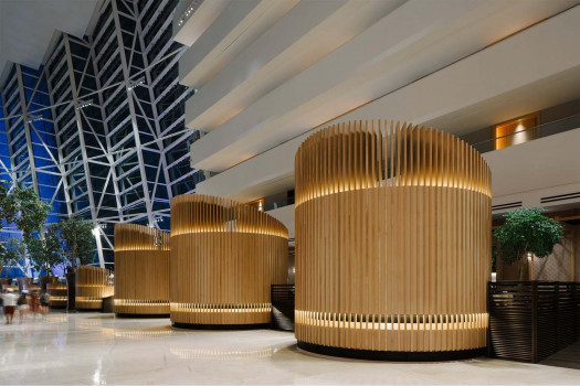
The hotel is formed by a U-shaped wall of rooms, within which is a second U, turned at an angle. Both are poised above the lower floors which contain all public, retail, and support facilities. The main hotel lobby is raised one level above the street, creating a special domain of luxury and elegance. Reception, bar, restaurants and lounges surround this great central court, connected by escalators and elevators to lower levels with ballroom and conference functions. Retail and food and beverage tenant spaces are located at street level, and benefit from the direct contact with outdoor public terraces and gardens. Service apartments are on the top three floors, as well as a single high-end restaurant.
Site: Urban and Green
The design gives a high priority to urban landscape, both to link the project to the city around it, and to provide an important amenity to users of the site. A rich range of landscape places is proposed, weaving hard public-use plazas and promenades with park-like landscape. Water, although small in area, plays an important part in creating edges and movement, as it is pulled through the site from the entry corner to the walled garden behind the hotel. The very shallow ponds are surfaced with river stones, allowing them to be left dry in winter where they provide texture and color. Small raised terraces with random groves of evergreens offer a public stage for Tai-chi, and places for the daily performance of urban life.
Design Architects:
Moore Ruble Yudell Architects and Planners.
Principal-in-Charge:
James Mary O’Connor FAIA

Partner: John Ruble FAIA
Senior Associate: Halil Dolan AIA
Associate Architect: Yang Architects


 Indonesia
 Australia
 New Zealand
 Philippines
 Hongkong
 Malaysia


