LA MURALLA ROJA


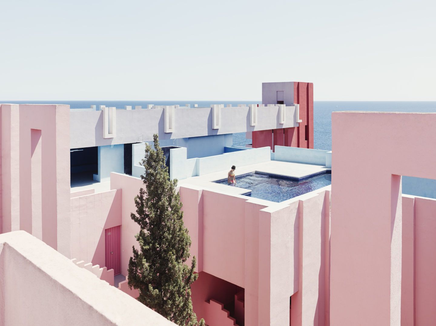
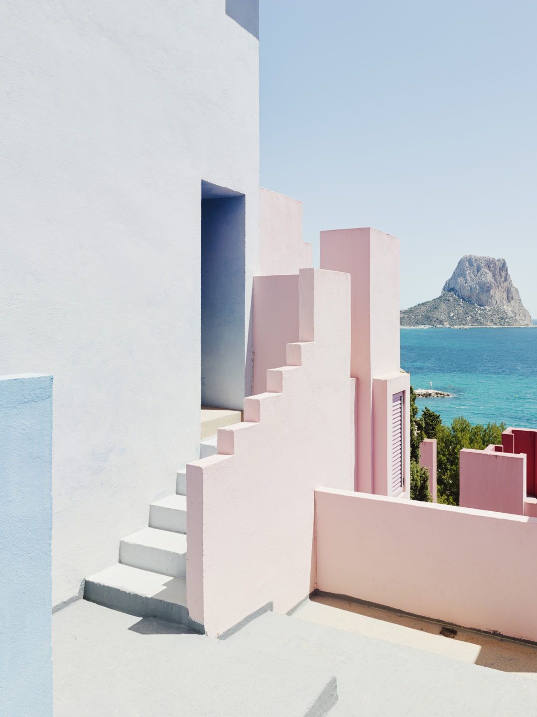
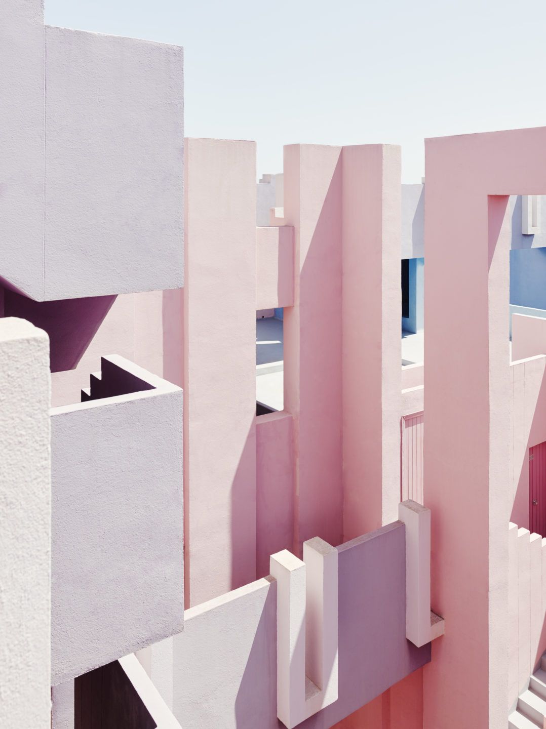
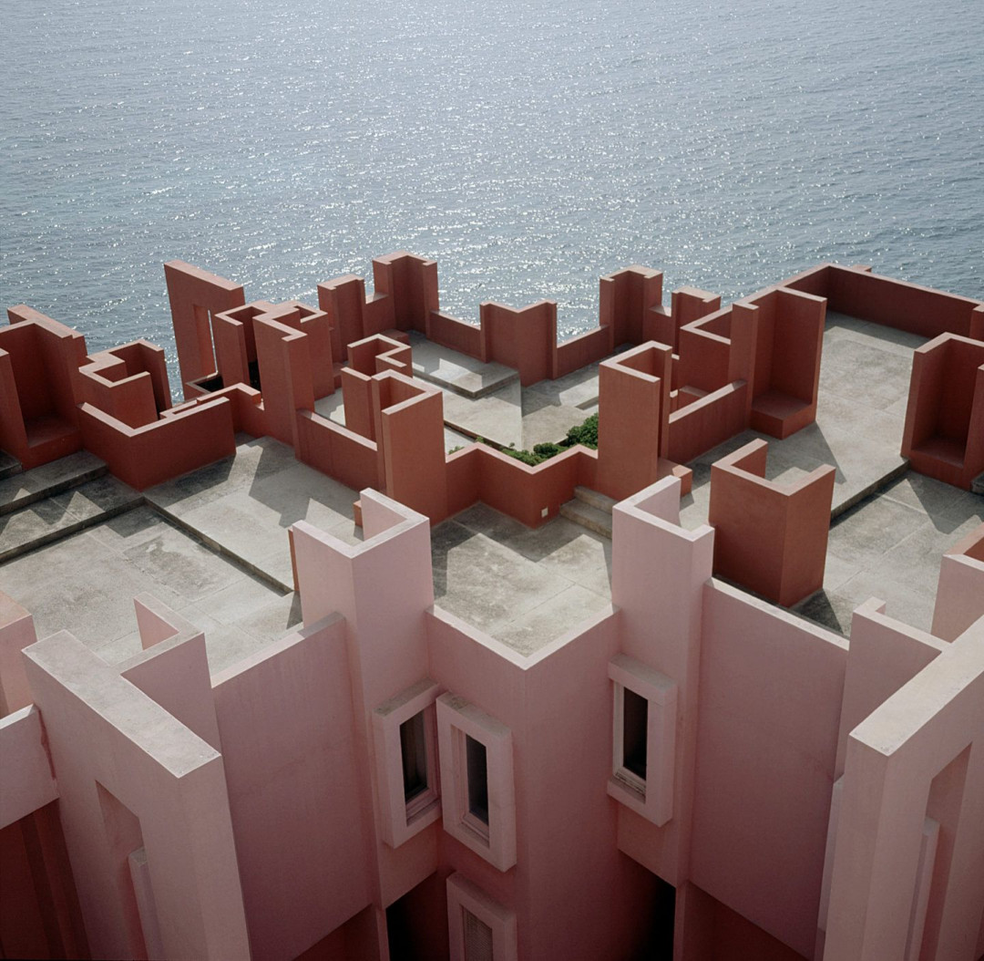
With this building, RBTA wanted to break the post-Renaissance division between public and private spaces reinterpreting the Mediterranean tradition of the Kasbah. The labyrinth of this recreated Kasbah corresponds to a precise geometric plan based on the typology of the Greek cross with arms 5 meters long, these being grouped in different ways, with service towers (kitchens and bathrooms) at their point of intersection. The geometric basis of the layout is also an approximation to the theories of constructivism, and makes La Muralla Roja a very clear evocation of these.
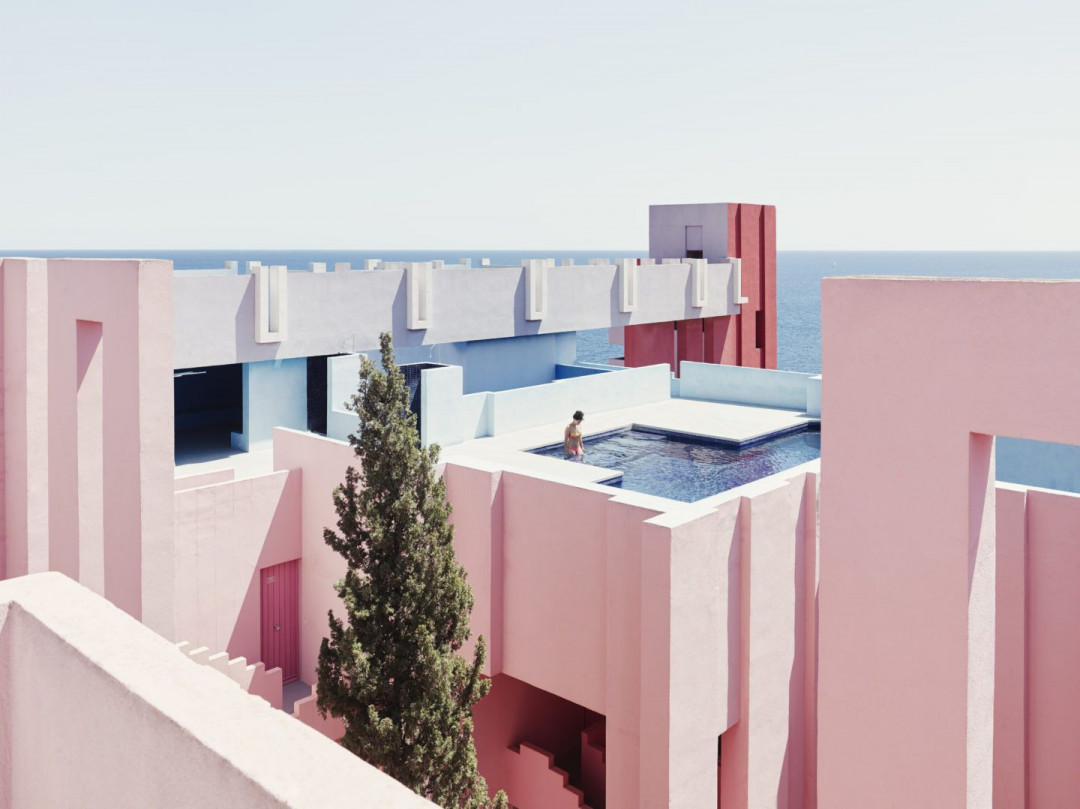
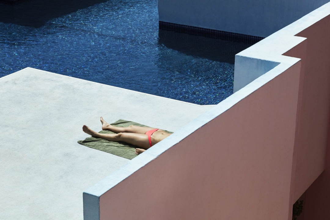
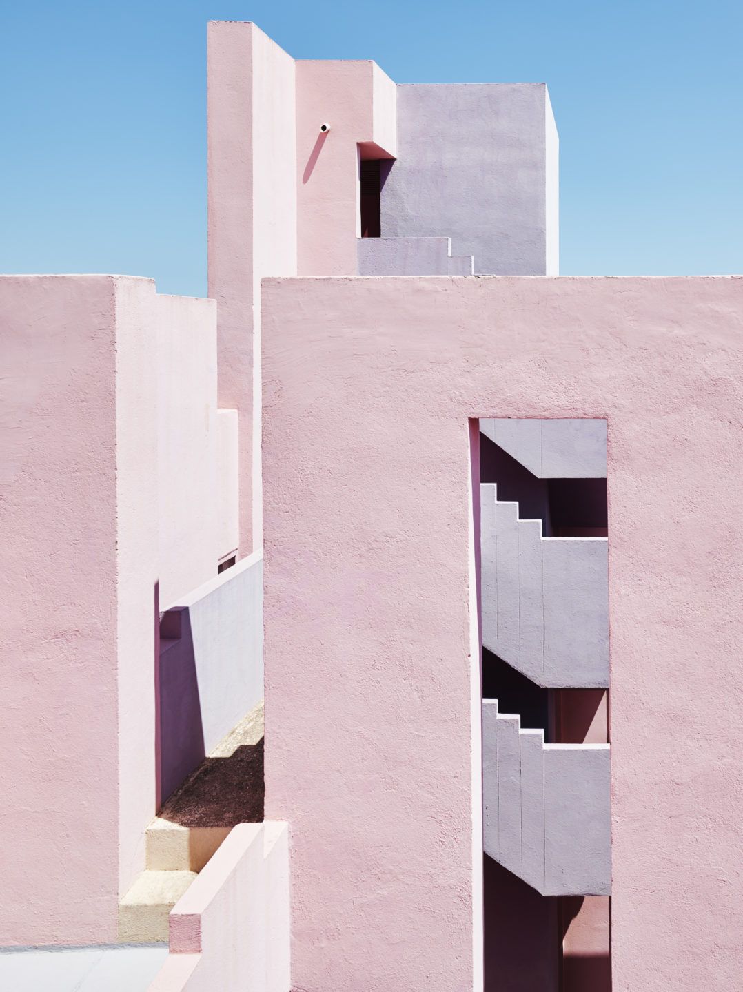
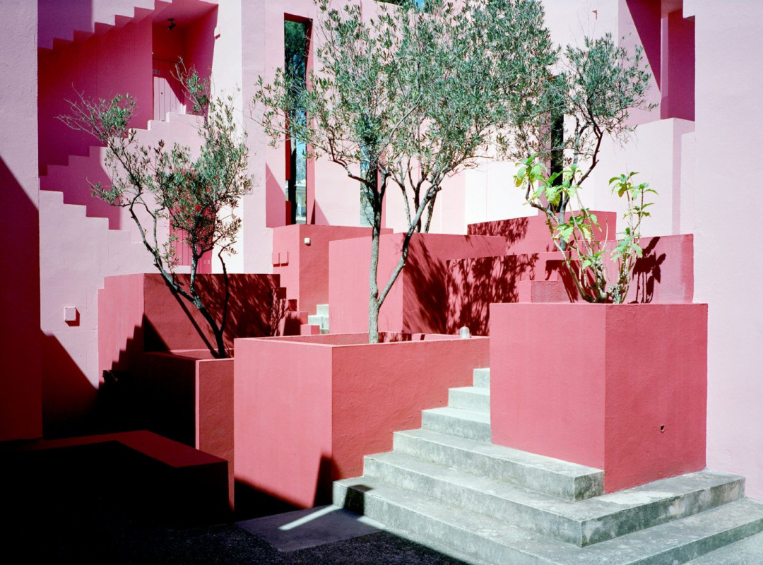
The forms of the building, evoking a constructivist aesthetic, create an ensemble of interconnected patios which provide access to the 50 apartments, which include 60 sqm studios, and two and three-bedroom apartments of 80 and 120 sqm, respectively. On the roof terraces there are solariums, a swimming pool, and a sauna for resident’s use.
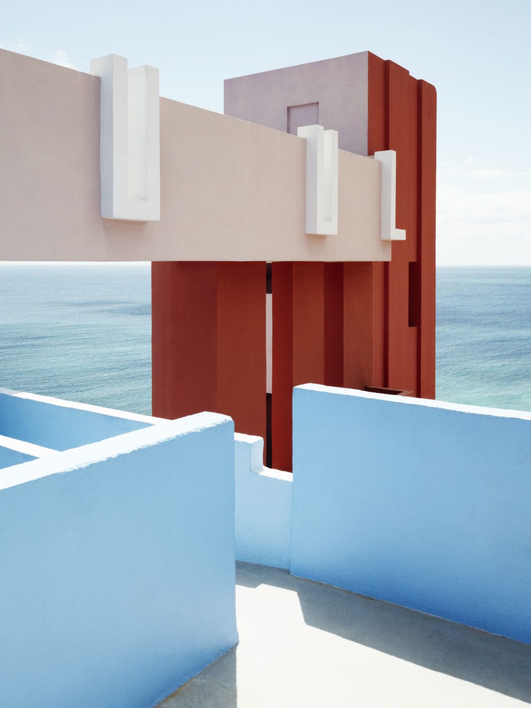
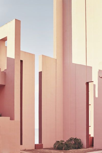
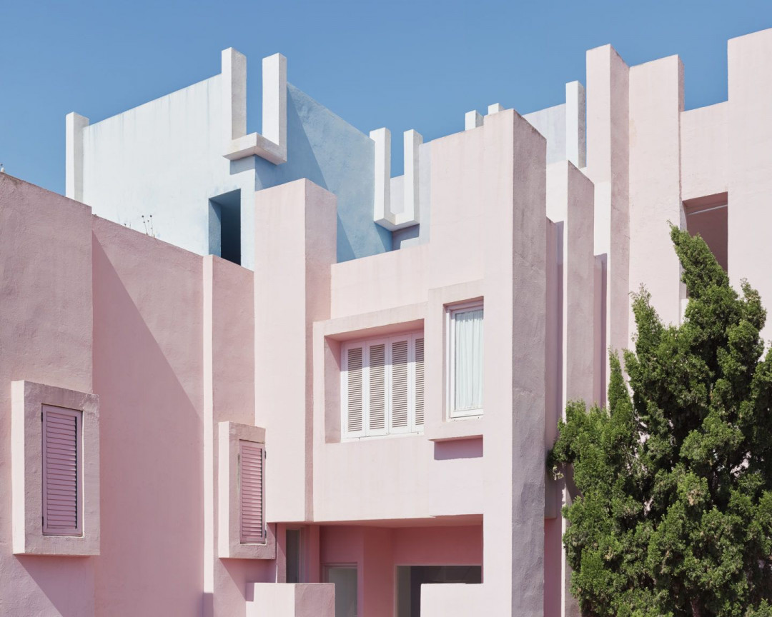
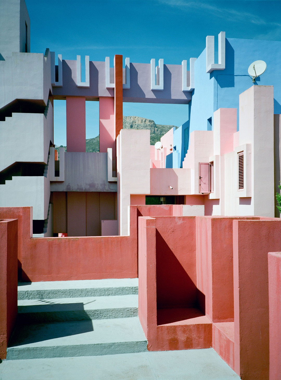
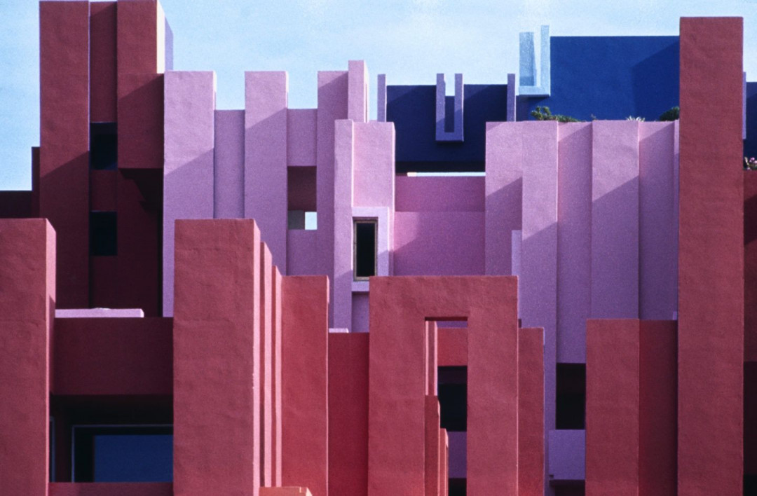
The criterion of applying to the building a gamut of various colours responds to the intention to give a determined relief to the distinct architectural elements, according to their structural functions.
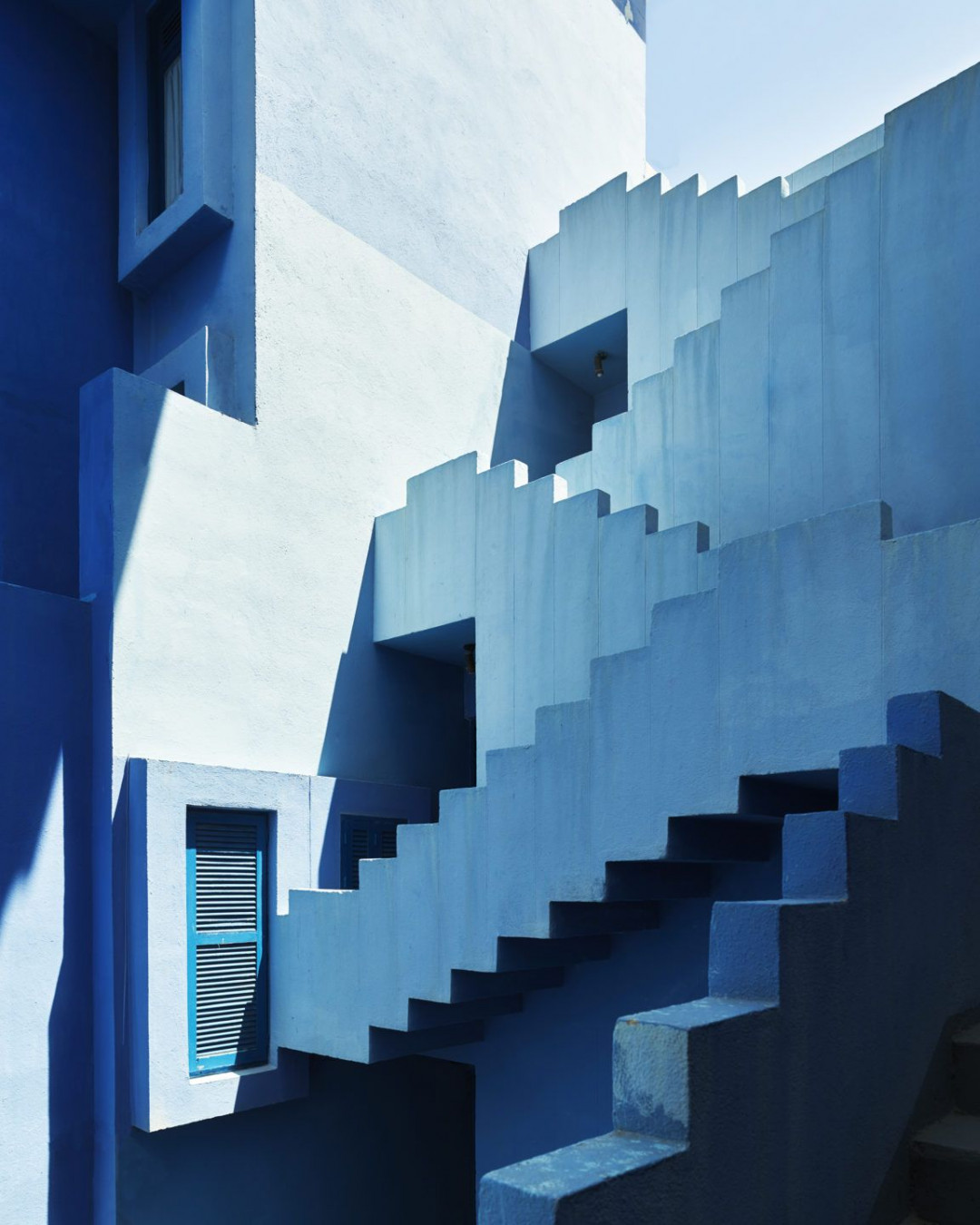
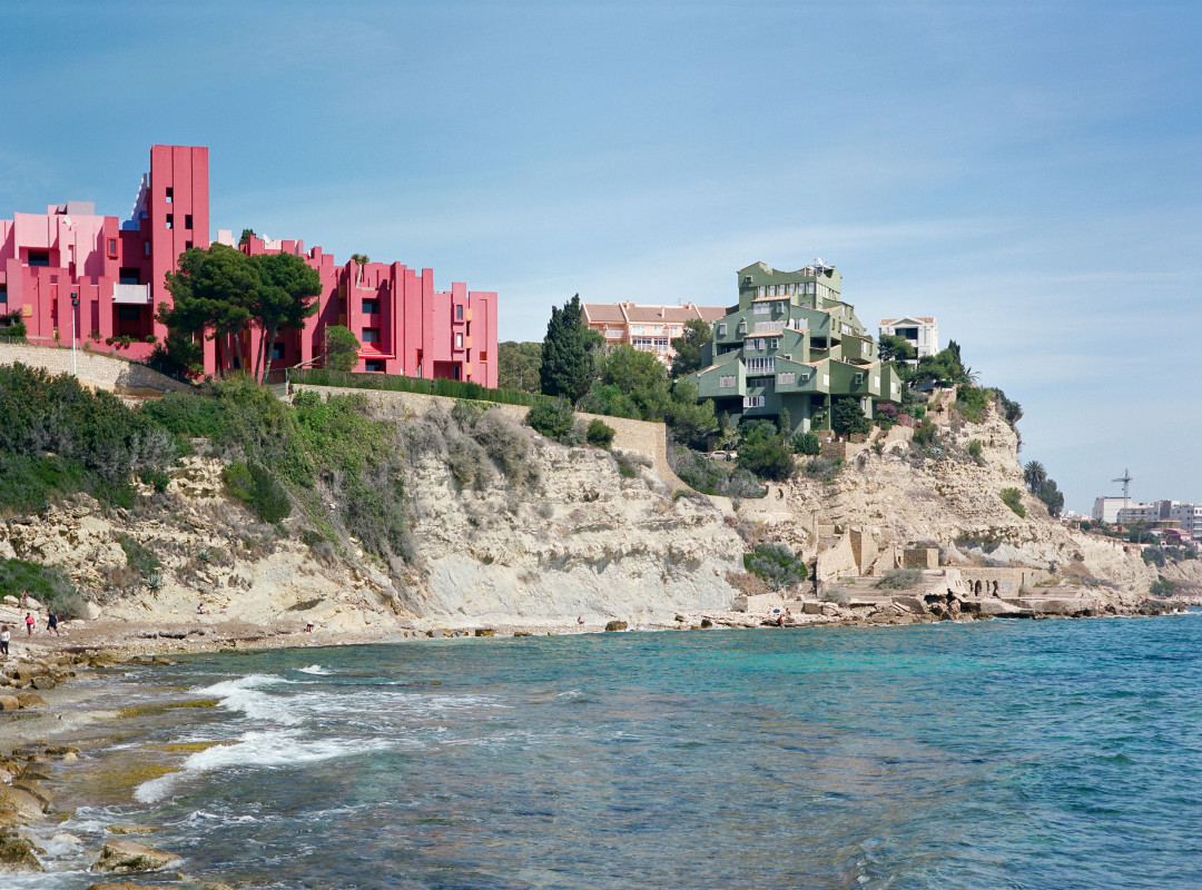
The outside surfaces are painted in various tones of red, to accentuate the contrast with the landscape; patios an stairs, however, area treated with blue tones, such as sky-blue, indigo, violet, to produce a stronger or weaker contrast with the sky or, on the contrary, an optical effect of blending in with it. The intensity of the colours is also related to the light and shows how the combination of these elements can help create a greater illusion of space.
This article originally appeared in ricardobofill.com


 Indonesia
 Australia
 New Zealand
 Philippines
 Hongkong
 Malaysia


