Team Value Pan-Home Furnishing Showroom | A Library of Inspiration for Materials


As a leading enterprise in the building materials and decorative industry, Team Value has created a 3,000-square-meter artistic showroom for new materials in the concept of a “Material Library”. Team Value Pan-Home Furnishing Showroom showcases the most cutting-edge and innovative products from both domestic and international markets. Here, “library” not only refers to the building’s design, but also reflects its practical management. Each new material is tagged with a unique QR code, allowing designers to scan and instantly access detailed information in the in-built system. This system, akin to a library catalog, provides designers with a highly efficient, one-stop solution for exploring and selecting the latest materials.
0.1 A Symphony of Space
The showroom, completed in three months, was a feat of synchronized design and construction. It’s a tall order to balance designing effects with construction progress. However, designers successfully shortened the construction time by modifying the existing steel structure: two original staircases were removed to create a clearer circulation route, aligning with the office layout of the company.
Upon entering the lobby, two distinct routes unfold: one extends to the material hall on the first floor, and the other ascends a sculptural staircase to the office area on the second floor.
The first floor displays new materials, with a two-story-high central exhibition area at its core. The two parallel display walls, designed in a library style, along with the central meeting table, give the central area a sense of order and precision, setting the tone for the overall ambiance. This place also combines functionality, form and customer experience in a perfect way, which encourages free movement, allowing people to explore and select their most ideal materials, while also enables people to sit down at any time for detailed discussions with staff or suppliers.
At the center of the showroom stands a spiral staircase, its fluid handrail elegantly extending upwards, creating a sense of depth even though it doesn’t reach the third floor. Here, the interplay between straight and curved lines strikes a harmonious balance. Acting like a conductor orchestrating the rhythm of the space, the designer perfectly balanced the seemingly contrasting rigidity of straight lines and the softness of curves. The use of a gray mirrored ceiling further evokes an extraordinary visual effect akin to Inception.
The side spaces on the first floor continue the library-style material display, equipped with material cabinets and lounge seating. This design maximizes the display of various brands and products, while fostering spontaneous exchanges of inspiration.
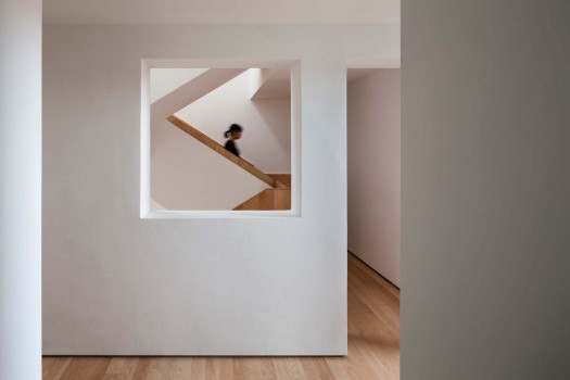
Stepping up the staircase at the entrance lobby, people reach the office area on the second floor. The staircase serves as not only a connection between floors, but also a multifunctional zone for leisure, discussions, and sharing.
Unlike traditional monotonous ones, this staircase wisely integrates a sofa reception area on the first floor. The two semicircular seats and a fireplace descending from the second-floor ceiling create a unique view of the hall.
In addition, the staircase extends outdoors to the balcony platform, breaking the boundary between inside and outside. The steps vary in size but are regularly paved. Some stand out boldly as terraces, adding a sense of discovery.
Reaching the office area on the second floor, people will find an open and healthy space where each functional department has its dedicated place. The independent working space, separated by glass, maintains detachment while preserving visual openness. The entire office area adopts concealed sliding doors, which create a relatively private working environment when closed, and integrate seamlessly with the overall open space when open, displaying the material and the use of decorative techniques. The meeting rooms are spacious and equipped with advanced multimedia technology, facilitating brainstorming sessions, detailed project discussions, and business meetings.
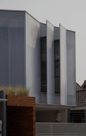
The exterior design of the showroom took full consideration of its surrounding conditions. The white façade gives the space a pure and artistic appearance. At the same time, the robotic arms and LED smart screens symbolize Team Value’s precise manufacturing and futuristic technology. The blending of art and technology endows it with an outstanding appearance in the surrounding complexity of the building materials market, establishing it as a distinctive landmark.
02. The Poetry of Materials
As a materials showroom, it’s a great challenge to maximize the display of diverse new materials while ensuring a cohesive tone of the space, given that there is a wide variety of building materials different in size, shape, texture and color.
The primary materials in the showroom are paint-free materials, one of Team Value’s signature product categories. The most difficult part of using paint-free materials is the integration of walls, cabinets and doors. Take the lobby as an example, luxurious stone textures and metallic finishes were applied to the walls and desks.
To highly unify the color and texture of the ceilings, cabinets, walls and floors of different materials and reach a visual harmony, the designers and the construction team collaborated closely. In the lobby, the ceiling was designed with grid wood plastic composite materials that curves horizontally, adapting to the existing beam structure. The curved wall that houses the fireplace showcases the seamless application of surface materials on a large-scale curved surface.


 Indonesia
 Australia
 New Zealand
 Philippines
 Hongkong
 Malaysia


