Courtyard Dreams


The front door to this villa in Grey Lynn might look typical, but it’s a portal to another time and place.
When Nick and Clare McIntosh and their two primary-school-aged children moved in to their new home in the Auckland neighbourhood of Grey Lynn, they already knew the house. “We had lived [two doors down],” says Clare. They also knew what changes they wanted to make.
UK-born Clare was inspired by the work of designer John Pawson – the consummate minimalist – whose ideas she came across as a child. “My grandfather and father were both builders,” she explains, “so we had lots of architecture books around the house.”
Later, when she worked at the BBC, she produced a documentary on Pawson – and, later still, while working on a travel programme about New Zealand, she fell in love with the country and relocated. Then she met Nicholas, a builder. Her fate was sealed.
The couple makes a well-oiled team with a shared passion for projects and although many would have considered this villa to be charming, it was on the wrong side of the street for sun. Still, it was elevated and, best of all, had a wide frontage. At the back of the home, there was an expansive garden planted in established palms – and enough room to manoeuvre. The couple saw the opportunity.
Jose Gutierrez of Jose Gutierrez Architecture firm had worked with Nick and Clare before on their previous home, just two doors down. He wasn’t surprised by their ambition to refurbish and then create an extension that wrapped around a courtyard. It made sense, too. “There was a good deal of north-facing space on the 480m² section,” he explains. This plan capitalised on that while also observing the strict building coverage of 40 per cent in a heritage zone.
But, says Gutierrez, architecture is not just about compliance or making things fit. “It’s about intrigue and evoking the senses.”
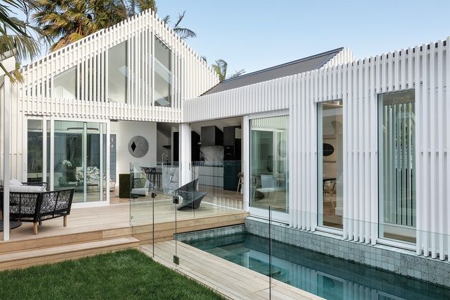
The front door is a typical, traditional entry off a white-balustrade verandah. Peel it open and there’s a view: a vertical window that frames the inviting pool and the gabled peak of a palm-fringed pavilion, which has a tropical feel. This could be Bali or The Bahamas.
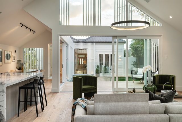
Sightlines from the new extension to the front door add a sense of drama and transparency to this project. Image: Samuel Hartnett
The journey, visual and visceral, loops from old to new around the sheltered courtyard. Moving along the main axis of the home, screening gives glimpses of a planted garden on one side of the corridor that connects the original to the extension. On the other, reflections shimmer in the water as ceiling heights and angles change to delineate space. “That’s part of the sensory experience,” says Gutierrez. “A flat ceiling gives way to a raked one over the dining space and, finally, expands into that double-height volume of the main living room.”
The extension, which was built and project-managed by Nick, was a true collaboration of minds. In their brief to Jose, Clare made reference to John Pawson’s Baron House – an arrangement of crisp, shed-like buildings set around a courtyard in rural Sweden. Certainly, there are traces of that here: the layout, the pitched roofs, the all-white palette countered by timber elements stained black.
Meanwhile, Gutierrez planned the proportions and the design moves to ensure that the addition was not too dominant on the site. “The battens break down its scale and make the pavilion more ethereal – its form starts to diffuse,” he says. The deep 90mm battens multitask by hiding the flashings and fixings on the painted-ply cladding and lend verticality to the exterior. “I also like the way the battens allow snippets of green to seep through and that the interchange between solid and openings creates an abstract aesthetic when viewed in certain ways,” says Gutierrez.
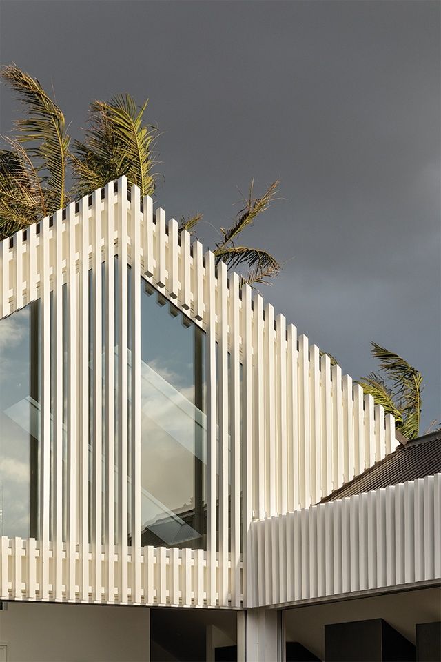
Vertical battens break up the façade and lend dynamism to the design of the extension. Image: Samuel Hartnett
Having lived through several major renovations, the McIntoshes were unfazed by staying put during the build and Clare, who has swapped her career in TV and the media for full-time project and family management, was integral to the design of the interiors. She likens making spaces to building a film set. The house is her stage and she set about adding elements of luxe.
For the kitchen, she sourced a slab of Invisible Blue marble for the island bench. It became her design muse. Although the whole house is painted white (Aalto’s Powdered Wig on the exterior, Gallery White inside), there is coordinated colour to be found. “The Italian oak floors have a faint grey-blue grain in them and the pool tiles are Sukabumi stone, which is bluey green,” she says.
Nick spent three weeks getting the fume finish on the kitchen cabinetry just right, waxing the doors then staining and rubbing and reapplying to achieve a smoky shade. The scullery bench is slate with a leathered finish and the rangehood was custom-made to their specifications. “We had to enlist a specialist steel colourist to make it the right tone to fit with the kitchen.”
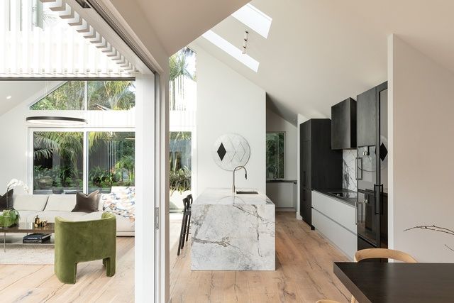
For the kitchen, the owner sourced a slab of Invisible Blue marble for the island bench. It became her design muse. Image: Samuel Hartnett
Once all was built around them, Clare chose furnishings, using a mix of old family pieces and new buys, including many items sourced from her birthplace. “My mum still lives in the UK and, every time she comes to visit, she has to bring over a suitcase full of taps, vases and nice little Tom Dixon pieces I can’t get here,” says Clare.
Finely detailed both inside and out, the house is a stone’s throw from Ponsonby Central. After living in London, the couple enjoys the buzz – the sense of activity and excitement just beyond the door. Inside, the courtyard with its deep plunge pool is an unexpected escape. Clare: “I love the way the road frontage looks small but, once I’m home, I can see all the way across the pool to the back of the section – for almost 40 metres. The scale feels grand.”
For Gutierrez, that’s the measure of the project’s success on this compact city site: linking a 100-year-old building with its contemporary counterpart in a way that celebrates them both.
This article was originally published on ArchitectureNow


 Australia
 New Zealand
 Philippines
 Hongkong
 Singapore
 Malaysia


