House in Heguri Heguri House


The hope of the site was that it was not far from where I currently live, and that it was a residential area that was just right for the distance from the station and the budget.
In such a flow, it was decided to build a house in "Hegori" that meets all of the above. After many hearings with the contractor, we designed a design that can balance the two concepts ("one-story" and "quality over quantity") in order to fulfill all of these requests.
"Flat building-one-story building-"
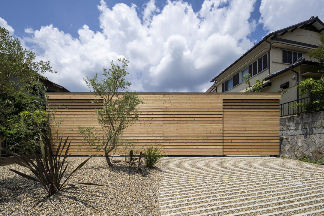
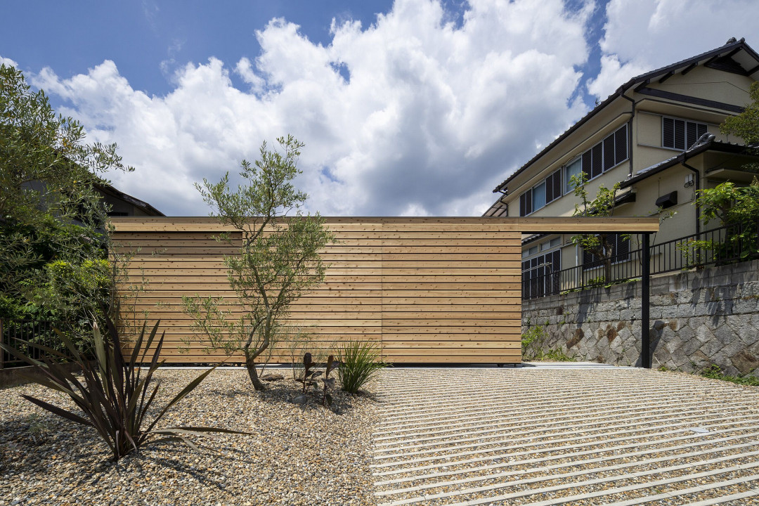
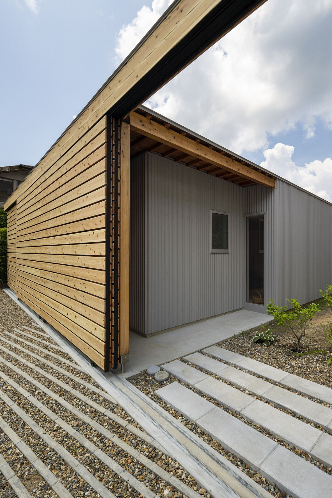
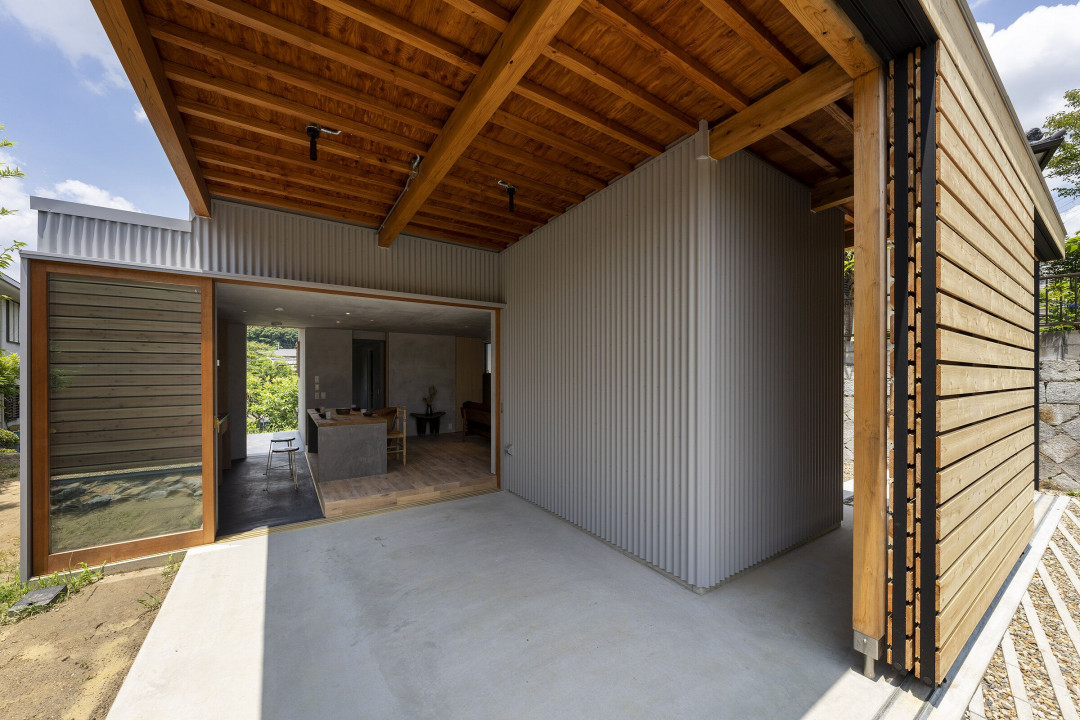
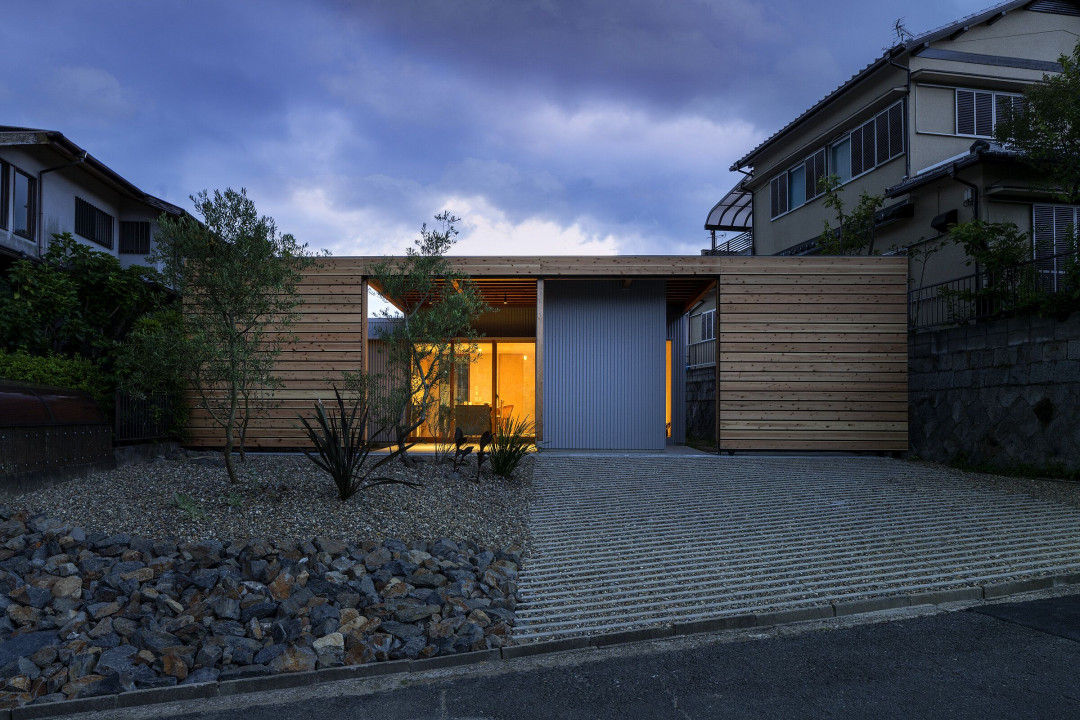
The most distinctive element is the wall that extends to both ends of the site. The purpose here was how to create a space with a sense of privacy within a limited cost. But yet, what do you do to alleviate the feeling of obstruction while sometimes blending in with the surroundings? I also considered the viewpoint. As a result, we designed a moat that can satisfy both "a space with a sense of privacy" and "a space without a sense of blockage."
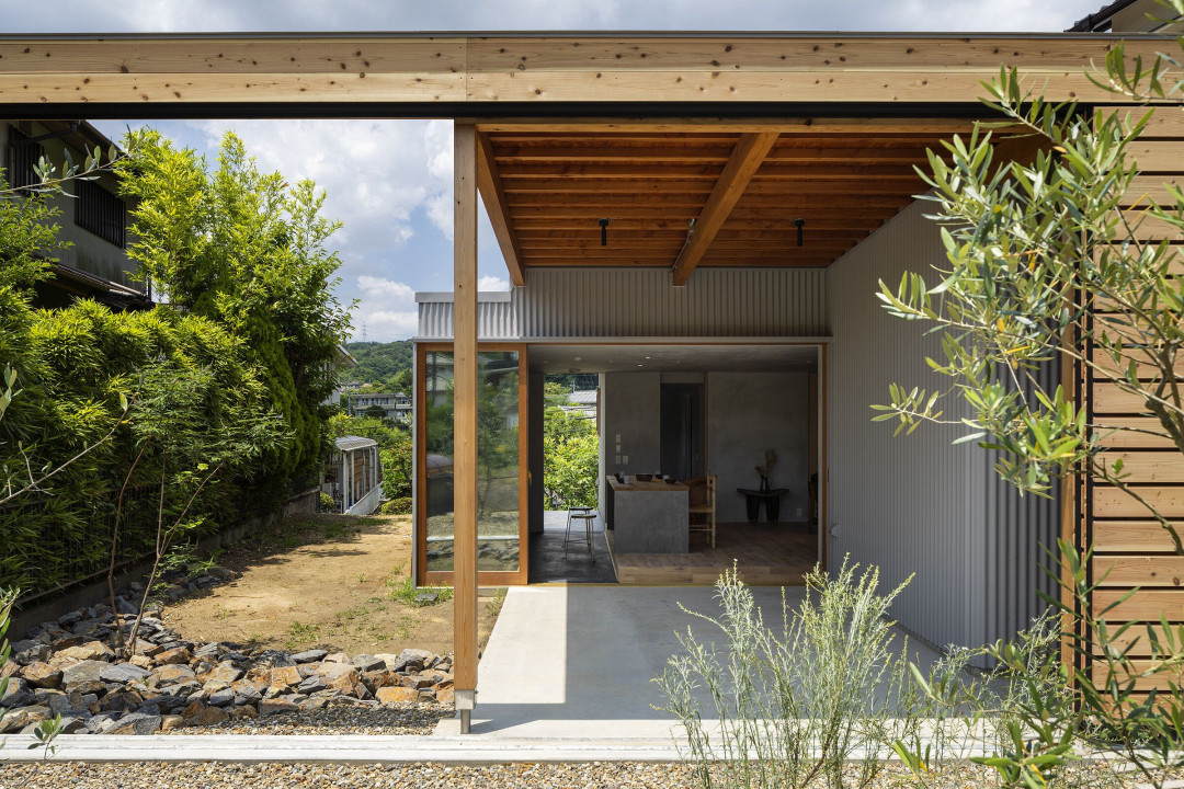
However, there is a feeling of oppression in the space with only a fence in the residential area. Therefore, the layout of the fence and the building was shifted from the parallel line of the road. By not making the building parallel to the windows of the adjacent land, the line of sight inside and outside will not be face-to-face, and the deviation will be less noticeable. The result was four gardens, and one of the attractions was the occasional choice of a cozy place.
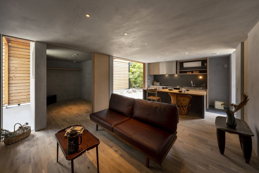
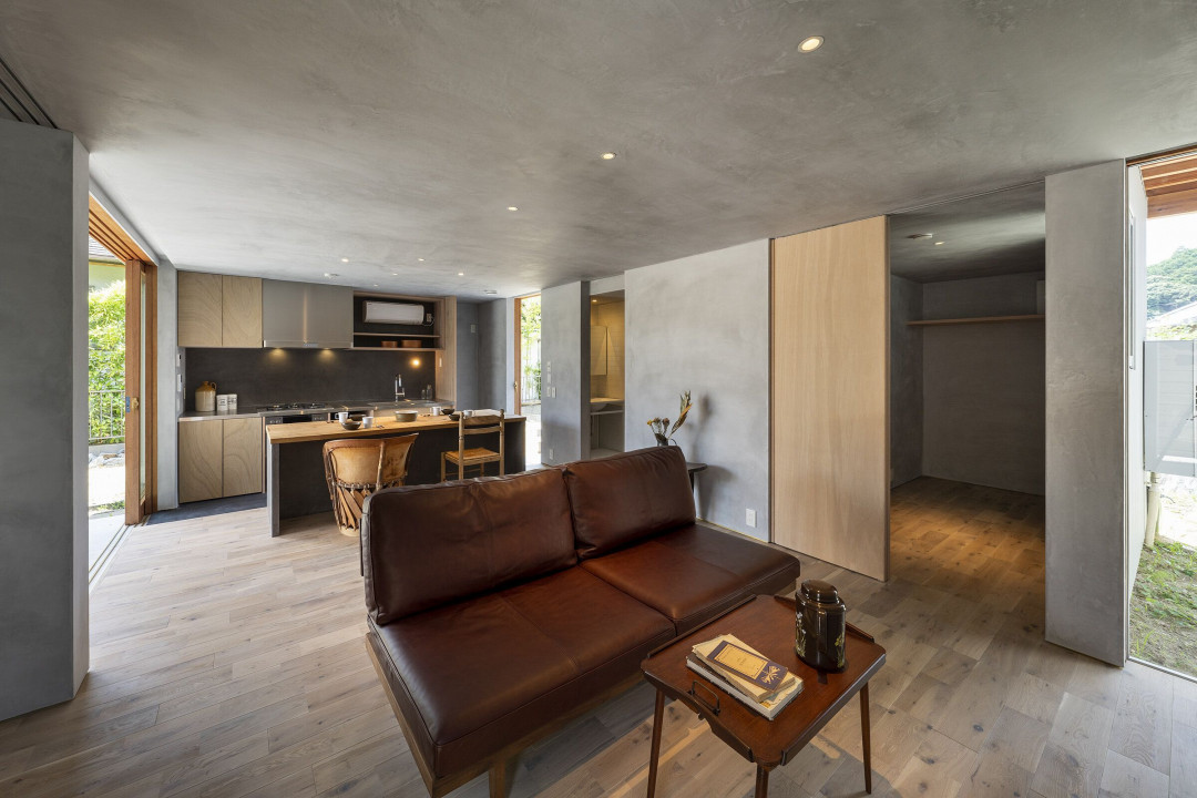
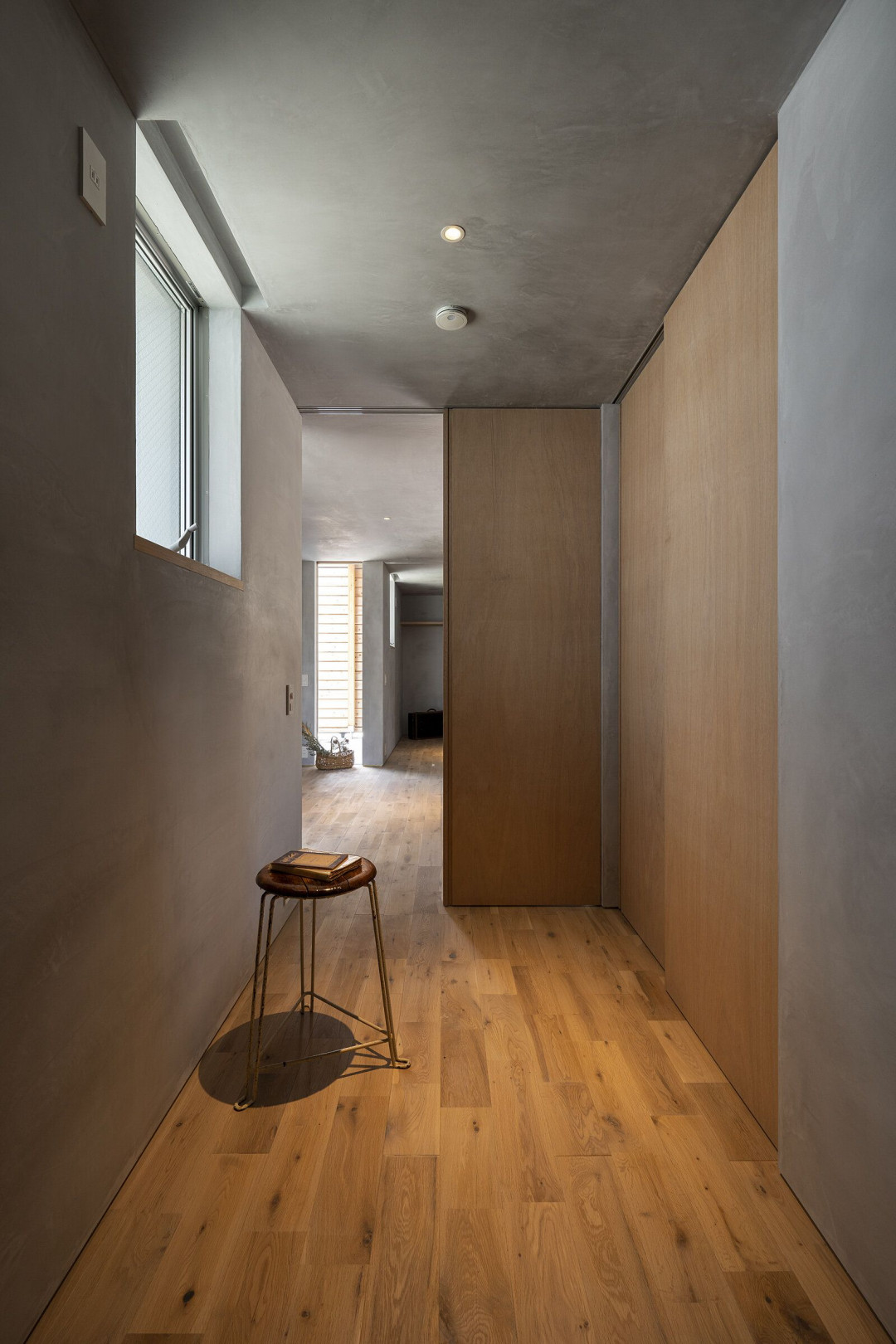
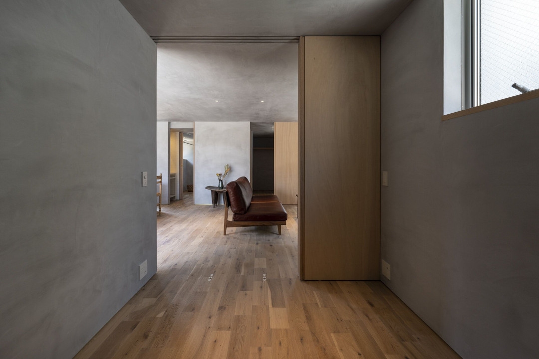
In addition, each room connected to the living room as a flow line has a clear entrance, and at first glance, the front of the toilet, which can be seen in a part of the corridor, is also designed to double as a washbasin.
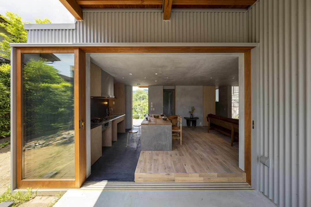
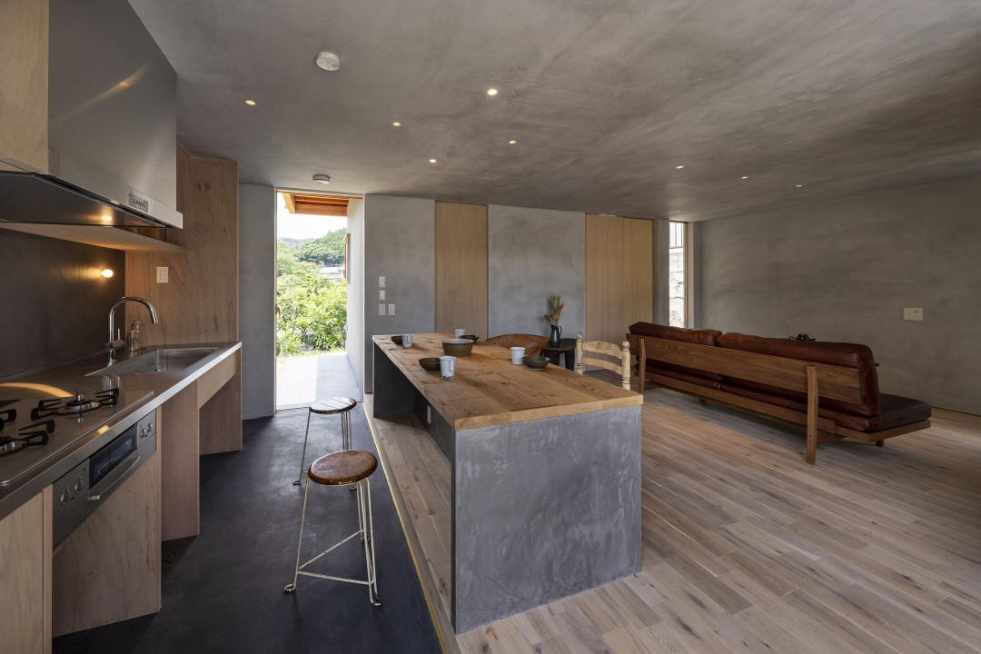
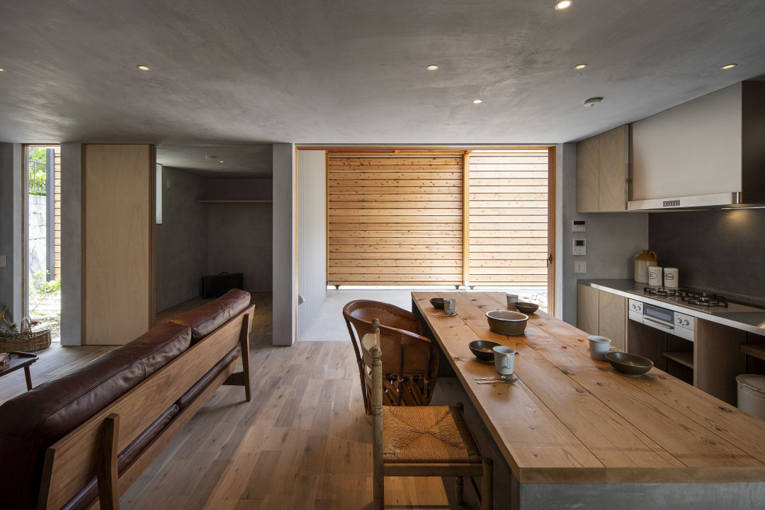
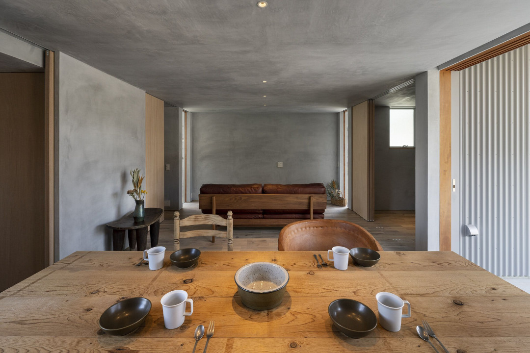
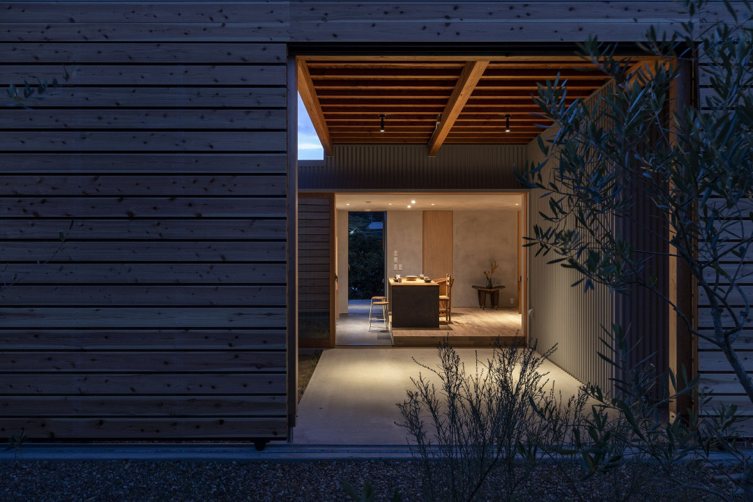
Considering the flow of housework, the entrance soil and the street soil are integrated to establish a connection with the kitchen. It is expected that there will be two children's rooms in the future. Finishing is done with plaster and solid flooring.
"Quality before quantity"
The customer emphasized "quality" while being compact. In today's world, minimalism is being reviewed in the context of "information overload" and "material overload."
One of the examples devised for that. It is a "entrance porch and outdoor living room". Although this is the entrance porch, it is a space where you can do a little outdoor activities. As the number of families of the contractor increases, the activities will change in various ways. I hope that the family will make colorful memories even in the space called "entrance porch".
The same applies to the space called "closet and dry space". As the number of families increases, the amount of laundry inevitably increases. Not only as a closet, it is a space where you can dry your room even on rainy days.
These are exactly the spaces where you can enhance your quality of life.
The point of ventilation equipment is a filter that takes in filtered air into the room.
Above all, the idea at the time of design was "I want my family to stay healthy forever." We adopted type 2 ventilation through a filter that removes impurities from the outside air, so that clean air circulation can be created in every corner of the house. In addition, a sprayed heat insulating material for wooden construction was used, and the sash was also made of double glazing to improve heat insulating properties.
The planting plan is to confront three olives against a façade with a simple and impactful fence. In order to emphasize the same tree species, the surrounding area was gravel, and the gravel was surrounded by chestnut stones to connect the inside and outside of the fence. Chaste tree, which has a leaf color similar to olive, was planted on the inside to give the space continuity when opened.
If these trees grow large, I think they will further impress the compactness and luxury of this house.
The lighting plan emphasized the visibility of things. It is a lighting plan that pursues a light that affirms shadows and darkness by reviewing the "excessive amount of light" that seeks the "amount" of brightness and living comfortably at night. The ceiling downlight uses a "glareless downlight" that gives the illusion that the light is "on" but "off". The presence of equipment was suppressed and unpleasant glare was eliminated. The size is Φ50, which is a small lighting fixture.
The ceiling surface, where the presence of lighting fixtures is suppressed, coexists with the beauty of the space and sophisticated minimum rhythm.
The era of mass production and mass consumption is over. From now on, it will be an era where quality and ease of use are required while being surrounded by only what you like and being compact. While emulating the challenges of our predecessors, we hope that it will become a new breath and model for the future housing situation.
This article originally appeared in arbol-design.com


 Australia
 New Zealand
 Philippines
 Hongkong
 Singapore
 Malaysia


