Office S A Highlights Simplicity through Adit Haus Design


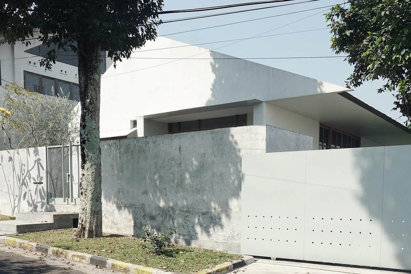
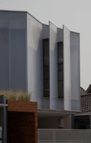
While many residential designs are competing on coming up with unique shapes for houses, Adit Haus by Office S A stands out with its simple shape. Located on the outskirts of Bandung, this house has a common appearance—a façade with a combination of rectangular and triangular shapes.

©Office S A
The homeowner, who leads a minimalist lifestyle, is the reason behind this approach. The emerging forms are basic, corresponding to their functions without any decorative elements. One of the examples is the overhang with thin iron plates. The overhang’s width, thickness and position create a light plane, as compared to those made out of concrete or other heavier materials that would take up more space on the façade.

©Office S A
Connected to the garden, the side and rear overhang are intended to provide a wide and shady terrace space. The terrace is partitioned by a sliding door that opens into the house’s main room. Without any partitions, the main room accommodates almost all the owner’s daily activities. This, again, emphasises the simplicity of the design. Obviously with such a large main room, more space can be created when the sliding door to the terrace is opened, meeting the needs of the homeowner who likes to organise gatherings.

©Office S A
Since the main room is large, other spaces such as the bedrooms, toilets and kitchen are designed mainly for practicality. The size of the rooms and the limited storage area, according to the designer, are key to supporting the owner’s minimalist lifestyle, so as to discourage the accumulation of items.

©Office S A

©Office S A
On a site that is nearly 400 square metres, Adit Haus only occupies half of the total site. The rest of the site is made into a green area, which can easily be enjoyed from the main room and, by extension, the terrace. The simplicity of the finishing with white paint, plaster and door and window frame that accentuates the use of wood that complements the surrounding landscape.

©Office S A
Without being splashy, Adit Haus is a good example of a design that affirms the owner’s lifestyle, especially through the arrangement of space, mass formation and details.


 Australia
 New Zealand
 Philippines
 Hongkong
 Singapore
 Malaysia


